
This article covers Text Inputs and their use cases. Text Inputs are elements that allow a user to enter freeform text. These are primarily used for qualitative information capture, such as in a survey, or to display important information on the screen for the seller or customer.
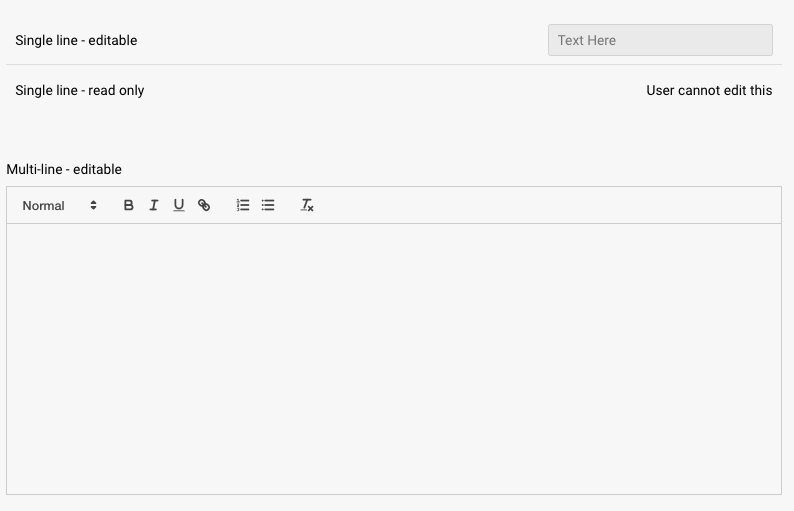
Text inputs can be made read only or editable, and can be defined as single-line or multi-line. If set to multi-line, you get access to all the rich text editing capabilities, such as bolding, hyperlinks, and numbered lists.
Text placed in the Placeholder section will show up in the field if there is no text present, and text added at the bottom in the Text section will be added to the field by default.
Here's how they look on a page in the various formats:
When editing a text input, you will have access to the following properties:
Design properties
- Size
- Grid - sets the size of the element based on the number of columns you want it to span across the page. A standard page is made up of 12 columns. So for example, two equal elements placed on a page would each span 6 columns.
- Fixed - set the exact size of the element using pixels or a percentage
- Fit content - makes it so the element expands to fit the content that it contains
- Fill space/available - expands the element to the size of the section it is contained within
- General - show or hide the element on the page
- Background color - set the background of the element to be a color
- Margins - space elements out on a page by adjusting the px size of margins. Margins define the bounds outside of an element (pushes content away from it).
- Conditional Visibility - define what devices each element will be visible on. For example, you may want to hide certain large elements on a mobile device because they take up too much space, or are not as relevant.
Item properties
- Label - give the item a name
- Visibility - set the item to visible or hidden
- Enabled - set the item to Editable or Read-only
- Mnemonic - give the item a mnemonic that can be used in rules and for report tags
- Salesforce label - provide a label that can be used to tie the value to a field in Salesforce (this value will be inherited by the CRM once an Analysis is created from the CRM)
- Placeholder - text that will be displayed inside the input when a user has not entered a value
- Line type - select single line or multi line. Multi line will be much larger and give you access to rich text editing capabilities.
- Text - this is the actual text currently in the field
- Tooltip text - allows you to enter a tooltip that will be available by hovering your cursor over it
Replies have been locked on this page!