
Overview
This article covers Charts and how they are used. Charts are a a powerful Item that allow the information in your Analysis to be visualized in a multitude of ways. The current chart types supported are:
-
Bar - A horizontal representation where each bar's length corresponds to the value of the data.
- Ideal for comparing discrete, categorical data, especially when labels are long or there are many categories. It's great for showing differences between groups (e.g., sales performance across different regions).
-
Column - Similar to bar charts, but with vertical bars. Each bar's height represents the value of the data.
- Best for comparing data across categories over time. Commonly used for visualizing trends or making side-by-side comparisons (e.g., monthly sales over the year).
-
Area - A variation of the line chart where the area under the line is filled with color.
- Use this to show trends over time and to emphasize the magnitude of change between different data sets. It’s useful when displaying cumulative totals (e.g., market share growth over time).
-
Line - A chart where points are connected by lines to show trends over a period.
- Best for showing trends and changes over time. Use when you want to visualize continuous data or observe the relationship between two variables (e.g., stock prices or revenue growth over time).
-
Scatter - A chart that displays points representing two variables on an X and Y axis, often showing the relationship or correlation between them.
- Perfect for identifying correlations, patterns, or trends between two data variables (e.g., sales vs. customer satisfaction).
-
Pie - A circular chart divided into slices to illustrate the proportion of each category to the whole.
- Best for showing parts of a whole, especially when the categories are few and distinct (e.g., market share distribution).
- Waterfall - A chart that shows the cumulative effect of sequentially introduced values, both positive and negative.
-
Combination - A chart that combines two different chart types (e.g., bar and line charts) in one visualization.
- Use this when you need to show multiple data types on the same chart, such as comparing actual performance against a target (e.g., actual vs. forecasted sales over time).
Each chart has it's own set of configuration properties, and depending on the chart type, can be tied to various elements. These include:
- Analysis variables - these are variables calculated based on all the inputs and benefit values, e.g., Net Present Value, Return on Investment, Benefits Potential Year 1.
- Benefit properties - these are calculated values specific to each Benefit, e.g., Current Total, Proposed Total, Total Realized Impact.
- Benefit calculator rows - these are the individual rows that make up the formula of each benefit, e.g., Average Deal Size, Total Number of Impressions, Annual Revenue.
- Investments - these are the values of any individual investment, e.g., Initial Investment, Total Investment, Investment Year 1.
Note - the variables visible in the list will filter based on the data type selected. For example, if you select Currency as your data type, you will only see variables that match that data type. A variable set to the Number data type would not show up in the list.
Additionally, all except the pie and waterfall charts can be visualized using polar coordinates, which plots the points radially around the center of the chart. Now, we will go over all the different chart types and how they work.
Editable Charts
Bar, Column, Area, Combination, and Line Charts
The first five editable chart types (Bar, Column, Area, Combination, and Line) all share the same properties. This means they use the same setup for series data and categories, but are displayed differently. When you first open the chart editor, you will see four tabs on the left hand side of the modal.
Chart
The first tab is the Chart tab. This is where you configure the general properties of the chart, and get a preview of what a completed chart might look like using sample data.
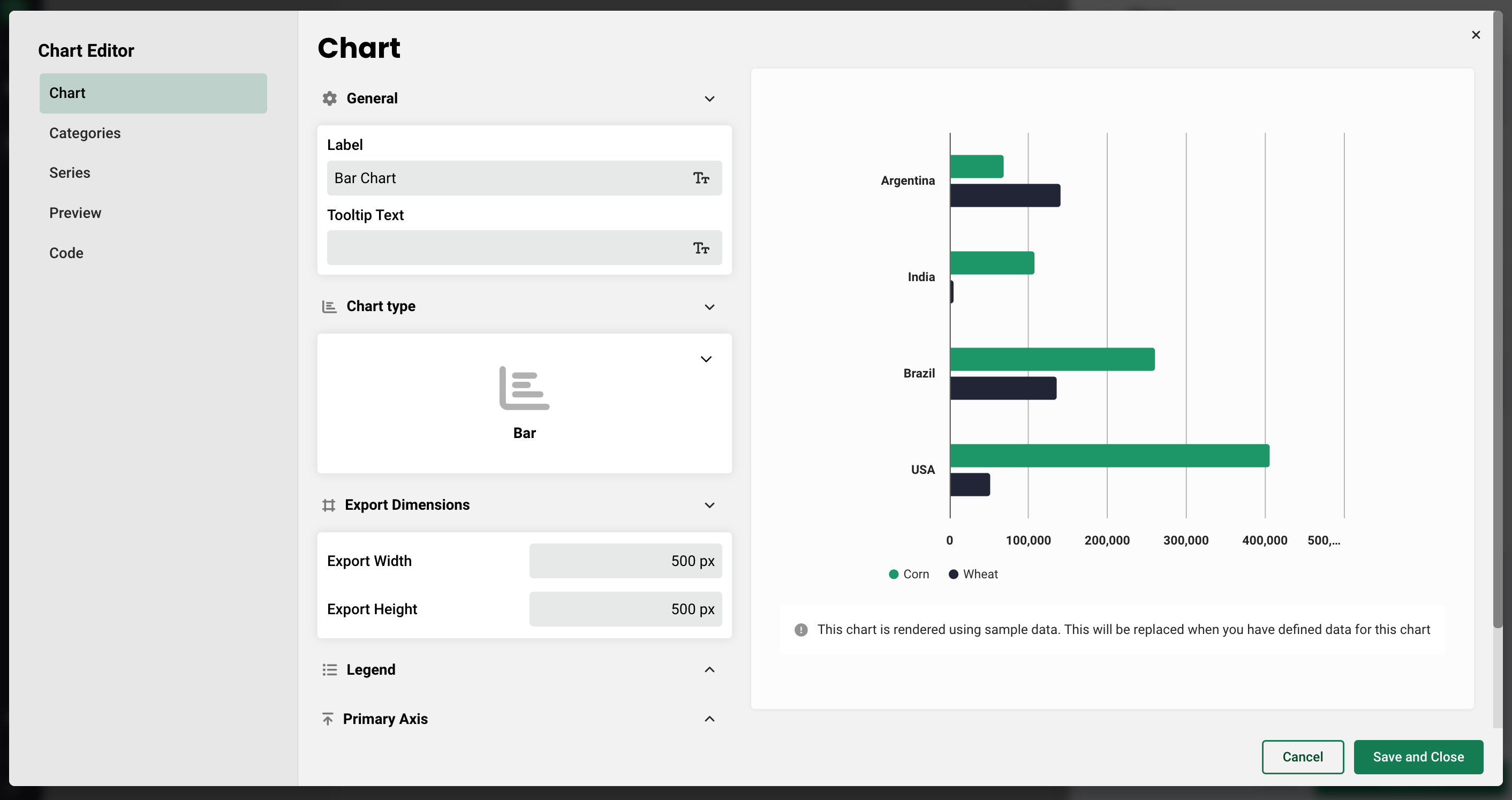
From top to bottom on this tab, you have the ability to:
- Add a label and a tooltip
- Change the chart type
- Adjust the width and height
- Hide or show the legend, and select it's placement relative to the chart (top, right, bottom, or left)
- Select whether the same data type is applied across all series, or able to be chosen individually for each series. This determines what variables are visible in the list when selecting the series data.
- If the same data type is applied across all series data, you will also have the option to add a label to the x-axis, add a unit of measurement, and select a minimum and maximum value.
- Add series stacking, which gives you the ability to group multiple series together to combine their values into a cumulative sum.
- Use polar coordinates, which plots the points radially around the center of the chart.
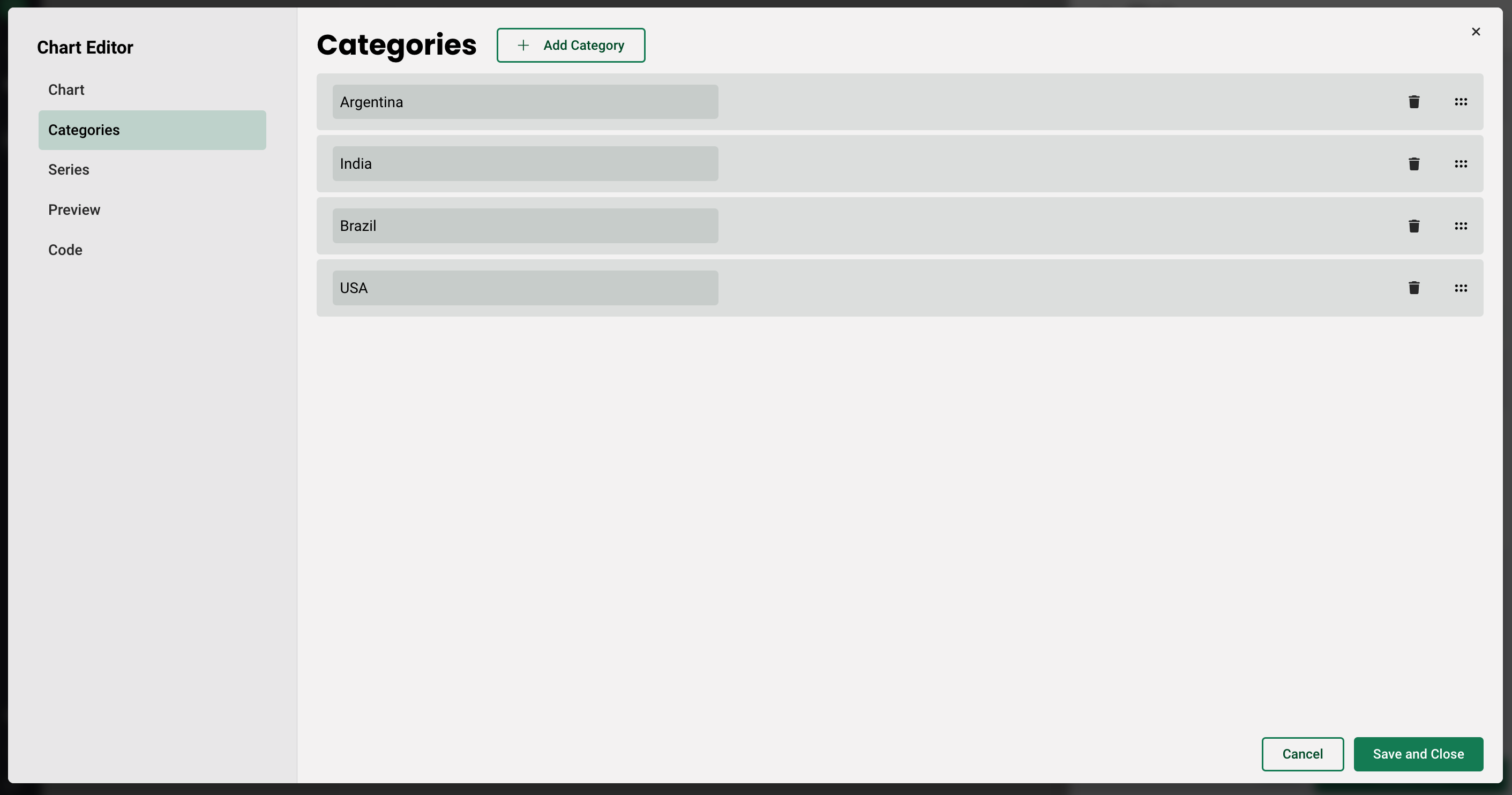
Categories
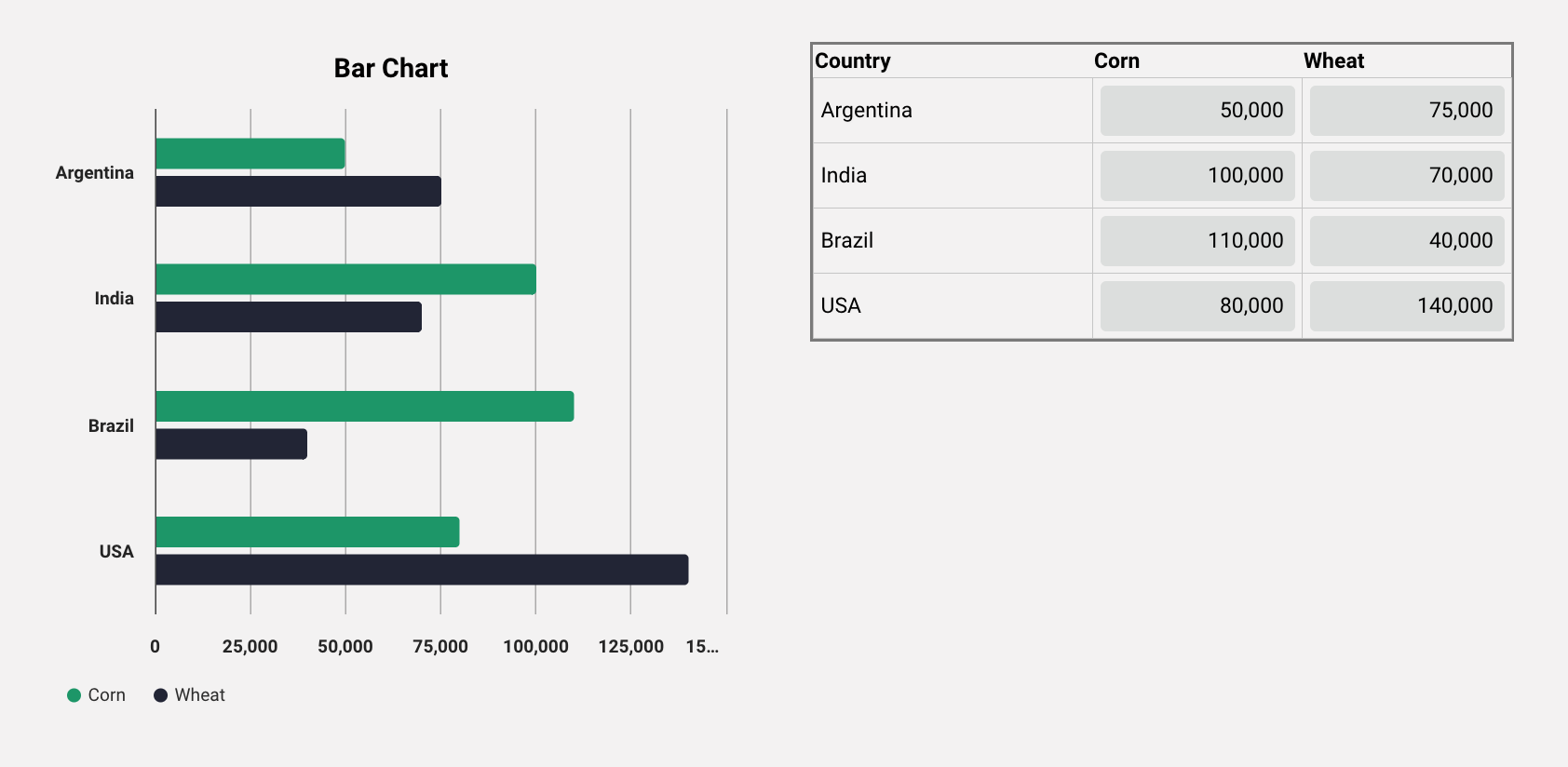
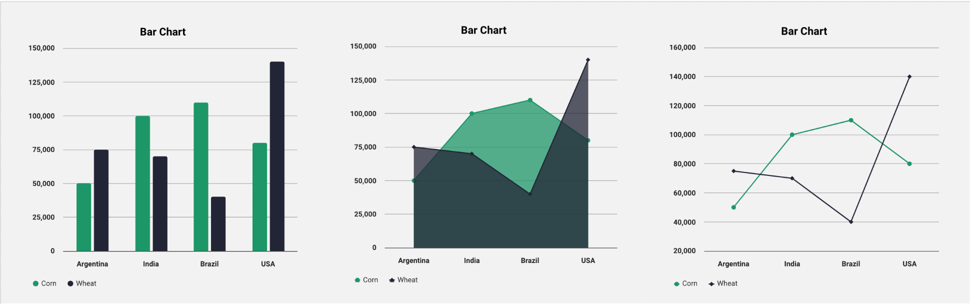
The second tab is the Categories tab. This is where you create the categories that each of the series are grouped by. For this example, let's recreate the example above showing Corn and Wheat production in Argentina, India, Brazil, and the USA. Once you get to the Categories tab, all you need to do is create a new category for each by selecting Add Category.
Series
Once you have created all your categories, next you will create your series and tie them to data on the Series tab. You can also include a label and change the color of the series here as well.
Continuing with the above example, you need to add a series for Corn and Wheat. Using the Add Series button at the top, you can create new series, and toggle between them using the dropdown to the left.
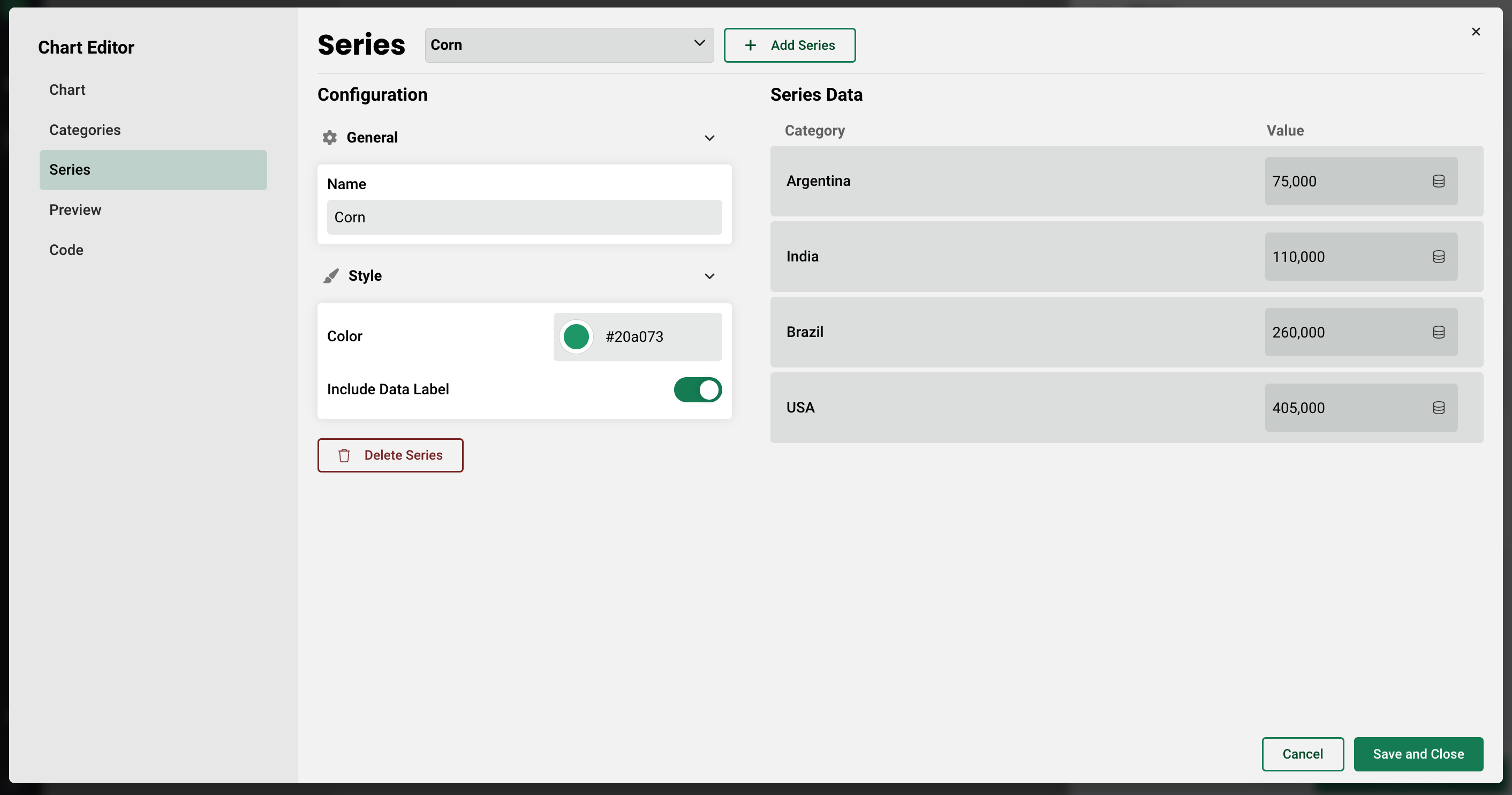
Once a series is added, the categories will populate on the right, with the ability to either manually enter a value, or tie the series to variables. If you decide to manually enter a value (shown above), then this value will be static and the series cannot be changed once it's placed on a page. If the series are tied to variables however, then any changes made to those variables will dynamically change the series data in real time on the chart.
Let's say you instead wanted to have editable inputs for each of the series in each category that when changed by a user, would affect what was displayed on the chart. Continuing with the example, you could create global variables for each series, per category, and add them into a table on the same page as the chart so a user could enter their own data.
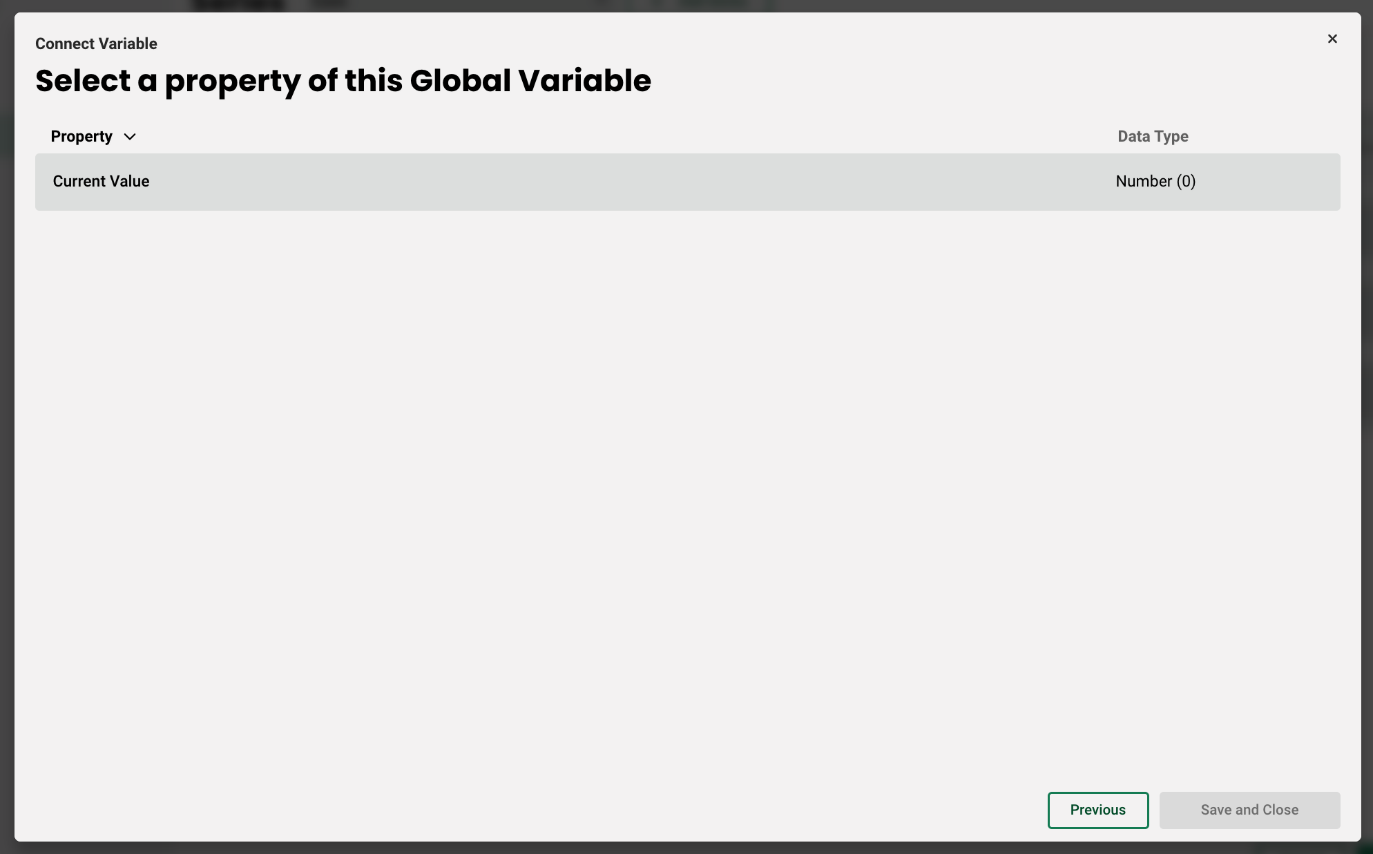
In order to tie the fields to data, click the small pancake icon to the right of the field, then select which variable you want to tie to the series. Remember, you will only see the data that matches the data type that is assigned to that series.
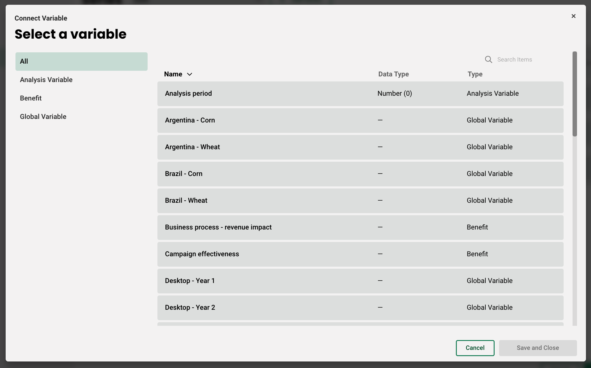
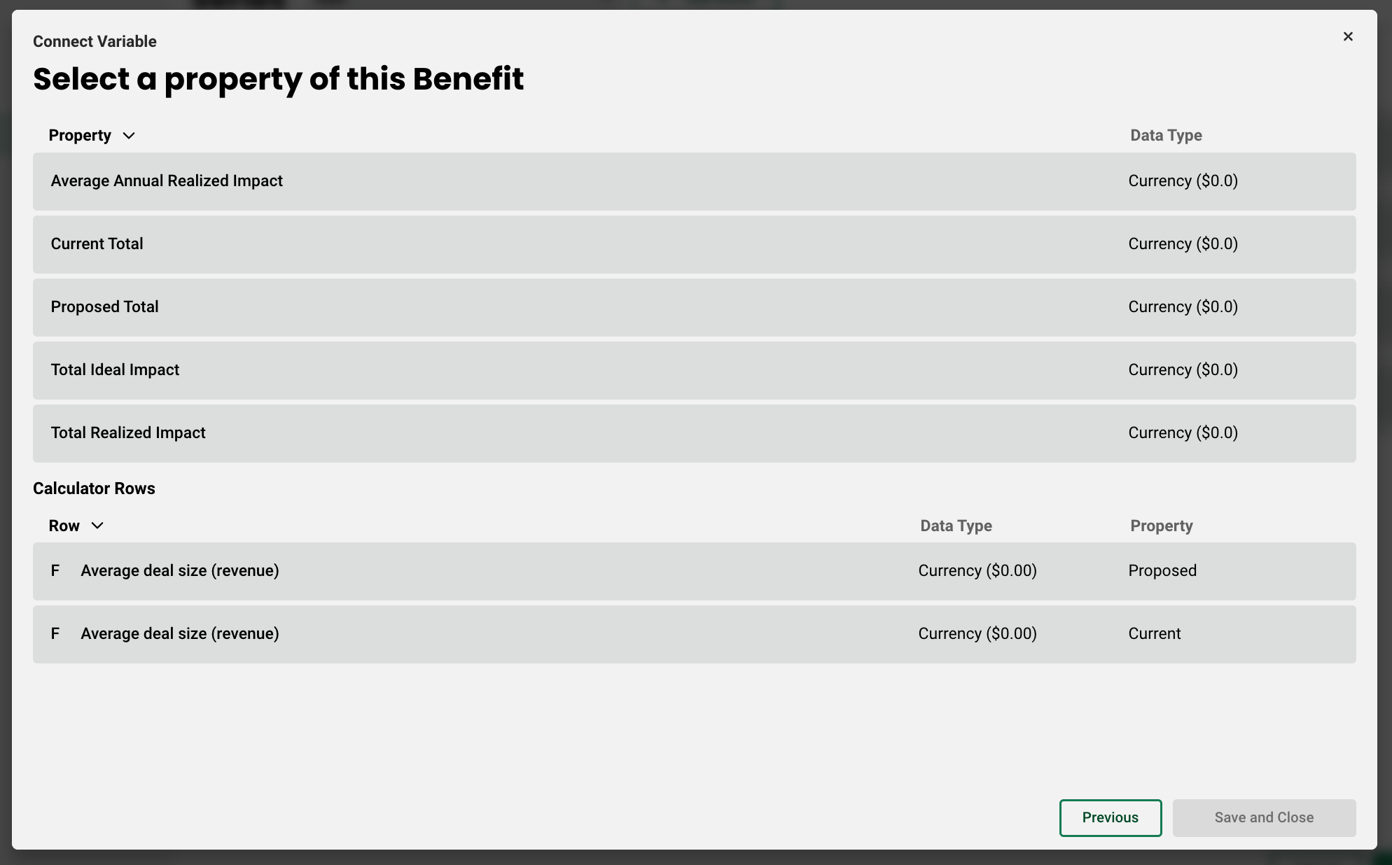
Once you select a variable, you will then be able to select the property you want to connect. In these cases where we are connecting global variables, there is only a single property - current value.
However, if you are working with currency for example, which is a common data type for benefit variables, it might look something like this:
Once you have connected all your variables, any changes made to those inputs will dynamically adjust the chart on the page. Here's an example:
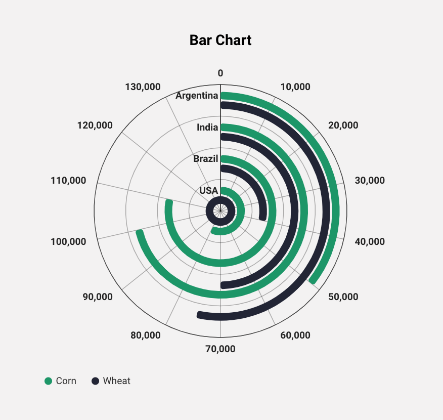
As mentioned above, several chart types can be made polar. Here is what the same chart looks like using polar coordinates:
Since the Bar, Column, Area, and Line charts all share the same properties, you can easily switch the type without without having to remake the chart. The only difference with a combination chart is that you can add two different visualizations in a single view. Here is what the same chart looks like in the other types:
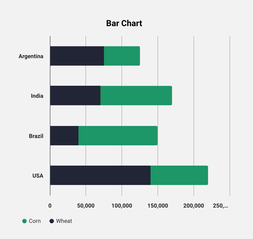
Lastly, say you wanted to add series stacking so that the total production of both corn and wheat for each country was in a single bar. First you need to create the group on the Chart tab, then on each series, add that series to the group you created using the dropdown at the bottom of the general section. Here's how the final chart would look:
Scatter Charts
When creating scatter charts, there are a few differences in the chart editor. First, instead of creating categories on their own tab, you have the ability to configure the x and y axis independently on the Chart tab, each containing the same options as the previous four chart types.
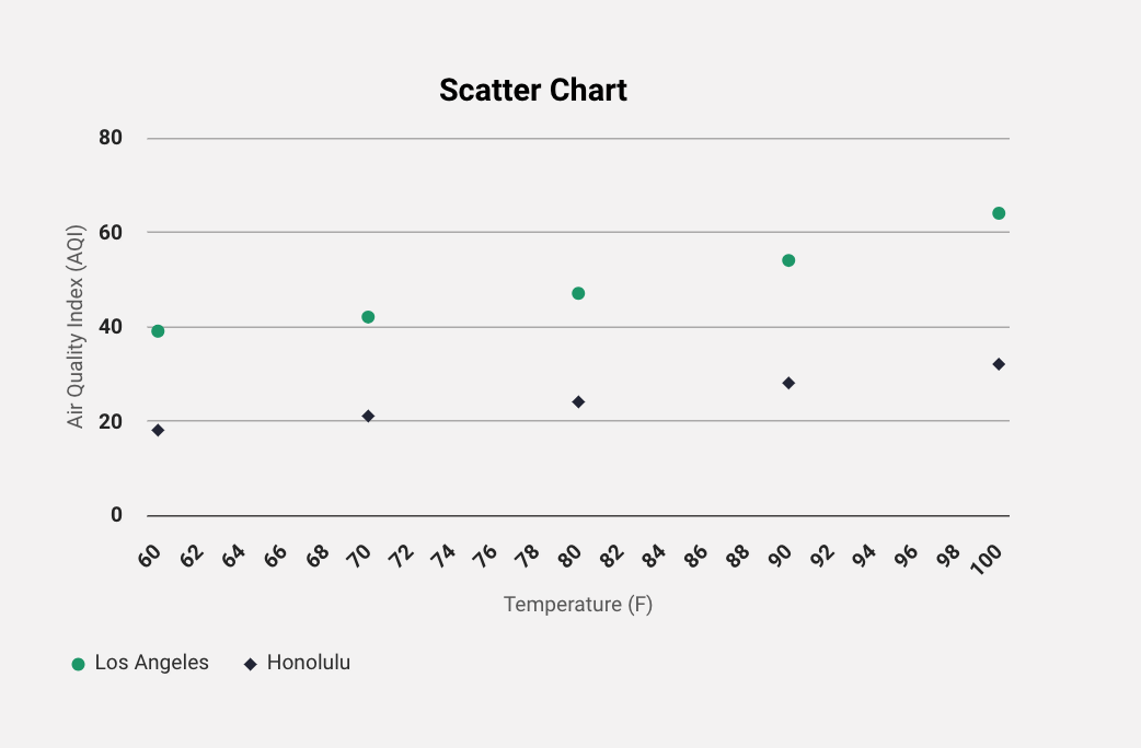
Let's create a chart that shows the correlation between temperature and air quality in the cities of Los Angeles, CA and Honolulu, HA. First, configure the x and y axis by adding your labels. We will add one for Temperature and one for Air Quality Index.
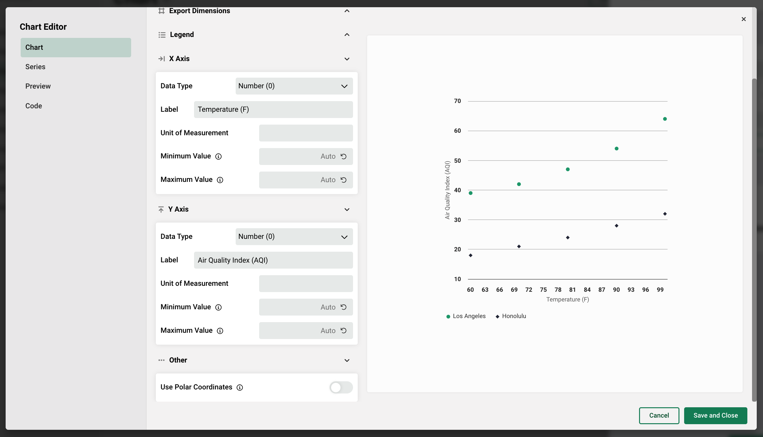
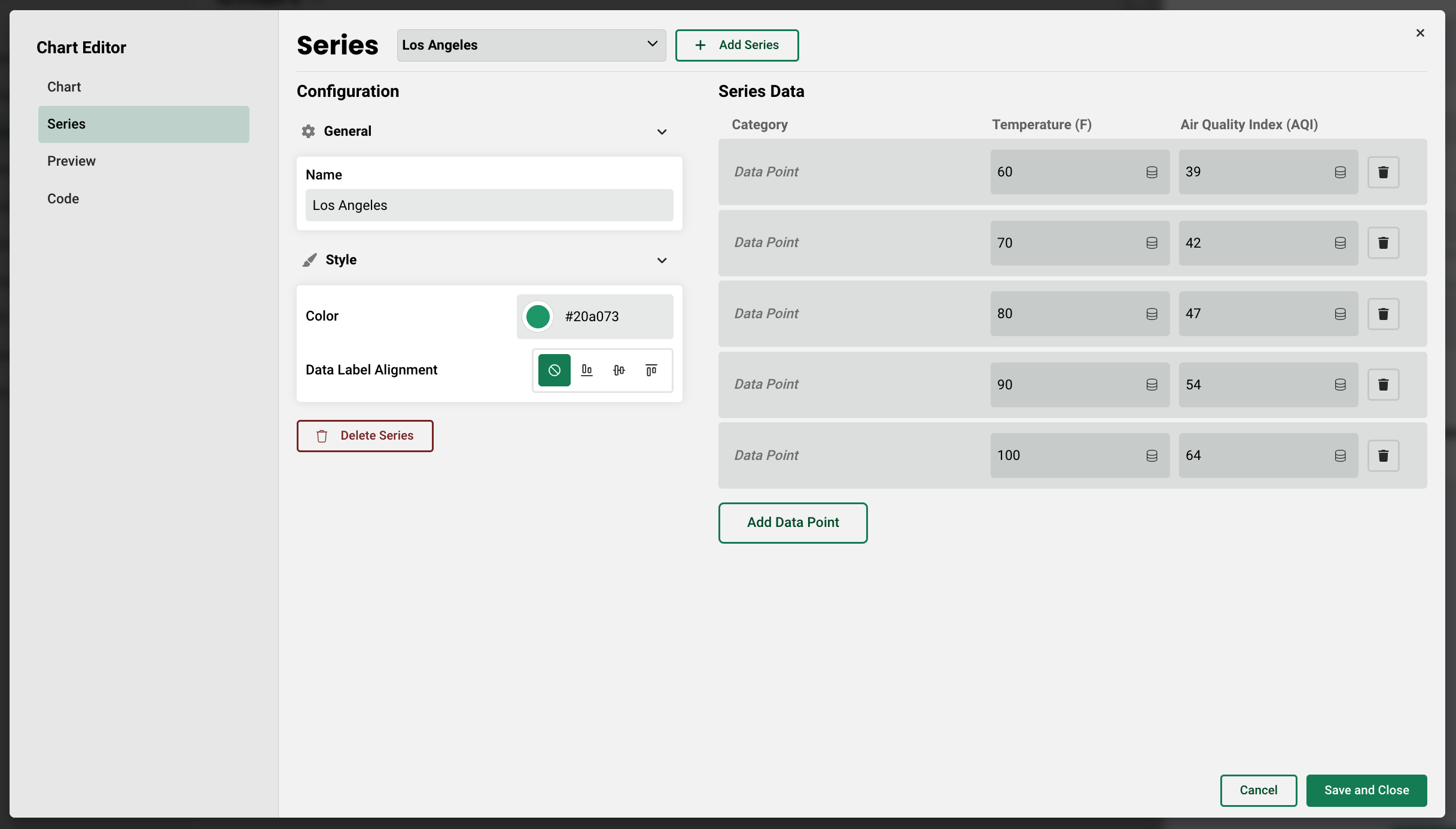
Next, on the Series tab, add your two series, one for Los Angeles and one for Honolulu, then add five data points that will each have a field for the Temperature and Air Quality Index.
Here's how the final chart looks:
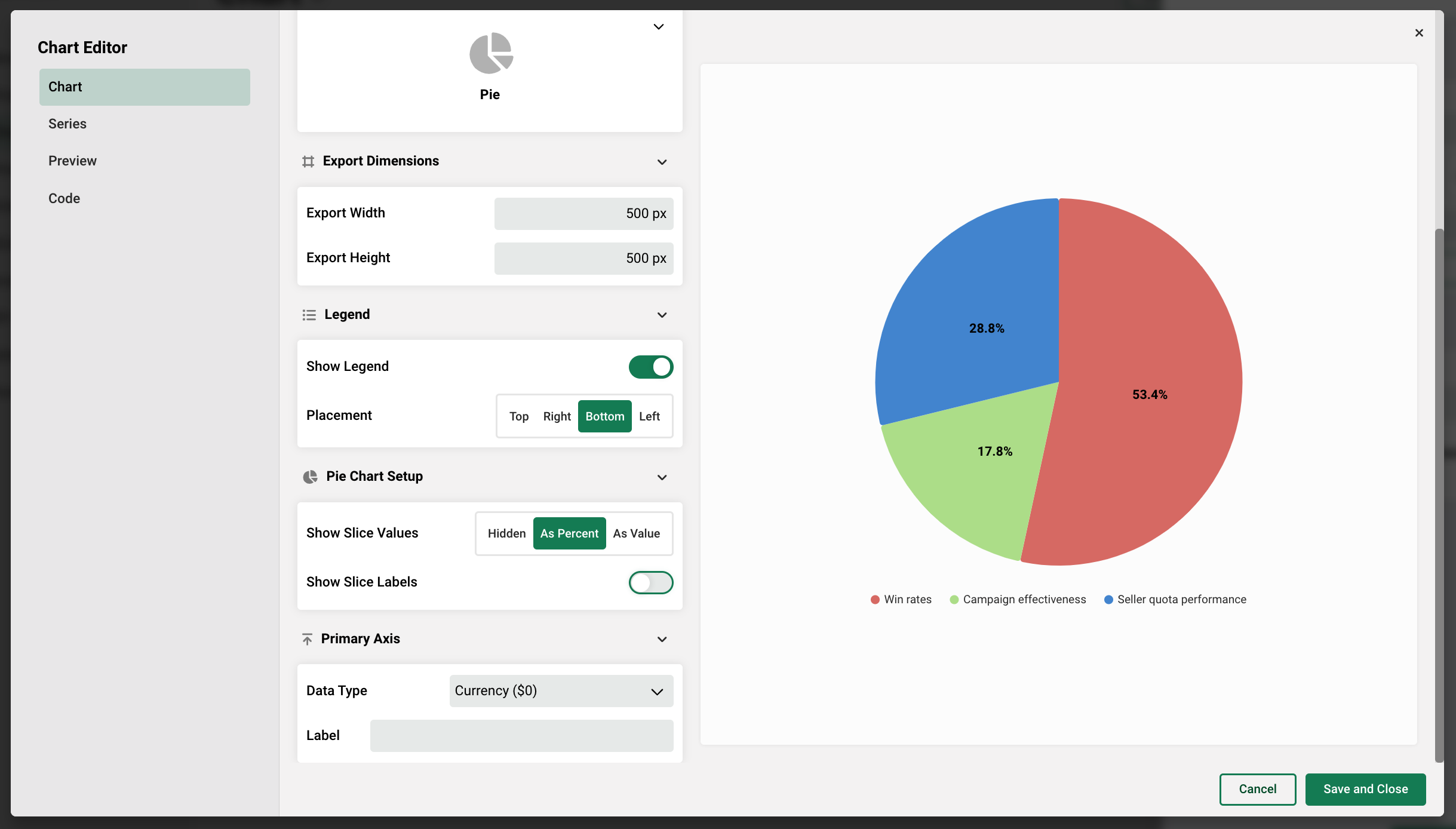
Pie Charts
Pie charts contain a single configurable axis on the Chart tab, and allow you to define how slices are displayed - hidden, as a percent, or as an absolute value.
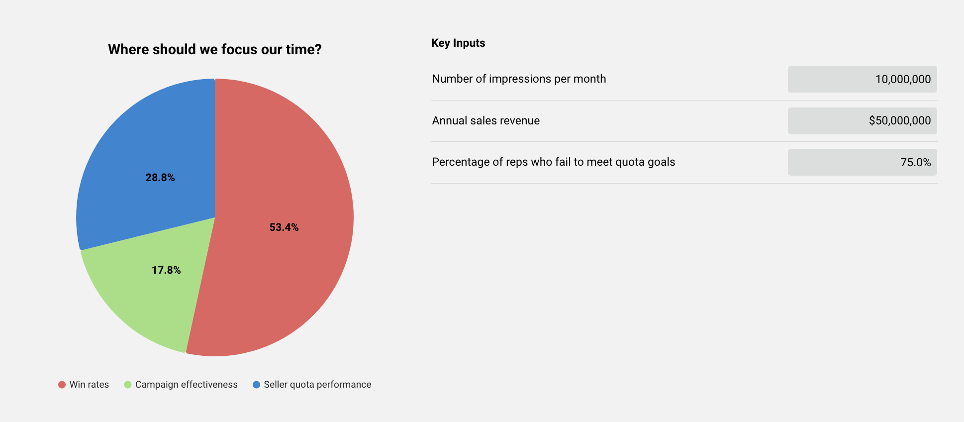
Let's say an author wants to create a chart that shows the monetary impact across three separate benefits in order to identify the benefit with the most value for the business. First, let's display each slice as a percent, show the labels, and choose currency as our data type.
Next, let's create and name our series, one for each Benefit we want to compare.
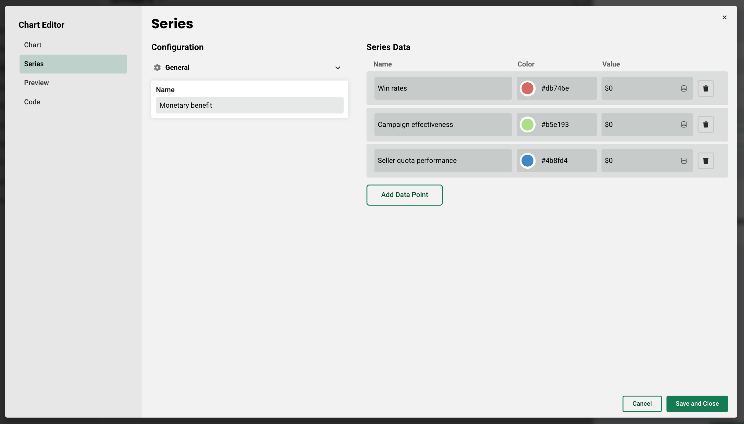
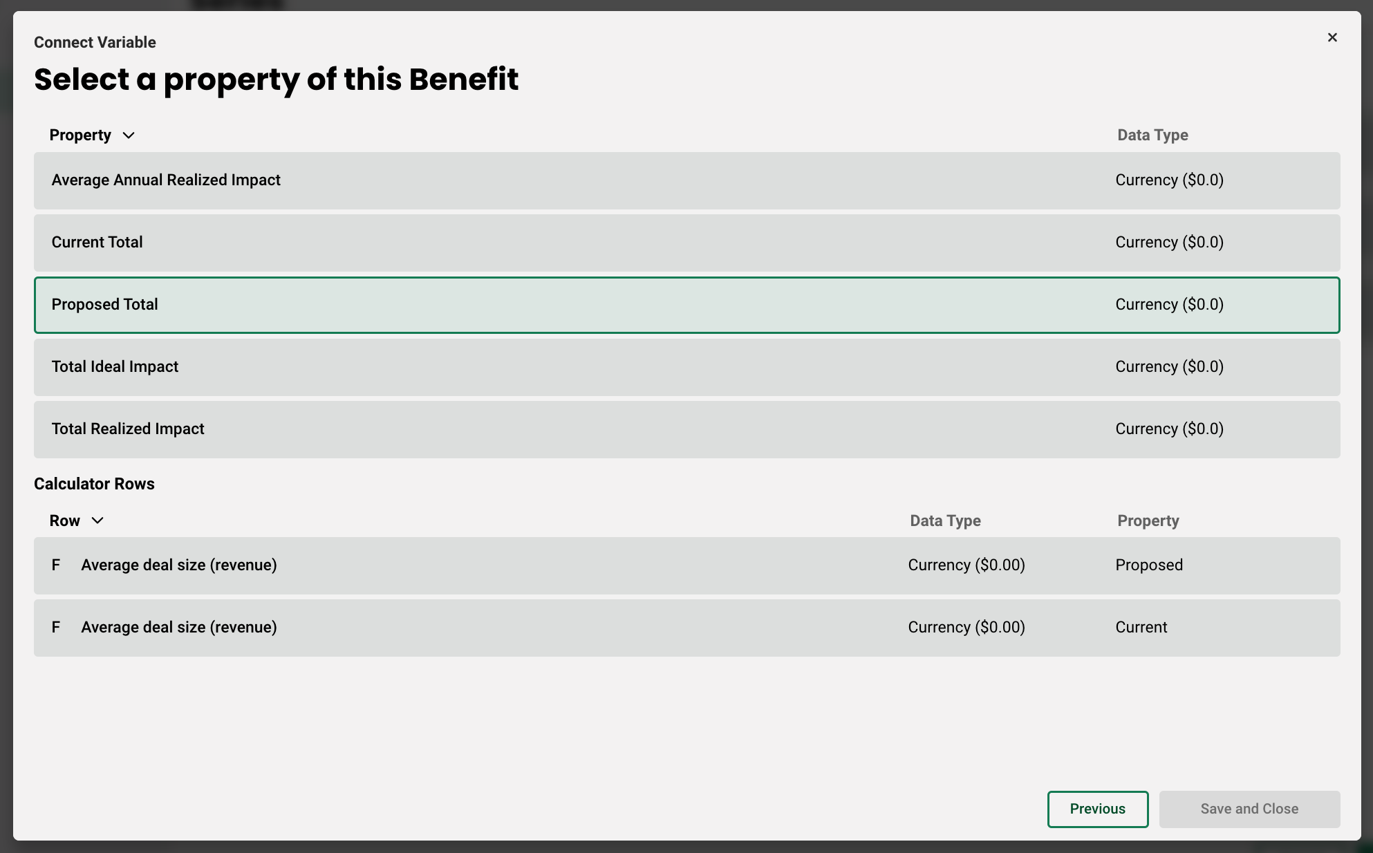
Then, using the pancake icon, we can select each Benefit, and then the property we wish to tie to the series. For this example, we will select Proposed Value for each so it's consistent.
Lastly, let's add some inputs that are directly tied to how the benefits are calculated to a table with the chart. In this case, we are comparing the benefits Win Rates, Campaign Effectiveness, and Seller Quota Performance. The global variables Annual sales revenue, Number of impressions per month, and Percentage of reps who fail to meet quota goals, are each incorporated into the benefit calculations, respectively.
In a real life scenario, as a rep captures customer data during a call, the chart changes to reflect the highest value business drivers for their organization.
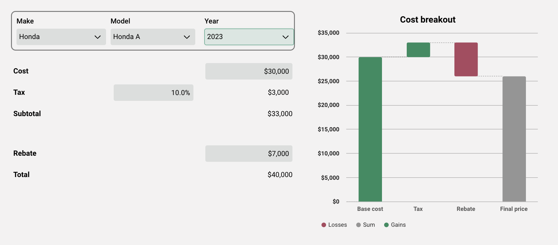
Waterfall Charts
The last chart type is the waterfall. This chart differs from the rest in that each series can have either a positive, negative, or sum designation. Let's say you want to create a chart that shows total price of a car purchase after tax and rebates are factored in. In the following example, a data table has been created which stores information for a number of car models.
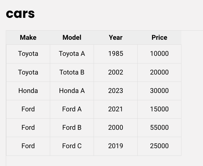
The data table is then connected to global variables, which are tied to the waterfall chart series data (see article Driving Inputs Using Data Tables for more information on how to set this up). Here's what the configuration looks like:
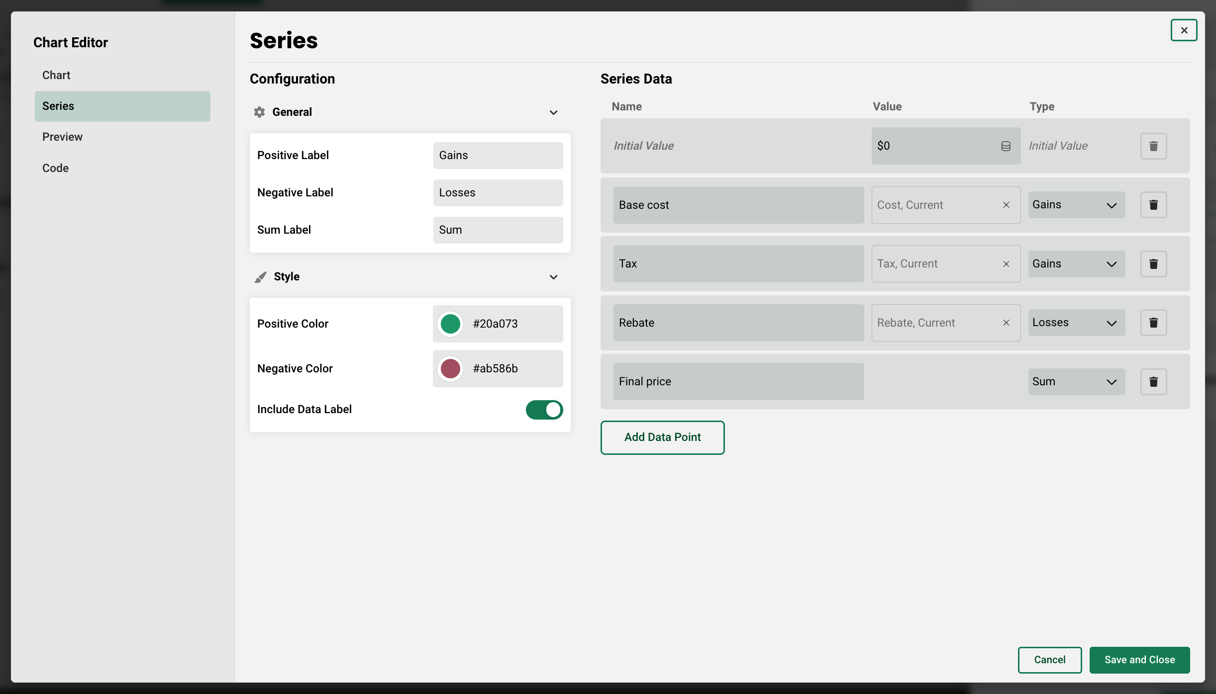
As you can see, variables that result in a positive change to the cumulative total are marked as "gains," and variables that result in a negative change to the cumulative total are marked as "losses." Here's how the chart along with the corresponding variables could be set up on a page:
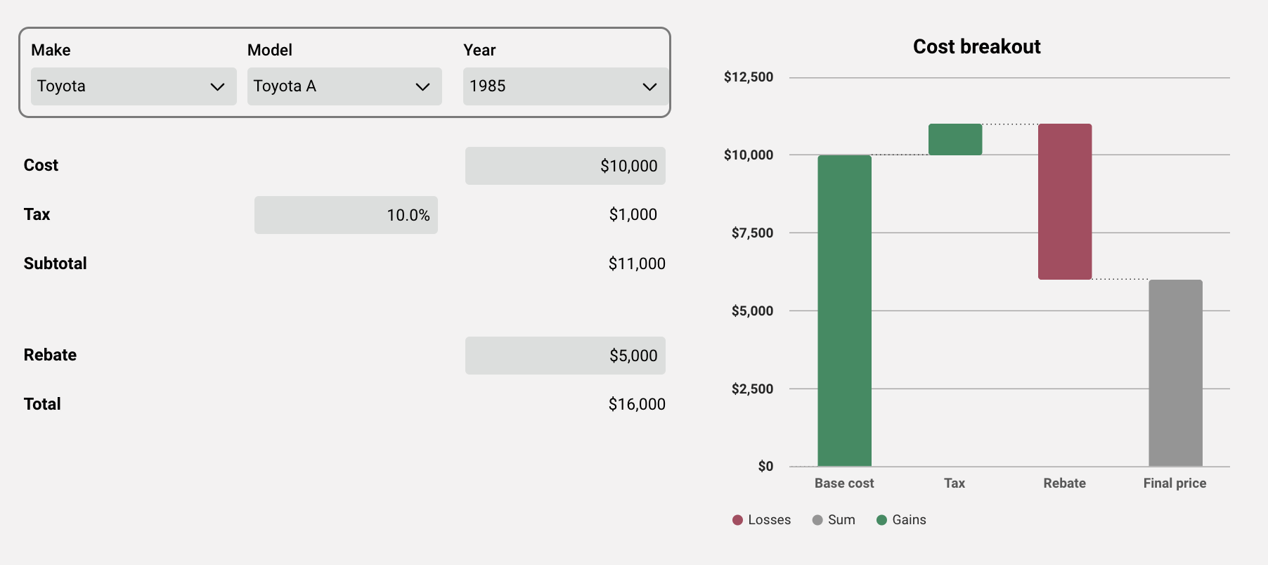
If we were to choose a different vehicle model and increase the rebate amount, the chart adjusts based on the new input.
Non-editable Charts
In addition to customizable charts, there are also a number of default charts throughout the application. Each of these can be pulled into your output report using report tags. Please see the report tag library articles for guidance. These include:
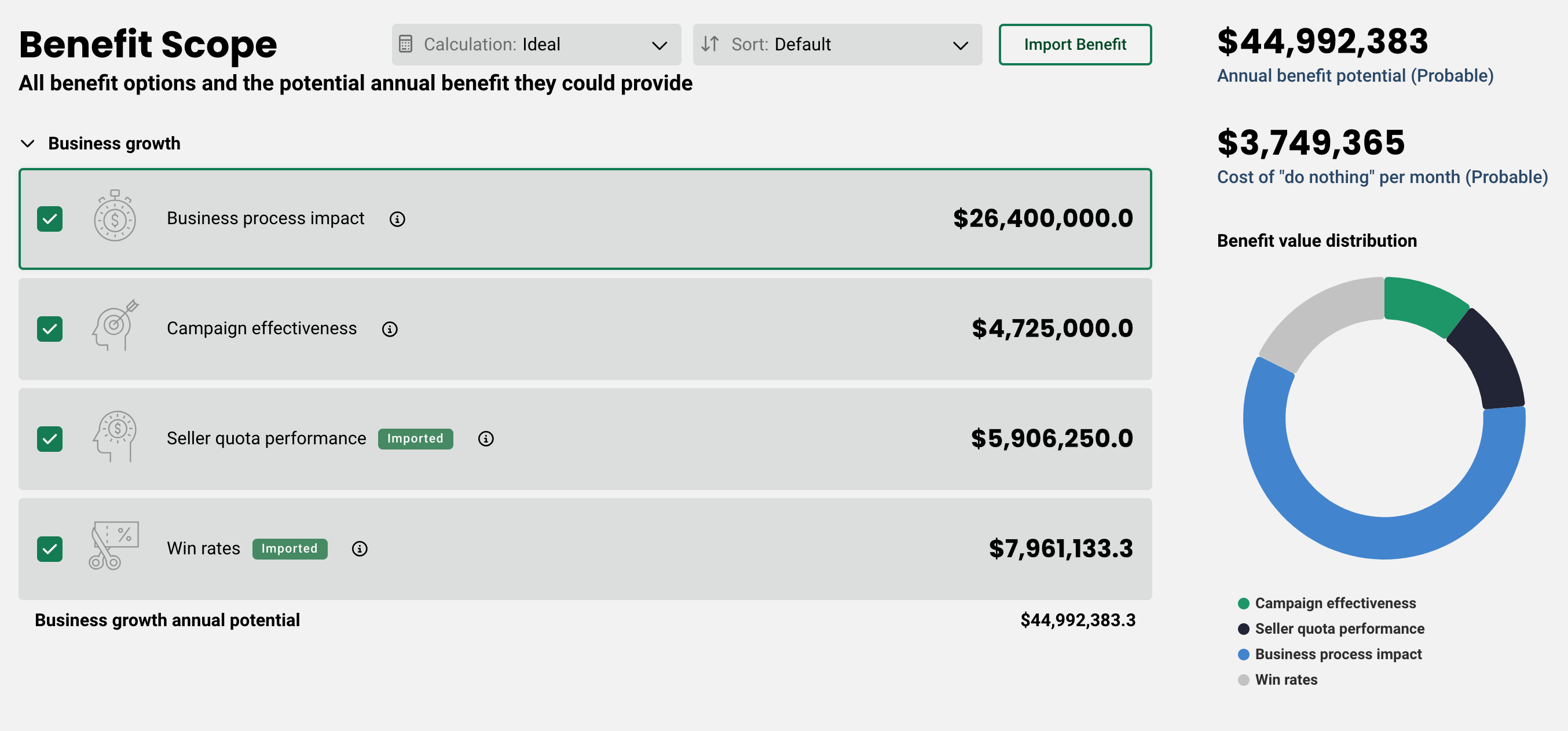
- Benefit value distribution chart - this is located on the pre-built Benefit Scope page and shows the distribution of value of each of the benefits on a donut chart.
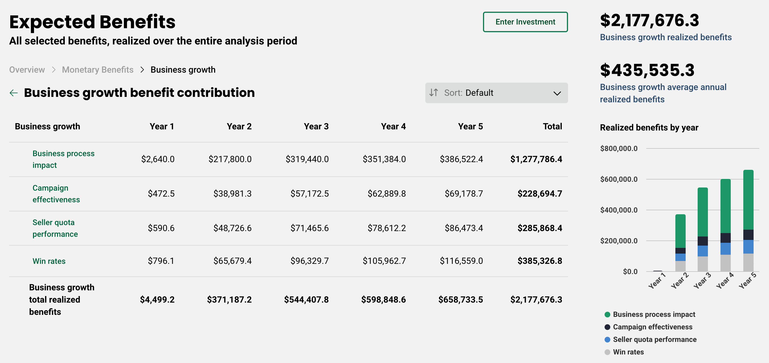
- Realized benefits by year chart - this is located on the pre-built Expected Benefits page and shows the realized value for each benefit stacked per year on a column chart.
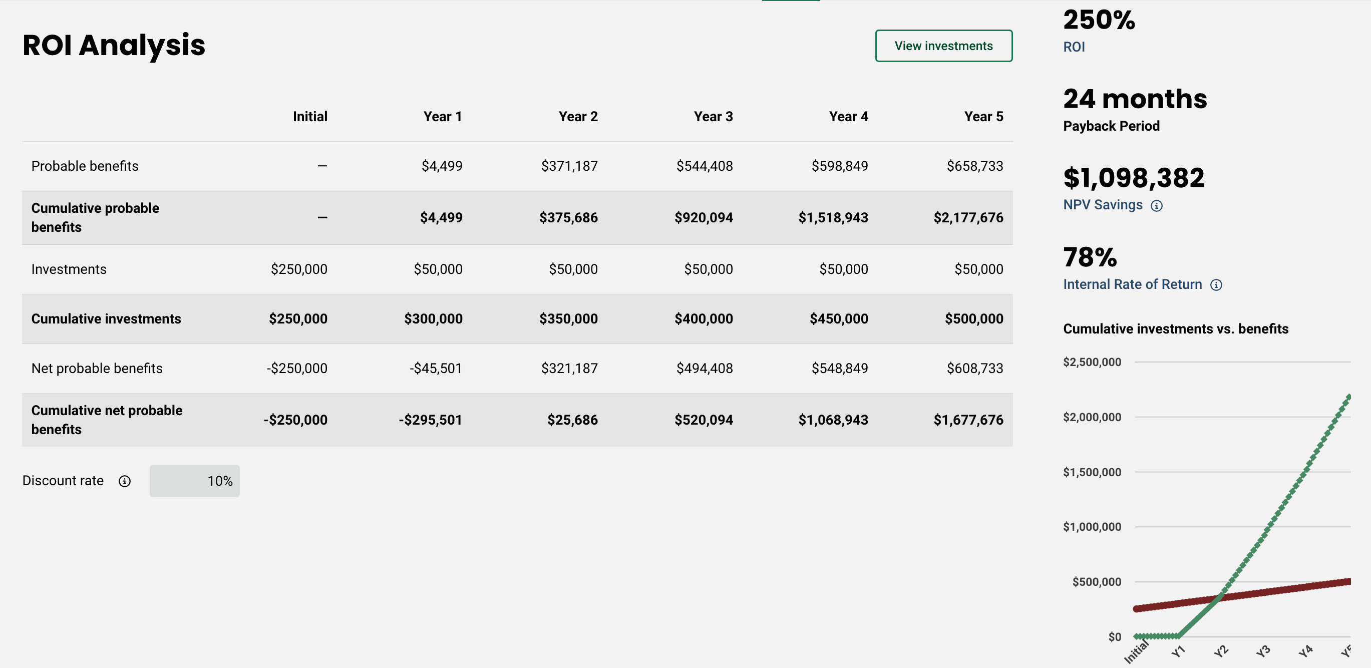
- Cumulative investments vs. benefits chart - this is located on the pre-built ROI page and shows investment over benefits over time on a line chart.
Replies have been locked on this page!