
This article cover Images and their use cases. Images can be added to a page, or added as the background of a section. This is a great way to tailor your tool to your audience or match your organizations branding requirements.
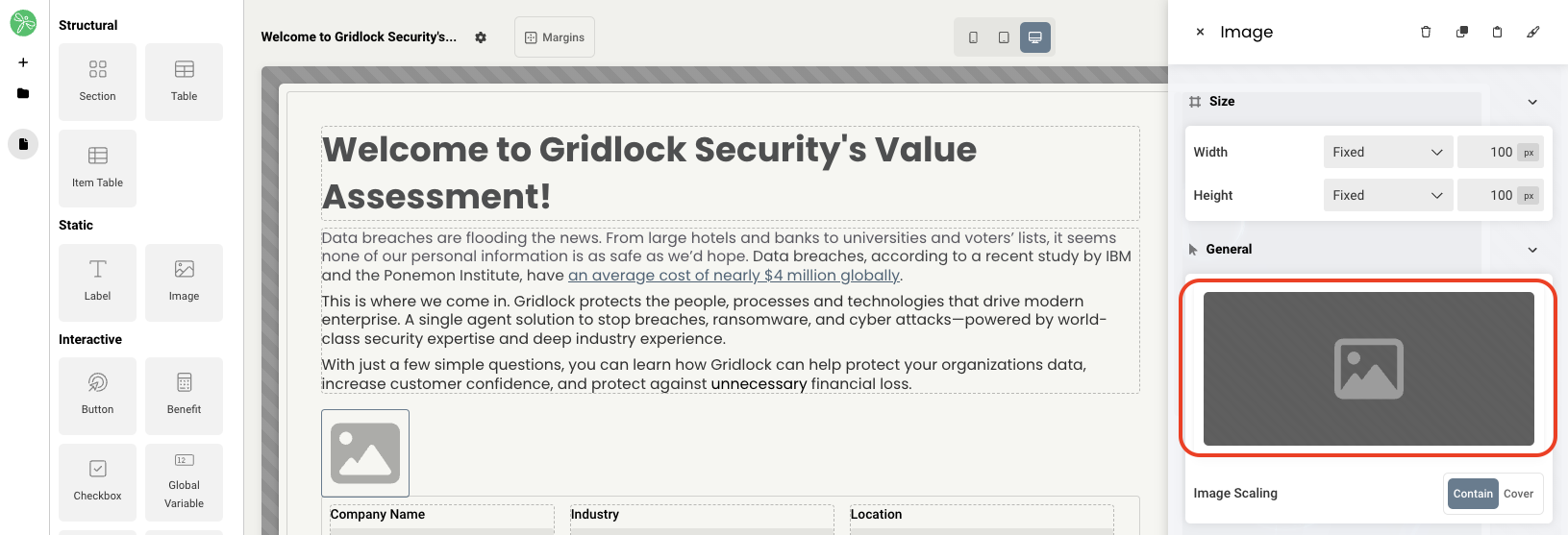
If you plan to add the image as an Interactive element to a page, select the grey box in the General section of the Image editor side panel, then select Choose an Image.
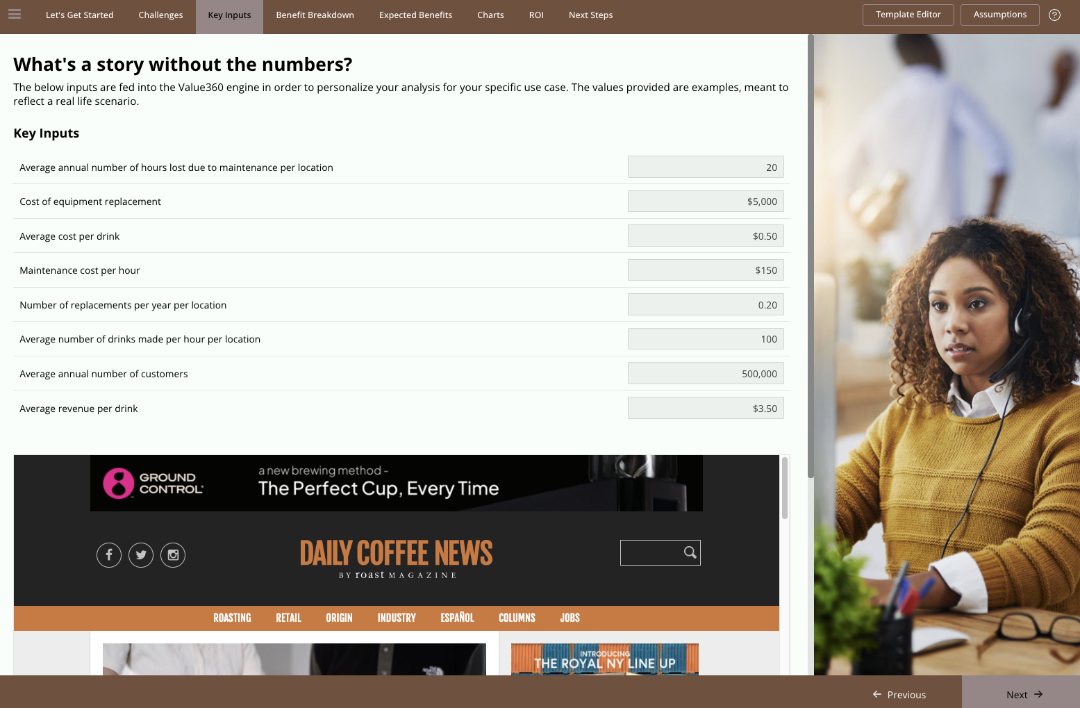
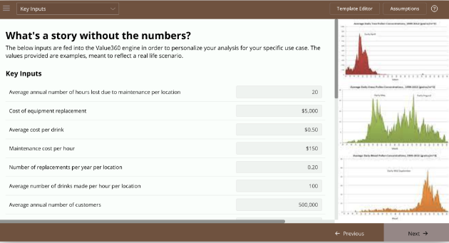
You will be brought to a file explorer that allows you to choose an image to tie to that element. Here's an example of before and after replacing the stock photo:
If you plan to add the image as the background of a section on a page, navigate to the section, then in the Background section of the editor side panel, change Background Style to Image, click the grey box, then select Choose an Image.
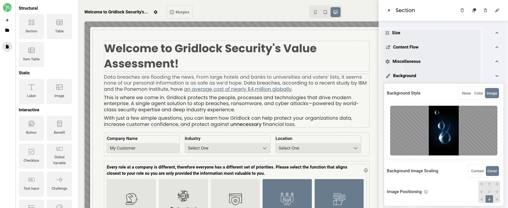
Once the image is added, you have the option to adjust it's position in the section using the arrows in cases where portions of the image is clipped.
When editing an image, you will have access to the following properties:
- Size
- Grid - sets the size of the element based on the number of columns you want it to span across the page. A standard page is made up of 12 columns. So for example, two equal elements placed on a page would each span 6 columns.
- Fixed - set the exact size of the element using pixels or a percentage
- Fit content - makes it so the element expands to fit the content that it contains
- Fill space/available - expands the element to the size of the section it is contained within
- Select image - use the file explorer to select an image to add
- Image scaling - set to contain or cover
- Margins - space elements out on a page by adjusting the px size of margins. Margins define the bounds outside of an element (pushes content away from it).
- Borders - add a border and define the weight of the border for any element. You may also link the border to a theme and add corner rounding if necessary.
- Drop shadow - add a drop shadow to an element to give a 3D shadow effect. You have the ability to adjust horizontal offset (px), vertical offset (px), blur amount (px), and the color.
- Conditional Visibility - define what devices each element will be visible on. For example, you may want to hide certain large elements on a mobile device because they take up too much space, or are not as relevant.
Replies have been locked on this page!