
This article covers Checkboxes and their use cases. Checkboxes provide a generic capability that allows solve for a number of use cases. Some examples are products, personas, or business initiatives. Checkboxes can be accessed via the Items library.
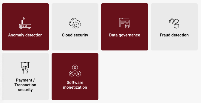
For example, if we have a tile representing a company product:
- When a challenge is marked as High or Top, it could automatically check a Checkbox
- When that Checkbox is checked, it could automatically enable a Benefit
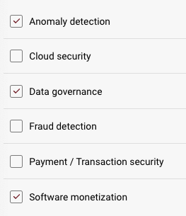
Here's how checkboxes appear on a page in both tile form and checkmark form.
When editing a checkbox, you will have access to the following properties:
Design properties:
-
Size
- Grid - sets the size of the element based on the number of columns you want it to span across the page. A standard page is made up of 12 columns. So for example, two equal elements placed on a page would each span 6 columns.
- Fixed - set the exact size of the element using pixels or a percentage
- Fit content - makes it so the element expands to fit the content that it contains
- Fill space/available - expands the element to the size of the section it is contained within
- General - show or hide the label of the element on the page
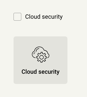
- Display style - display the checkbox as a tile that can be clicked, or a checkbox that can be checked
- Background style - set the background of the element to be a color
- Margins - space elements out on a page by adjusting the px size of margins. Margins define the bounds outside of an element (pushes content away from it).
- Conditional Visibility - define what devices each element will be visible on. For example, you may want to hide certain large elements on a mobile device because they take up too much space, or are not as relevant.
Item properties:
- Label - give the item a name
- Visibility - set the item to visible or hidden
- Default state - set whether or not the checkbox is checked or unchecked by default
- Mnemonic - give the item a mnemonic that can be used in rules and for report tags
- Salesforce label - provide a label that can be used to tie the value to a field in Salesforce (this value will be inherited by the CRM once an Analysis is created from the CRM)
- Other - add an icon
- Tooltip text - enter a tooltip that will be available by hovering your cursor over it
- Used by - shows you what rules use the element, and what pages it exists on
There are a couple of items that have unique ways to be displayed. These include:
- Checkboxes - can be displayed as either a Checkmark or a Tile
Replies have been locked on this page!