
This article covers Selects and their use cases. The Select is an element that allows a user to select one or more options from a list. Authors can then define whether the options are displayed as a list, a dropdown, a button (similar to a checkbox displayed as a tile), or a button group. Selects can be created as single select or multi select.
After configuring the general properties of your Select item, you can create options for a user to choose from and assign a value to each (we recommend going in numerical order from top to bottom as this is what's used for reporting)
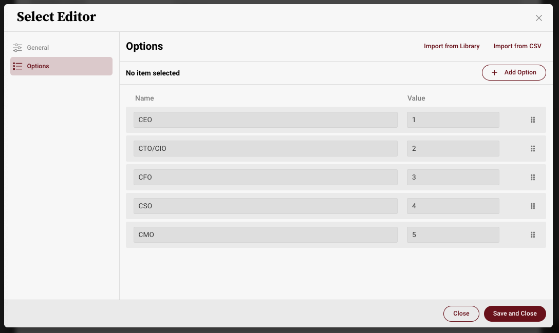
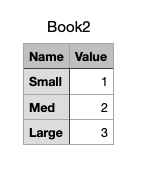
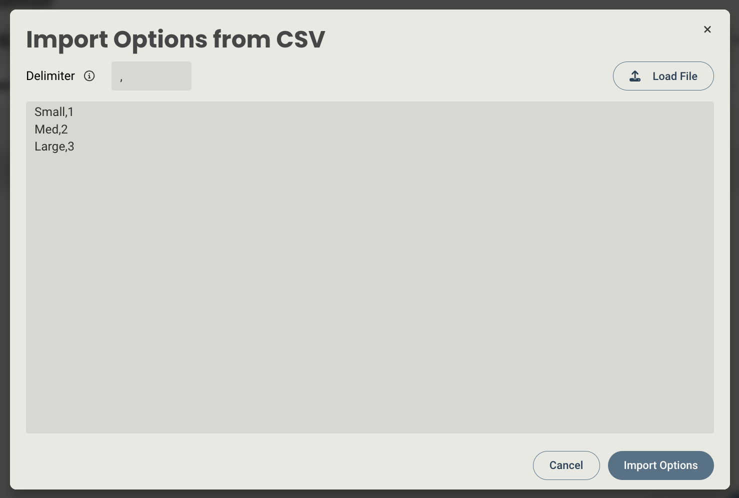
You also have the ability to select one of the default dropdowns from the library (Industry and Location) or add your own list via text input or a CSV with an existing list of options. The CSV must be formatted in two columns, one for the label, and one for the number. Here's an example:
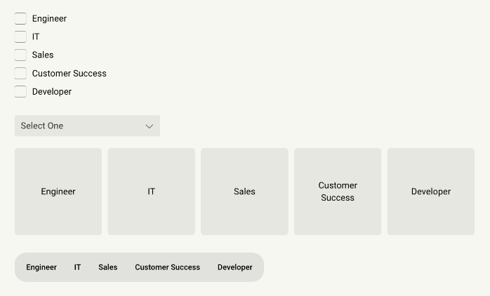
After creating your new Select item, this are how they will appear on the screen in the various display formats (based on the order above). Note - display properties are controlled by editing the item on a page.
When editing a Select, you will have access to the following properties:
Design properties
- Size
- Grid - sets the size of the element based on the number of columns you want it to span across the page. A standard page is made up of 12 columns. So for example, two equal elements placed on a page would each span 6 columns.
- Fixed - set the exact size of the element using pixels or a percentage
- Fit content - makes it so the element expands to fit the content that it contains
- Fill space/available - expands the element to the size of the section it is contained within
- General - show or hide the element on the page
- Style - display the Select as a list, dropdown, button, or button group.
- Background color - lets you set the background of the element to be a color
- Margins - allows you to space elements out on a page by adjusting the px size of margins. Margins define the bounds outside of an element (pushes content away from it).
- Conditional Visibility - allows you to define what devices each element will be visible on. For example, you may want to hide certain large elements on a mobile device because they take up too much space, or are not as relevant.
Item properties
- Label - give the item a name
- Visibility - set the item to visible or hidden
- Enabled - set the item to Editable or Read-only
- Mnemonic - give the item a mnemonic that can be used in rules and for report tags
- Salesforce label - provide a label that can be used to tie the value to a field in Salesforce (this value will be inherited by the CRM once an Analysis is created from the CRM)
- Type - set the select as single select or multi select
- Source - set whether the select will be created via manual entry using the select item editor, or connected to a data table.
- Tooltip text - allows you to enter a tooltip that will be available by hovering your cursor over it
Replies have been locked on this page!