
This article covers Challenges and their use cases. Challenges are inputs that allow a user to set a priority of a particular initiative or business area. This is important for prioritizing or ranking what's most important for the customer and capturing information that can be used in future conversations.
Each of these priority selections can be attached to elements downstream using rules in order to perform actions like turning on a Benefit associated with that particular challenge, or hiding a set of variables that are no longer relevant when a user selects a certain priority level.
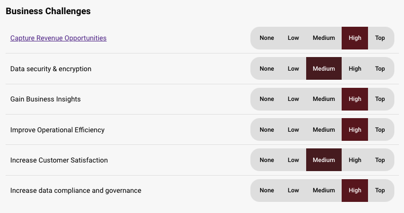
Current available selections for Challenges are:
- None
- Low
- Medium
- High
- Top
Here is how challenges appear on a page:
When editing a challenge, you will have access to the following properties:
Design properties
- Size
- Grid - sets the size of the element based on the number of columns you want it to span across the page. A standard page is made up of 12 columns. So for example, two equal elements placed on a page would each span 6 columns.
- Fixed - set the exact size of the element using pixels or a percentage
- Fit content - makes it so the element expands to fit the content that it contains
- Fill space/available - expands the element to the size of the section it is contained within
- General - allows you to show or hide the label on the page
- or a checkbox
- Margins - allows you to space elements out on a page by adjusting the px size of margins. Margins define the bounds outside of an element (pushes content away from it).
- Conditional Visibility - allows you to define what devices each element will be visible on. For example, you may want to hide certain large elements on a mobile device because they take up too much space, or are not as relevant.
Item properties
- Label - give the item a name
- Visibility - set the item to visible, hidden, or when applicable. If when applicable is chosen, it will only be visible when it's being used by Benefits that are set to Included.
- Default value - set the item to No selection, None, Low, Med, High, or Top
- Mnemonic - give the checkbox a mnemonic that can be used in rules and for report tags
- Salesforce label - provide a label that can be used to tie the value to a field in Salesforce (this value will be inherited by the CRM once an Analysis is created from the CRM)
- Tooltip text - allows you to enter a tooltip that will be available by hovering your cursor over it
Replies have been locked on this page!