
Inflow / Outflow Net Value Reports is a report that helps you track the delta between two different cohorts, visualizing the net change over time for two components (positive change and negative change). Effectively, this report will give you an “over time” view of the waterfall graph, split into positive and negative components.
Jump to:
Creating an Inflow/Outflow Report
Common Use Cases
Inflow / Outflow Net Change reports allow you to track any entry & exit (or input / output) process, like pipeline creation vs closed pipeline and the change in amount over time. Some common inflow/outflow net change reports include:
-
Ticket/Case Creation vs. Ticket/Case Resolution: Track internal ticketing processes in Jira or Zendesk, etc. or even track cases for your own internal processes.
-
POC Start vs. POC End: Discover if you're having more opportunities or more opportunity value in a POC process than you were before.
-
Pipeline Creation vs. Closed Lost: Track how much of your created pipeline is closing, then use that data to improve the instances that didn't close and learn from and repeat those that did to help you WIN. MORE. BUSINESS.
-
ARR: Answer questions like, How much new business did I book over time? How much in renewals did I book over time? How much did I lose due to churn over time?
Creating an Inflow / Outflow Report
If you're new to creating reports, start with this article on creating reports, then when you get to the visualization section, come back to this article to for the inflow/outflow configuration. If you're already a report pro...crack on.
Visualization
Visualization Type
Select Inflow/Outflow as your visualization type. You can also choose the report's default type to be the bar chart you see above or a table chart.
Card Summary
As with any card, you can add a custom card summary with hyperlinks and data variables.
Change Range
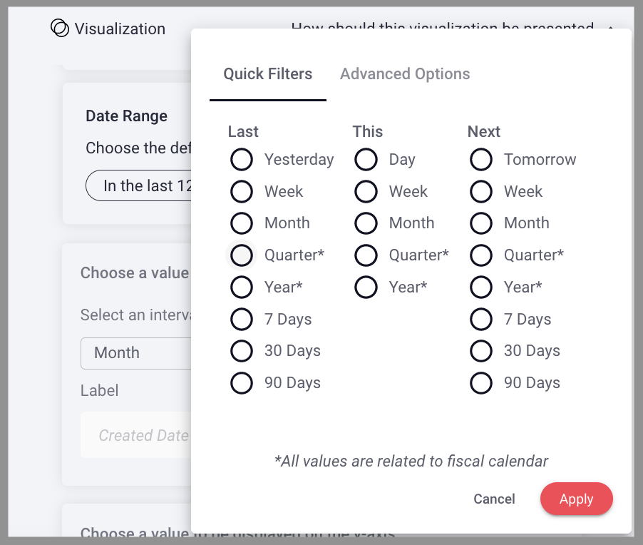
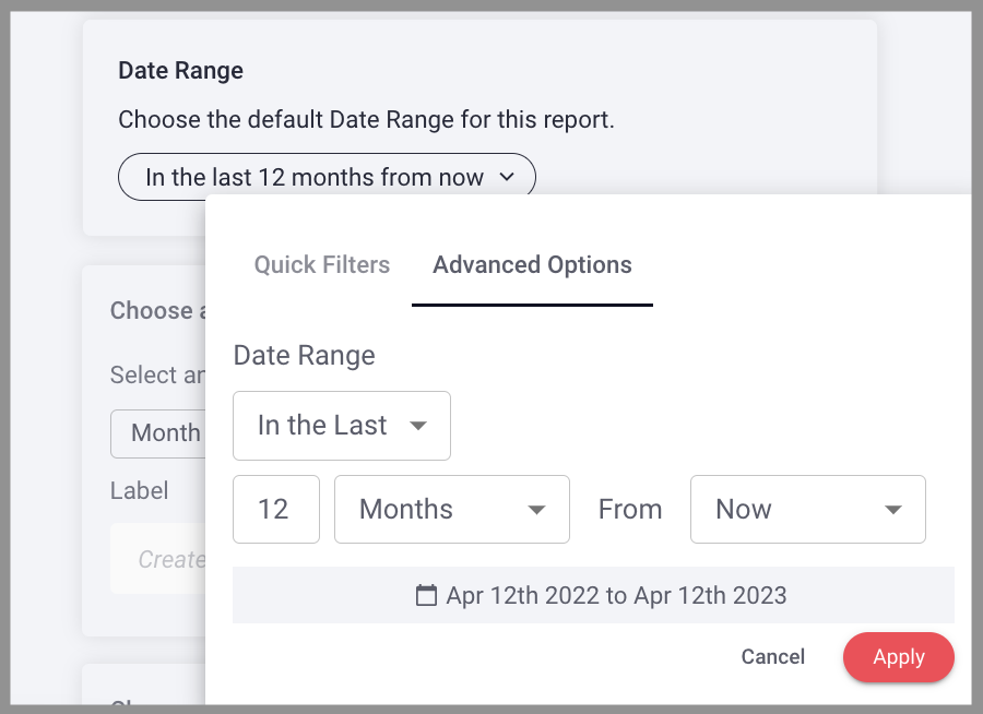
Choose the default change range to establish the time frame in which changes occurred. Think of this as the time period in which the selected value was input or output, entered or exited. You can select a Quick Filter or Advanced Options.
Quick Filter: Select from the prescribed list ranges & date types. All values are related to fiscal calendar.
Advanced Options: Specify the exact date range you want to configured.
Choose a value to be displayed on the x-axis
Select the time interval by which you want to track inflow/outflow. You can also elect to add a label for the x-axis.
Choose a value to be displayed on the y-axis
Select the aggregate metric from the dropdown menu to establish what calculation should occur.
Next, select an aggregate value, or the value you want calculated by the above selected metric.
You can also elect to create a label for the y-axis.
Choose a value for Inflow (positive)
Select a date property and filter to establish which inflow data will be graphed, these are the positive values on the graph.
Choose a value for Outflow (negative)
Select a date property and filter to establish which outflow data will be graphed, these are the negative values on the graph.
Net Value Change Line Overlay
You can toggle the net overlay for "Net Value Change" on to add a line overlay on the graph that tracking net value change for the data and metrics selected above.
Net Value compares any two cohorts to track if things are increasing or decreasing.
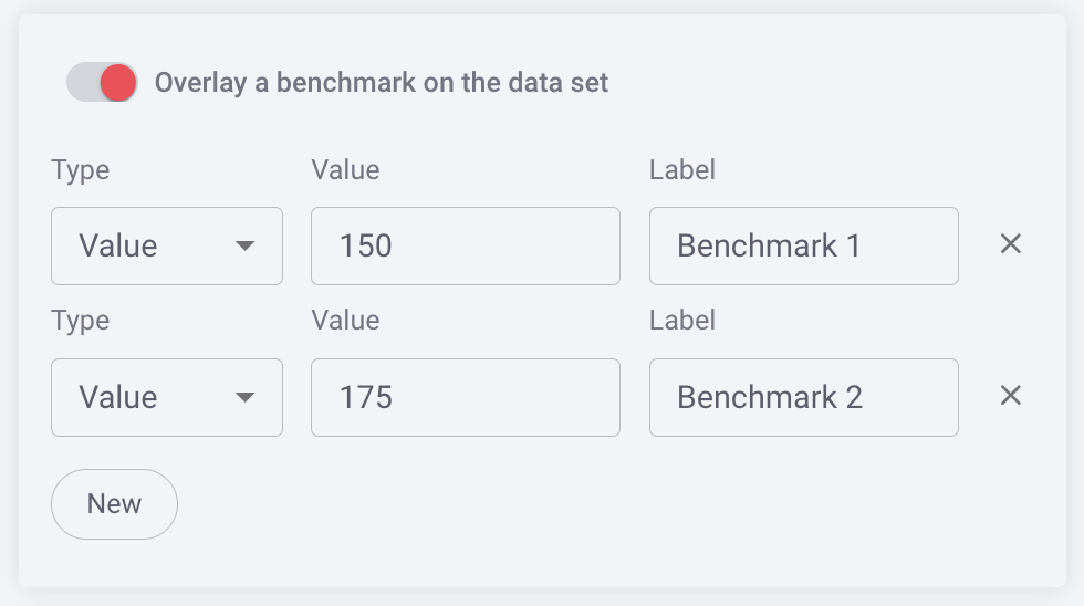
Benchmark
You can benchmark performance against a metric or a target when it doesn't make sense to use goals or the reference is a moving target, eg. a team average. Reference lines give analytics more context, and can help identify "good" and "bad" results by comparison.
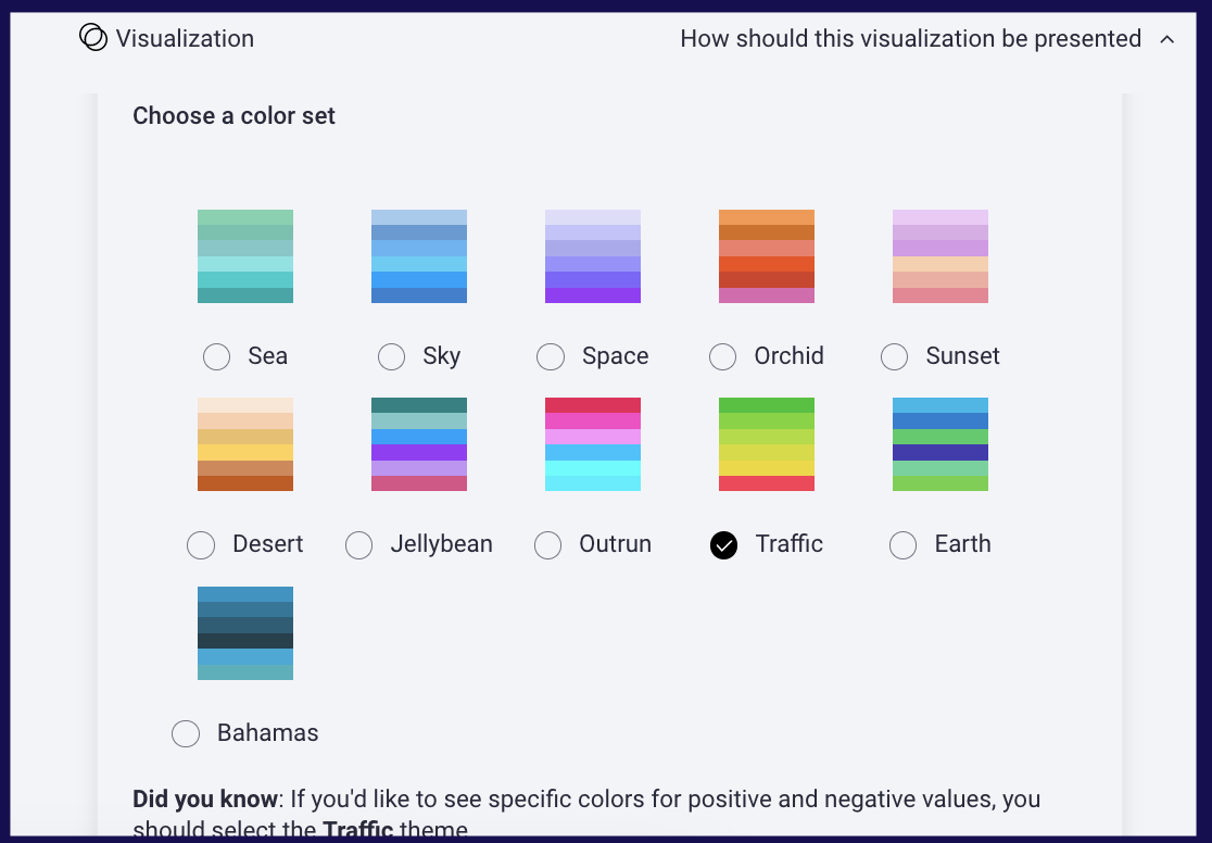
Color Set
Choose from the offered color sets the color scheme you want to be reflected in your bar chart. Split Data will also reflect this color scheme. Color legends and details information appear when you hover over any data in the bar.
Pro tip: Using the Traffic theme creates variations of green for positive values and variations of red for negative values to easily visualize inflow vs. outflow at a glance.
Replies have been locked on this page!