
Intelligence Reports consider data first and visualization second. That means you can establish the data you want to see and then decide which visual(s) represent it best. Since data come first, start with Creating & Editing Reports, then come back to this article to set up the Activity Report visualization.
Activity Reports allow you to track activity for any business outcome; you can track activity by person or against a set of opportunities, accounts, contacts or leads.
Jump to:
Common Use Cases
-
How much activity are you putting into a particular campaign?
Answer: Activity reports on a particular campaign that exists on specific opportunities and you can track activity against the opportunities participating in that campaign.
-
What's the difference in activity for a particular cohort of leads?
Answer: Activity report on leads, select the particular cohort of leads.
-
Is a particular SDR team producing the right activity?
Answer: Let's say you want your sales team to split their efforts between top of funnel pipeline development, accounts whitespace and bottom of funnel closing activities, you ca create an activity report to track activity against all three cohorts to better understand where your reps are spending their time. Not only how much time and effort they're spending, but where they're spending it.
-
How many emails did you send to how many accounts?
Answer: Activity report on account, select the activity definition that only targets emails. This will give us how many email activity to the accounts
-
How many demo meetings did you have?
Answer: Activity report on content user, select the activity definition that only targets meetings with demo type
-
Who on the team performed the most activity last week?
Answer: Activity report on content user, date range last week, interval week
-
How many calls do I have to make to create an opportunity?
Answer: Activity report on opportunity, the activity definition would only be counting calls, split by the opportunity status property
Creating Activity Reports
Activity Reports measure who has done what within any given time frame in your business process.
Report Basics
Visualization Type: Activity Chart
In the Visualization section of the report editor, select Activity Chart as the visualization type.
Orientation
Select Vertical or Horizontal orientation for your bar chart, you can also select default view type to bar chart or table.
Add report summary
Click in the text box to enter your subheading content. This information is a brief set of information you wanted to be relayed about the report; the text you enter will be displayed as it's written while you can include a specified data by adding subheading variables that will update with the rest of the data.
Basic Styling
The subheading section allows for basic styling, including Bold, Italic, and Underlined text as well as the ability to include hyperlinked data.
Subheading Variables
To enter subheading variables within your text, click the + button and choose from the populated list of variables based on the report's content.
Activity Range
Choose the default activity range by clicking on the activity range dropdown and determine the range in which you want to track activity.
Available Activity Types
Choose activity types to be included, you can include only those activities you want to track in this report. Select the activities to include and ensure the activities you do not want included are not checked.
Group By
This is where you're determining which cohorts you want to track activity for.
Select group by type
Select which type you'd like to group by, for example, grouping by property or time, which will then populate your options for the next selection. In the activity chart above, we've grouped by property.
Select a property
Based on the type selected above, you will now choose from the populated list. For example, if you selected property, a list of properties will show or if you selected time, you may then select an interval by which to group data. In the activity chart above, we grouped by property and selected the "Name" property.
Select the number of buckets to allow
The number of buckets allowed lets you choose how many data sets show up on one page of the graph. If you have more data than is easy to view on a single page of a graph, this allows you to limit that data set and scroll through the graph instead of trying to pack too much data to be visually pleasing.
Add a bar for missing values
Enable if you want to chart missing values.
Label
You can enter your label for the selected property's axis.
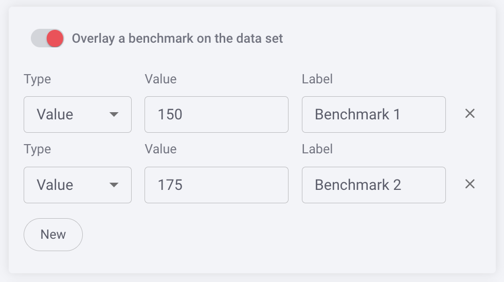
Benchmark
You can benchmark performance against a metric or a target when it doesn't make sense to use goals or the reference is a moving target, eg. a team average. Reference lines give analytics more context, and can help identify "good" and "bad" results by comparison.
Color Set
Choose from the offered color sets the color scheme you want to be reflected in your bar chart. These colors will differentiate the scatter plots (items) on the chart.
Once you have completed the visualization section, click save in the report editor to save your report. If you want to make changes to other sections of the editor, return to Creating and Editing Insights Cards.
Replies have been locked on this page!