
The Idealized Funnel Report is a flexible funnel that shows an idealized view of conversion metrics, is inspectable and interactive, and supports a grid visualization as well as the expected funnel visualization. You can even elect to split by a field, like rep, to add a whole new level of insight.
Since Intelligence reports consider data before visuals you can click Creating and Editing Reports to learn how to create report content. Once you reach the configuration section, come back here. If you're already a pro at creating reports...crack on.
Idealized Funnel Reports support a funnel visualization for all content types and all sorted values of any field for that content type. It can calculate conversion rates for counts or values, and the values will be configurable.
Jump to:
Creating an Idealized Funnel Report
Common Use Cases
-
Leads Conversion Funnel
-
Forecast Category Conversion Funnel by Value
-
Funnel Status Conversion Funnel by Value
-
Meeting Conversion Funnel by Count
-
Stage Conversion Funnel by Count / Value
-
MQL to Opp Creation
Creating an Idealized Funnel Report (Visualization)
Intelligence Reports consider data before visuals so start with Creating and Editing Reports to learn how to create report content. Once you get to the visualization section come back here to create the Idealized Funnel Visualization.
Visualization Type
Select Idealized Funnel from the chart type dropdown menu.
Default view type: select the bar chart icon to view the bar funnel or the grid to display funnel data in a grid.
Add Report Summary
Add Card Summary
Click in the text box to enter your subheading content. This information is a brief set of information you wanted to be relayed about the card; the text you enter will be displayed as it's written while you can include a specified data by adding subheading variables that will update with the rest of the data.
Basic Styling
The subheading section allows for basic styling, including Bold, Italic, and Underlined text as well as the ability to include hyperlinked data.
Subheading Variables
To enter subheading variables within your text, click the + button and choose from the populated list of variables based on the card's content.
Select A Property
Select field to display: select a field from the dropdown menu (eg. Stage Name).
Included Stages: based on the above selected field, select the stages you want included in the funnel. Stages with a checkmark are included, stages with empty circles will not be included.
Order: The selected included stages will appear in the order window where you can drag and drop the stages to appear in your desired order.
Select Loss State(s)
Select any alternative exit conditions you want to be considered in the funnel. Intelligence automatically considers the last stage in the order above as the the success criteria, but that's not the whole picture. Selecting a loss state(s) allows you to determine when content has a different exit condition and ensure it is included in the funnel.
For example, with no loss state selected, this funnel would only take into account the opportunities that get to Closed Won (the last stage). If we add a "Closed Lost" loss state, the funnel understands that an opportunity that goes Closed Lost still reached an exit condition and should be included in the funnel as such.
Pro tip: We recommend that you not include the loss state(s) in the included stages in the previous step. The funnel will still be correct, just more cluttered than necessary.
Choose a value to be displayed on the y-axis
I would like to display the aggregate metric by: select the aggregate metric from the dropdown, (eg. Sum, Count, Average, Minimum, Maximum, Count Unique).
Select an aggregate value: select the value by which you want to interpret the included data by the above selected metric (eg., Amount).
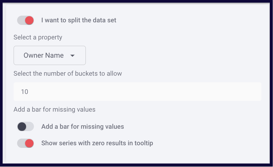
Split By
You can enable "I want to split the data set" for the funnel to split data by a selected property. (Like stage conversion by rep)
Split Data On/Off
Toggling Split Data on allows for the lines or table cells in your chart to be visually itemized, turning Split Data off displays your data as an individual total.
Select a Property
Select a property to split by.
Number of Series Allowed
You can limit the number of series allowed to be represented in your chart to prevent crowded visualizations when datasets contain more information than would be visually legible. (Max 150)
Add a bar for missing values
You can elect to Add a bar for missing values or Shwo series with zero results in the tool tip
Choose a Color Set
Replies have been locked on this page!