
Before you can report on goals, you'll need to create some - click here to learn how. Once you have a goal created, create a report using the Generic Goals Insight template and configure both the goal and the visualization as instructed below.
Jump to:
What is Goal Attainment by Person?
Who shows up on a Goal Attainment Report?
What is goal attainment by person?
Goal attainment by person tracks the individual goals and progress toward those goals over a selected period of time for each member in a certain level of your hierarchy. Each individual's progress is represented in a bar chart or grid. In a bar chart, a star inline with each bar represents that individual's goal. As with any report, you can drill into the report as a whole or click on a single bar for more data.
Who shows up on a goal attainment by person report?
Who shows up depends entirely on who is selected in the hierarchy and which type of hierarchy you're using:
-
User Manager Hierarchy shows the direct reports of the person selected, so if an individual with no direct reports is selected, no data will be returned.
-
Role Hierarchy has two possibilities:
-
Selecting a User Node shows the goal for the person you selected (since you don’t have direct reports by person in the role hierarchy)
-
Selecting a Role Node will show the people in that specific role
-
...and a hierarchy selection must be made!
Goal Configuration
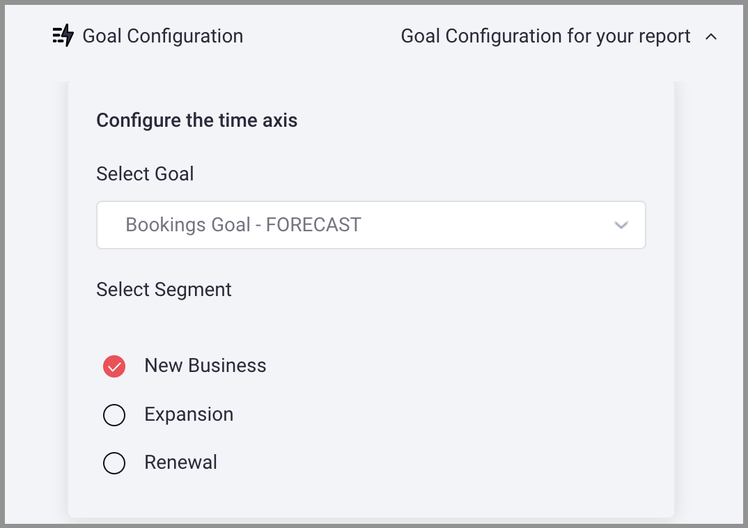
Configure the time axis
-
Select Goal: your available goals will be populated in the dropdown for selection
-
Select a Segment OR Multiple Segments: segments based on the selected goal and populated in the dropdown for selection.
When multiple segments are selected:
-
bars will be split by segment
-
Multi-segment cards will display totals of forecast and goal numbers for each segment and represent them as a single data point
-
The order of the splits will display in order, eg., first selected segment should always be the first split and so forth and colors will be consistent between intervals
-
Any composite number is itemized in hover
-
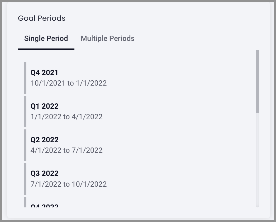
Goal Periods
Goal periods will establish the interval by which data will be graphed (by month, fiscal period, etc.) as well as the range of intervals the data will come from. This gives you the flexibility to view goals over time; how much of a goal was reached previously, where you are on your way to your goal now, and what the coming goals are, or any combination of the three.
Goal Period: Select Single or Multiple Periods
Single Period: Select a single period from the populate list to establish the goal period
Multiple Periods allows you to define multiple periods to be covered in your report.
First, select the visualization range (month, quarter, etc.), then use the sliding scale to determine start and end of the report period. You will see the description adjust as you move along the scale.
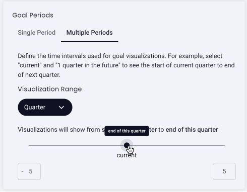
Note: If you adjust the scale to go back 52 months (-52), but only have data back 36 months, your graph will end where the data does so you won't have a large gap where no information is available.
To adjust the sliding scale range using the text box: enter the number of intervals in the past (left, negative) and/or in the future (right, positive). The sliding scale will adjust accordingly.
Visualization
Type
-
Select Bar Chart with Goals. (To make a Goal Headline card, click here.)
-
Select Vertical or Horizontal to determine the direction of your bar chart
-
Default View: Select the bar chart icon or grid icon to determine the how you want to view this graph.
Group by
-
Select Person from the dropdown menu
-
Max people to show (up to 20): to prevent a chart that's too full and cluttered to digest, enter the number of people to show on the chart (up to 20)
-
You can elect to Only include people with a goal defined or show all people, even those without goals
Add report summary just as you would when creating any other report type, you can even include Goal variables! Click the + button to add a variable to the summary.
Overlay Forecast Data (Optional)
Optional: You can have a line chart overlay of selected forecast data over your goal graph.
-
Select "I want to overlay forecasting data" to enable
-
Select the forecast types you want to be displayed
-
Choose the period type to display (the options populated will be based on the period configuration of the goal card. Eg., If the selected goal allows forecasting on both a monthly and a quarterly basis, choose which set of forecasts you'd like to display, if it allows for only one, no option will appear.)
Choose a color set: choose a color set for your bar chart, individual goals will be represented by a Star inline with the individual
Click Save
Note: When viewing a goal report, you must make a hierarchy selection for data to be populated or you'll see a message like this:
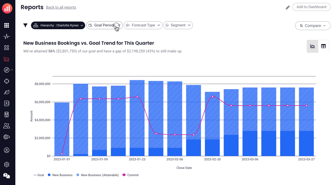
Attainment vs. Goal
Hovering over a bar in a goal attainment by person report provides you with the information below, giving you insight into exactly where the individual is in the current period.
-
Name of Person (Ex. Duncan Thomas)
-
Goal: Individual's Goal Amount (represented by the Start in the bar chart)
-
Attained: Progress to goal in goal period, shown in both amount and percentage
-
Gap to goal: amount needed to reach goal for this goal period, only shown if goal has not yet been reached
In Report Adjustments
You can adjust Goal Period, Forecast Type & Segment directly from the report. Click on the appropriate pill above the report, make your adjustments, and click Apply.
Replies have been locked on this page!