
You can create a bar chart that reports on historical data to track changes, identify trends, review past data, and more. Using any of the content types listed below, you can choose to view data over a specified, previous time period. Creating a history report is similar to creating a bar chart report, with a couple of key differences:
-
instead of the Calculation section, you see in other bar chart configurations, you will use the Historic Filter section to choose which content to include in historic calculations
-
in the Visualization section, your only option will be "Historical Bar Chart"
What kind of content can you create historical bar charts for?
Intelligence provides card templates for:
Generic Insight History Reports:
-
Contact History
-
Lead History
-
Opportunity History
-
Opportunity Product History
Out of the Box History Reports:
-
Pipeline History by Forecast Category (Opportunity History)
-
Pipeline History by Stage (Opportunity History)
Creating a History Report
-
Click here or by clicking Reports in the left nav.
-
Select an existing history card to copy and edit or click New Report to start from scratch. If you're copying a card, skip ahead to Step 5.
-
If you're creating a net new report, select a history template; search history to find the historical content type template you wish to create a report for and select your desired template. Click next.
-
Enter a Name for your report, and a Definition Label (this information will be a short description visible on the definition management page). Click next.
-
Filter: add a filter(s) to define what types of data will be shown in this view. You will see any filter that you don't make hidden in the columns of your report. Since this example is using the Opportunity History template, the available filters will define what type of Opportunity data will be shown.
-
Historic Filter: choose which content to include in historic calculations. When you click the + button, only variables of the report's content type with "track changes" enabled in the property mapping settings will populate.
For example, if we're reporting on pipeline stages, we add the historic filter for Stage Name and unselect Closed Lost and Closed Won to track stages over time and not the outcome.
-
Visualization:
-
Select Historical Bar Chart (click here if you're looking for information on a waterfall, or flow chart). You can elect to change the default view type to a grid by clicking the grid icon next to "Default view type".
-
Add a card summary
-
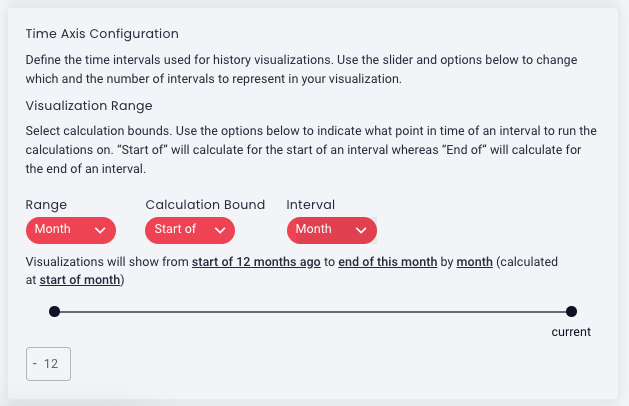
Time Axis Configuration
Visualization Range: define the time intervals
- Range: Select the type of time period you want to use to establish the date range to run calculations on. For example, if you want to see data from 6 months ago to today, you'd choose months.
-
Calculation Bound: Select whether the period is based on the "Start of" or "End of" a period. The date listed with each bar indicates the start or end date of the interval as selected. For example, if you select "start of" a weekly interval, the date listed will be showing you the start of the week.
-
Interval: Select time interval; day, week, fiscal week, etc. by which you will view data. For example, you want to see the last 1 year (range) of data to today...by month (interval).
-
Range selection slider: use the sliding scale selector to adjust the range based on the type of range selected above (1). You can slide left to increase the time graphed back in the past. You can slide right to adjust the end of the time period, up to current. For example, if the range is set to months, you can adjust the slider scale to calculate back twelve months to the current month.
Pro tip: You can also adjust the range in the text box to increase/decrease how far back the selector can go. As you move the slider, the description above it will adjust to describe the currently selected period.
-
Choose a value to be displayed on the y-axis
-
Select a metric/aggregate metrics: count, sum, average, min, max, count unique
-
Select an aggregate value if applicable
-
Add a Label: (Ex. We want to measure by the sum of opportunity amounts or Total Amount.)
-
-
-
OPTIONAL: Make any other desired selections as you would creating a bar chart; line overlay, data split, color set. (Ex. This report has a line overlay for the Count of Total Open Opportunities and is split by stacked stage names and uses the Sky color set.
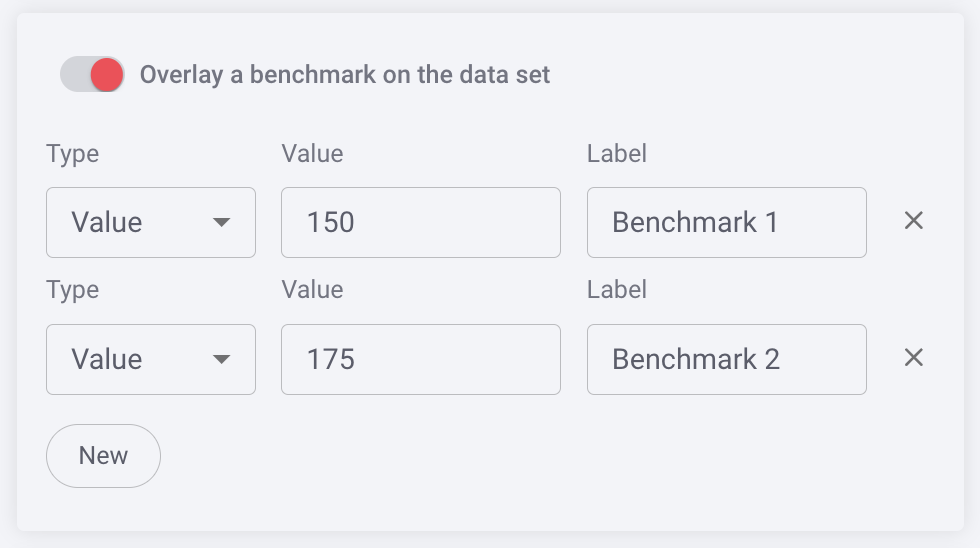
- Optional: You can benchmark performance against a metric or a target when it doesn't make sense to use goals or the reference is a moving target, eg. a team average. Reference lines give analytics more context, and can help identify "good" and "bad" results by comparison.
-
Click Save.
Check out the historical bar chart below illustrating the week-by-week historical value of opportunities by stage over the last six months. Click on a report to drill down or hover over a bar in the chart for itemized data.
Replies have been locked on this page!