
Intelligence Reports consider data first and visualization second. That means you can establish the data you want to see and then decide which visual(s) represent it best. Since data come first, start with Creating & Editing Reports, then come back to this article to set up the Area Chart visualization.
Area chart reports allow you to build an area chart displaying color filled areas between line chart lines to produce an easily digestible visualization of data. Area Chart reports offer more than their titular graphic, they also offer itemized graph details. Hovering over data sets within a chart produces written, itemized details.
Check out the Pipeline Creation Trend by Region area chart below, we'll use this as an example for configuring this viz type.
Creating an Area Chart Report
Card Basics
Visualization Type: Area Chart
In the Visualization section of the report editor, select Area Chart as the visualization type.
Add report summary
Click in the text box to enter your subheading content. This information is a brief set of information you wanted to be relayed about the report; the text you enter will be displayed as it's written while you can include a specified data by adding subheading variables that will update with the rest of the data.
Basic Styling
The subheading section allows for basic styling, including Bold, Italic, and Underlined text as well as the ability to include hyperlinked data.
Subheading Variables
To enter subheading variables within your text, click the + button and choose from the populated list of variables based on the report's content.
X and Y Axis Configuration
X Axis
The X Axis presents the data along the horizontal axis of the graph.
Dropdown options will be populated based on report content that prompt you to chose what field of data by which to group, and when available, what type within that field to display.
You can enter a custom label for the X Axis. The label can include data variables by clicking the + button and selecting a variable that will include data that continually updates. The X Axis label will be displayed beneath the graph.
Y Axis
The Y Axis presents the data along the vertical axis of the graph.
Dropdown options will be populated based on report content that prompt you to chose what metric you want to be measured and the type of value that will be displayed.
You can enter a custom label for the Y Axis. The label can include data variables by clicking the + button and selecting a variable that will include data that continually updates. The Y Axis label will be displayed up the left side of the chart.
Split Data
Select a field to split by
The area chart must be split to showcase the differences by colored area, choose the field you want split in your chart from the dropdown.
Number of Series Allowed
You can limit the number of series allowed to be represented in your chart to prevent crowded visualizations when datasets contain more information than would be visually legible. (Max 150)
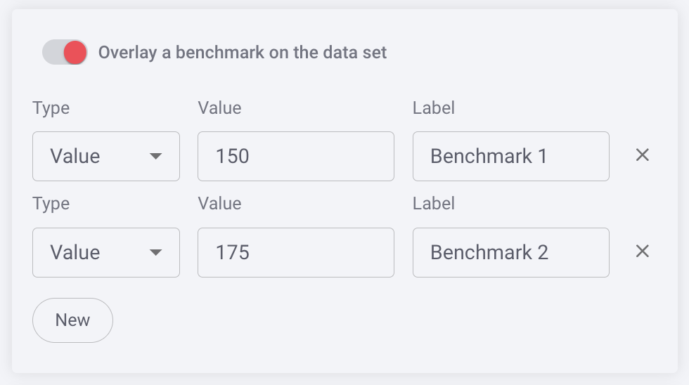
Benchmark
You can benchmark performance against a metric or a target when it doesn't make sense to use goals or the reference is a moving target, eg. a team average. Reference lines give analytics more context, and can help identify "good" and "bad" results by comparison.
Sort By
You can select to sort by split data (Split Name) when split is enabled, or sort by default.
Sort Order
You can leave the sort order in default or choose to sort by ascending or descending.
Color Set
Choose from the offered color sets the color scheme you want to be reflected in your area chart. Split Data will also reflect this color scheme. Color legends and details information appear when you hover over any data in the bar.
Chart Tips
-
Hovering over data in your chart will display a legend with further details, including itemized amounts.
-
Clicking on the report header will produce the inspection drawer as it does for all reports, but also offers the ability to click on an individual bar or in an itemized portion of an area to display a report below with data specific to your selection. When you select a specific area, a legend with the corresponding information will appear on the chart in the inspection drawer.
Once you have completed the visualization section, click Save in the report editor to save your report. If you want to make changes to other sections of the report editor, return to Creating & Editing Reports.
Replies have been locked on this page!