
Mediafly empowers users with the ability to create custom forms for surveys, questionnaires, or to collect data. Creating forms in Engagement is easy, as content managers will only need to drag-and-drop the necessary field types and specify the details of each field.
Jump to:
- Creating a Form
- Field Elements
- Form Responses
- Theme
- Field Rules
- Thank You Page Message
- Form Sample
- Viewing Responses
- Posting Form Responses to Salesforce
Creating a Form
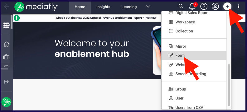
- Click on the + (or the Create button) and select Form.
-
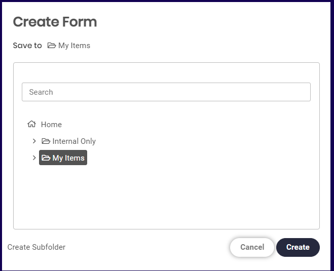
Specify the location where the form is to be saved. Click on the Create button to start creating a form.
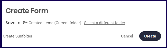
Note: If you created the form while inside a certain folder, the Create Form window will display the specific folder you are already in. Select on "Select a different folder" to save the form in another location. - Enter a form name.
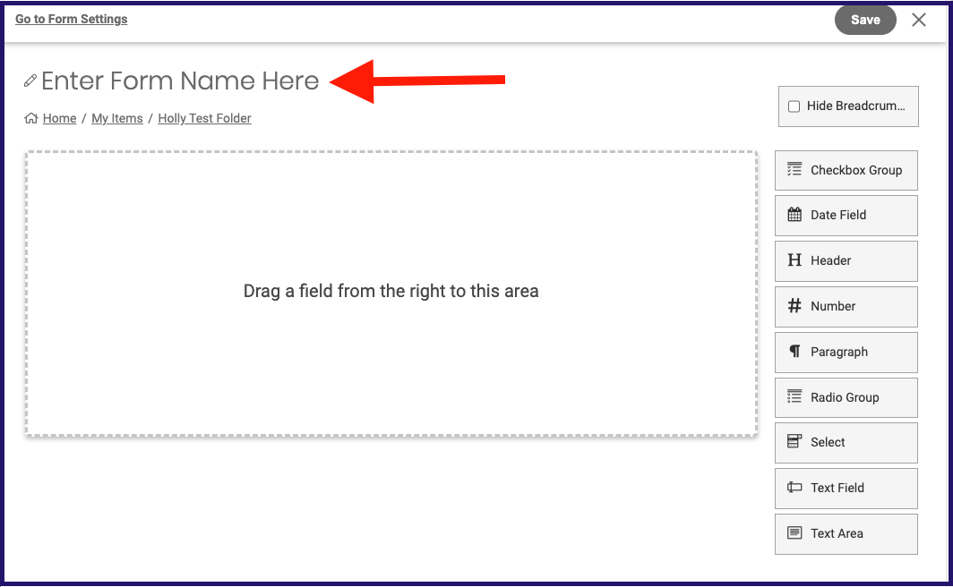
- Now you can start adding field elements and configuring the setting of your form! Keep reading to learn more. And don't forget to click SAVE!
Pro tips:
- You can click on "Hide Breadcrumbs" under the form name, allowing you to save space and have more control over where form submitters can navigate from the form page. Unchecked, breadcrumbs will be visible during editing and in the form itself.
- You can also click "Go to Form Settings" to jump down to the form settings without having to scroll as your form grows.
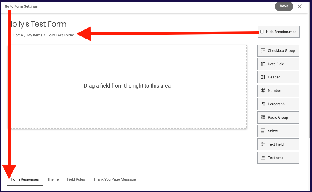
Field Elements
There are nine field elements that you can use to create a form. To add a field, drag it into your form.You can drag the field to rearrange, and hover over the form to populate options to remove (x icon),edit (pencil icon), or copy (copy icon) the element. You'll click edit when you're ready to customize the field.
Jump to:
1. Checkbox Group
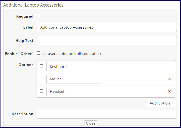
This field is used to create questions or items where a question requires users to select one or multiple answers. This field provides the following properties:
- Required- Tick this flag if this field is a mandatory item. An
icon is displayed after the label if this flag is marked.
- Label- Use this to specify the text or title of the item.
- Help Text- If this field is defined, a
icon hovers next to the label and the defined text is displayed if the user hovers the mouse over the icon.
- Enable "Other"- If the 'Let users enter an unlisted option' flag is marked, an additional option, 'Others', is provided. If the user marks this option, a field is displayed for the user to specify a custom answer.
-
Options- Use this to specify the options for the question.
Note: To set whether an option is marked by default, mark the checkboxes before each corresponding option.
- Description- Use this to add a description to the header.
2. Date Field
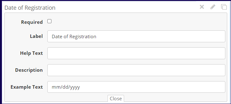
This field is used for users to specify a date. This field provides the following properties:
- Required- Tick this flag if this field is a mandatory item. An
- Label- Use this to modify the text or title of the item.
-
Help Text- If this field is defined, a
- Description- Use this to add a description to the header.
-
Example Text- Use this to specify how date information should be entered
-
Eg., Example Text for January 23, 2021
- mm/dd/yyyy = 01/23/2021
-
Eg., Example Text for January 23, 2021
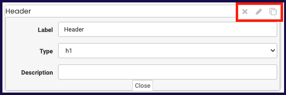
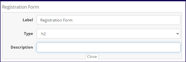
3. Header
This is a read-only field where you can specify a title or text. This field provides the following properties:
- Label- Use this to modify the text of the header field
- Type- Use this to set the header type. Users may select between header types h1, h2, h3, and h4 to determine the header level
- Description- Use this to add your desired of text to show beneath header.
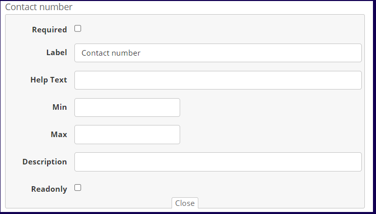
4. Number
Use this to create a blank field where users may input a number. This field provides the following properties:
- Required- Tick this flag if this field is a mandatory item. An
- Label- Use this to modify the text or title of the item.
-
Help Text- If this field is defined, a
- Min- Use this field to define the minimum number that the user can specify.
- Max- Use this field to define the maximum number that the user can specify.
- Description- Use this to add a description to the header.
- Read Only - Mark this field if the field is the field is a read-only field.
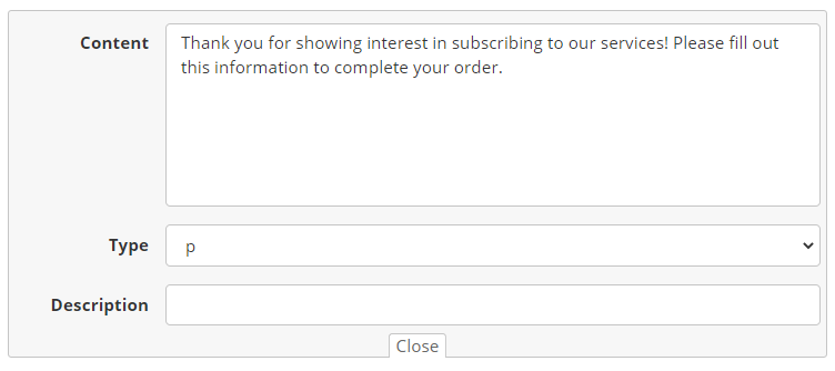
5. Paragraph
This field is a read-only field that is used to write a paragraph for the end user to read when filling out the form. This field provides the following properties:
- Content- Use this to specify the content of the paragraph.
-
Type - Use this to select the paragraph type:
- p (paragraph)
- address
- Blockquote
- canvas
- output
- Description Text- If this field is defined, a
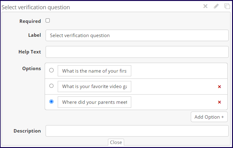
6. Radio Group
This field is used to create questions or items where a question requires users to select one answer from a list of options. This field provides the following properties:
- Required- Tick this flag if this field is a mandatory item. An
- Label- Use this to specify the text or title of the item.
- Help Text- If this field is defined, a
- Enable "Other"- If the 'Let users enter an unlisted option' flag is marked, an additional option, "Others' is provided. If the user marks this option, a field is displayed for the user to specify a custom answer.
- Options- Use this to specify the options for the question.
Note: To set which option is marked by default, mark the checkboxes before the corresponding option. -
Description- Use this to add a description to the radio group field.
7. Select
This field is used to create questions or items where a question requires users to select one answer from a dropdown list. This field provides the following properties:
- Required- Tick this flag if this field is a mandatory item. An
- Label- Use this to specify the text or title of the item.
- Help Text- If this field is defined, a
- Enable "Other"- If the 'Let users enter an unlisted option' flag is marked, an additional option, "Others' is provided. If the user marks this option, a field is displayed for the user to specify a custom answer.
- Options- Use this to specify the options for the question.
Note: To set which option appears as the default selected item in the dropdown list, mark the checkboxes before the corresponding option. - Description- Use this to add a description to the select field.
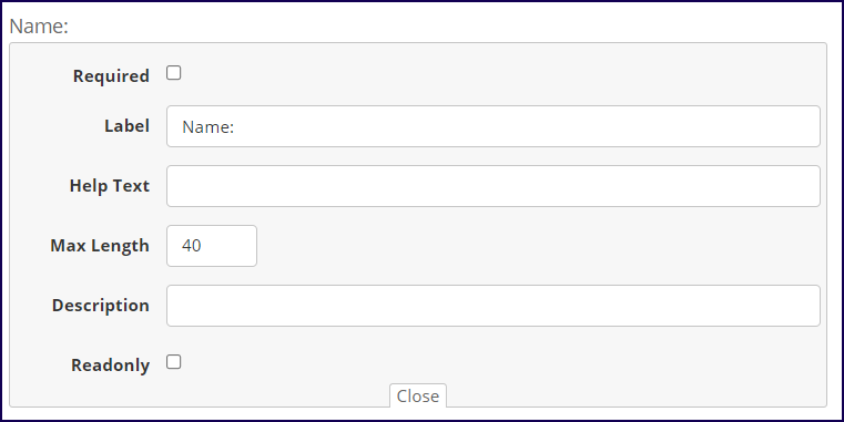
8. Text Field
Use this to create a blank field to be answered by the user. This field provides the following properties:
- Required- Tick this flag if this field is a mandatory item. An
- Label- Use this to specify the text, question, or title of the item.
- Help Text- If this field is defined, a
- Max Length- Use this to specify the max length of characters a user can input in the field.
- Description- Use this to add a description to the text field.
- Read Only- Mark this field if the field is the field is a read-only field
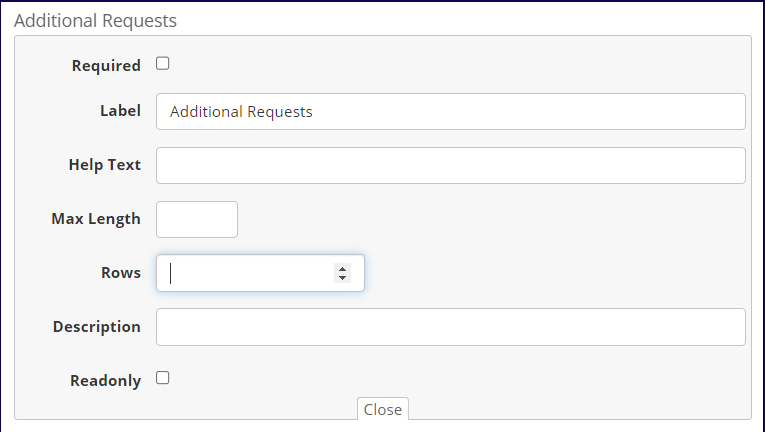
9. Text Area
Use this to create a large blank field for questions/items that require explanations or freeform answers. This field provides the following properties:
- Required- Tick this flag if this field is a mandatory item. An
- Label- Use this to specify the text, question, or title of the item.
- Help Text- If this field is defined, a
- Max Length- Use this to specify the max length of characters a user can input in the field.
- Rows- Use this to specify the maximum number of rows to be used in the text area.
- Description- Use this to add a description to the text field.
- Read Only- Mark this field if the field is the field is a read-only field
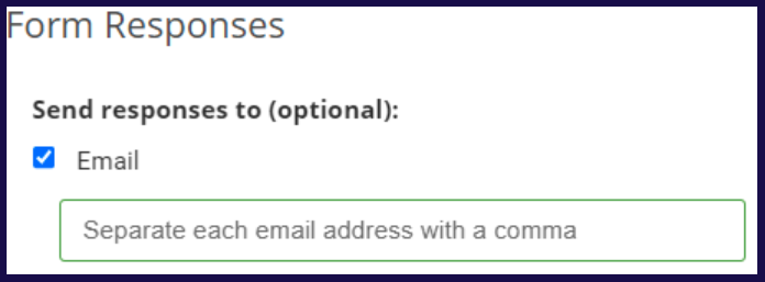
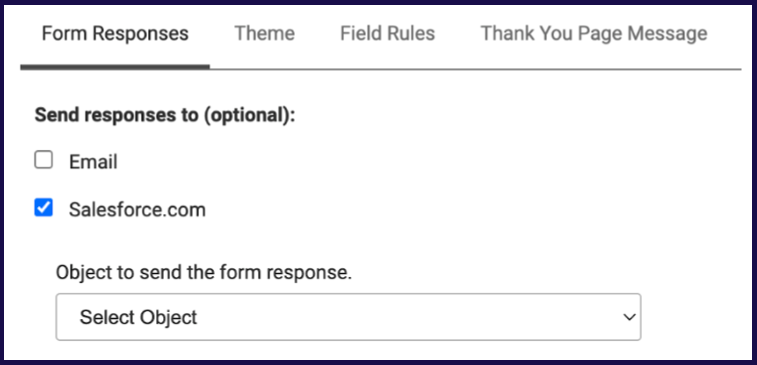
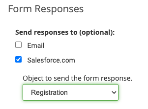
Form Responses
-
Email: Form responses allows you to set where a form response notification email is sent. Marking email displays a blank field. Specify the email where you wish the response notification is sent.
-
Salesforce.com: This option is only present if the "Forms - Salesforce.com" option has been enabled in your environment. If you don't see it and think you should, please open a support ticket. Click here to learn more about posting form responses to salesforce.
When checked, this option will present you a login button (if you're not already logged into SFDC) then a dropdown of possible Salesforce objects to choose from for defining when the form would post responses to.
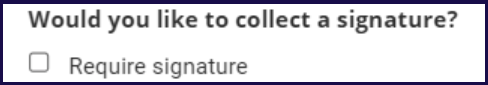
- Require Signature: Selecting the Require signature option adds a new mandatory field to the form which users must draw their signature to submit the form.
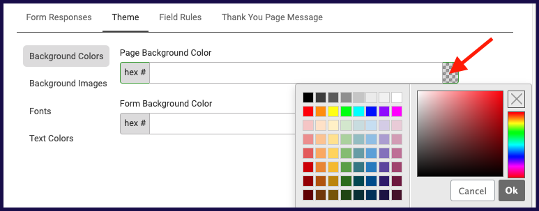
Theme
Theme options allow you to define custom background colors, images, fonts and text colors for your form page and/or form container. The form preview above settings will reflect the options you choose here so you can see what your form will look like.
Background Colors
Show existing or select a color by clicking on the gray checkerboard icon, or enter a hex # to define a Page Background Color and/or Form Background Color.
To remove the color and return to defaults, simply delete the hex #.
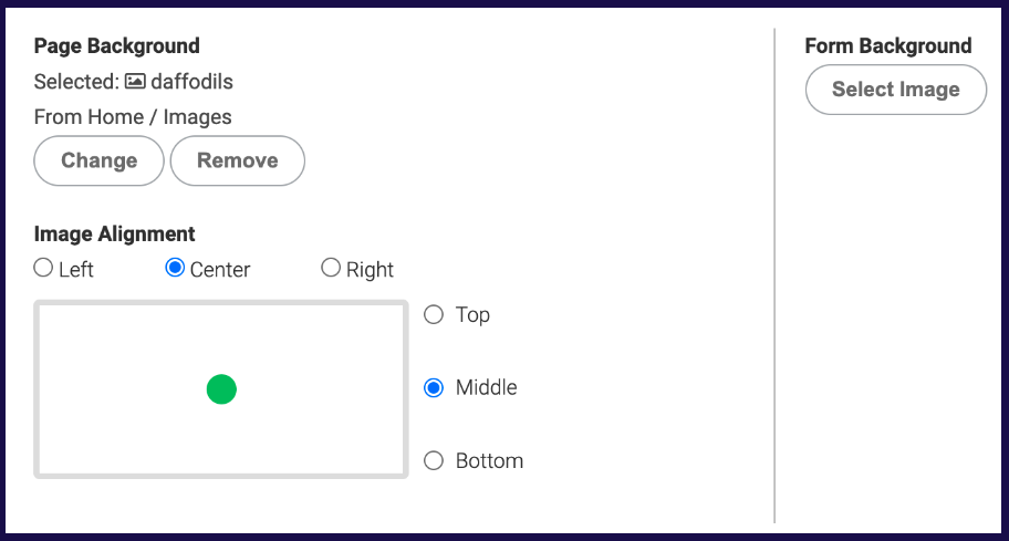
Background Images
Click on Select Image to browse folder content and define an image for Page Background and/or Form Background. Note: When provided, background images appear over background colors.
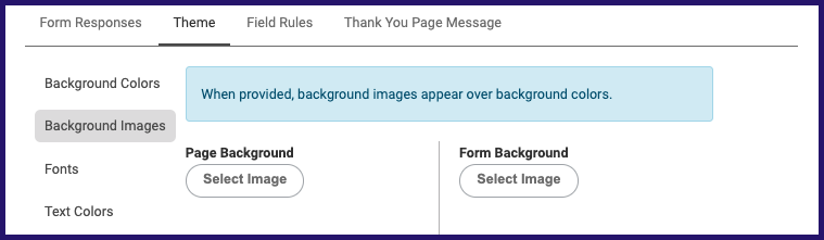
Once you’ve selected an image to use you will have the option to change, remove and align the image. How much of a shift you might get from the image alignment feature depends on the size/dimension of the selected image vs. the length of the page.
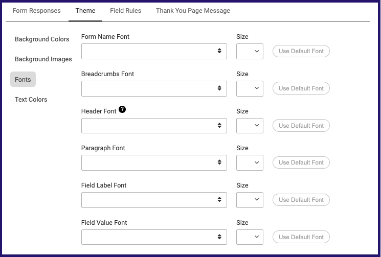
Fonts
You can choose to define custom font & font sizes for different sections of your form by selecting the desired font & size for each section listed below. No selection will result in default font, and if you want to revert to the default simply click "Use Default Font".
- Form Name
- Breadcrumbs
- Header
- Paragraph
- Field Label
- Field Value
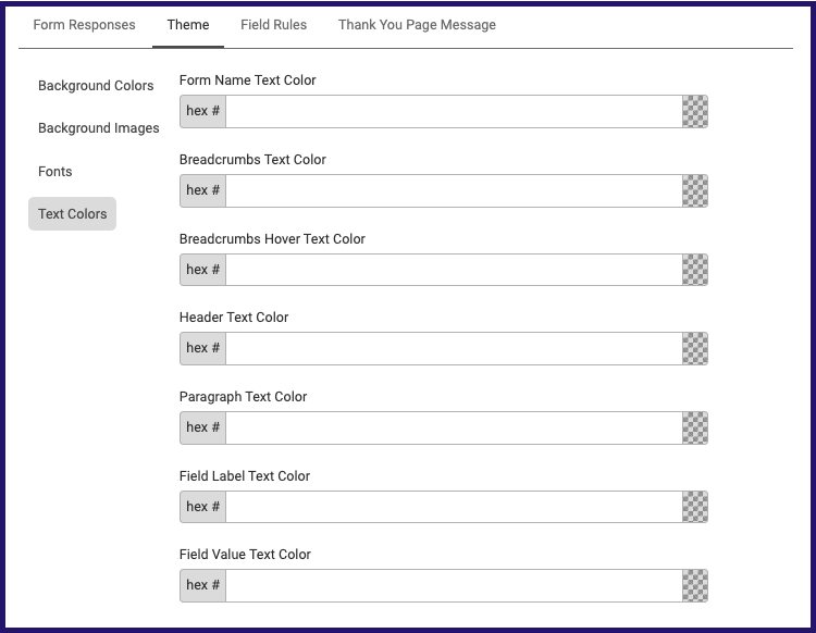
Text Colors
You can choose to view or define custom colors for the text sections listed below by clicking on the checkerboard icon and selecting a color or entering a hex # for each text section.
To remove the color and return to defaults, simply delete the hex #.
- Form Name
- Breadcrumbs
- Breadcrumbs Hover
- Header
- Paragraph
- Field Label
- Field Value
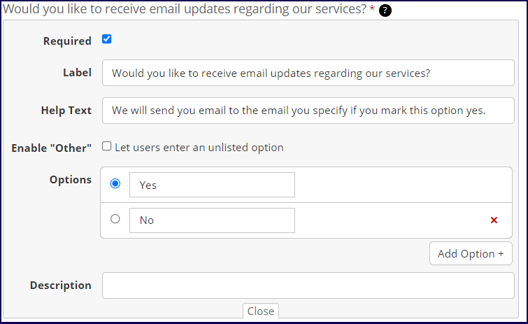
Field Rules
You may add field rules to allow you to show or hide a field or add a query parameter. To add a field Rule, click on the Add field Rule button and select on the field rule type.
If form field labels are edited after field rules have been defined, then the related rules will need to be updated. When you create a rule an alert will populate reminding you of this.
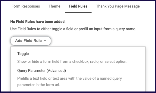
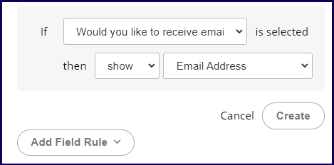
Toggle
This rule shows or hide a field based on a selected option in a checkbox, radio, or select field. In this example, if the 'Would you like to receive email updates' is selected, then show an Email Address Text field is displayed.
Query Parameter (Advanced)
The "Query Parameter (Advanced)" option allows you to prefill a text field or text area in a form using the value of a specified query parameter from the form's URL. For instance, if you create a collection in Viewer that includes a form, the URL for that form will contain parameters such as the collection ID. By setting up Query Parameter rules in the form settings, you can capture these URL parameters and automatically populate designated fields in the form with their corresponding values. This feature helps streamline form submissions by reducing the need for manual data entry.
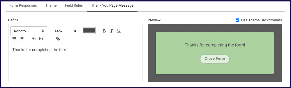
Thank You Page Message
Use this to specify the message that is displayed once a user successfully submits a form. You can format and include hyperlinks in your thank you page message. You will also see a preview that updates as you edit the message.
If theme backgrounds were used, you'll have the option to check "Use Theme Backgrounds" to have your existing theme applied to the thank you message.
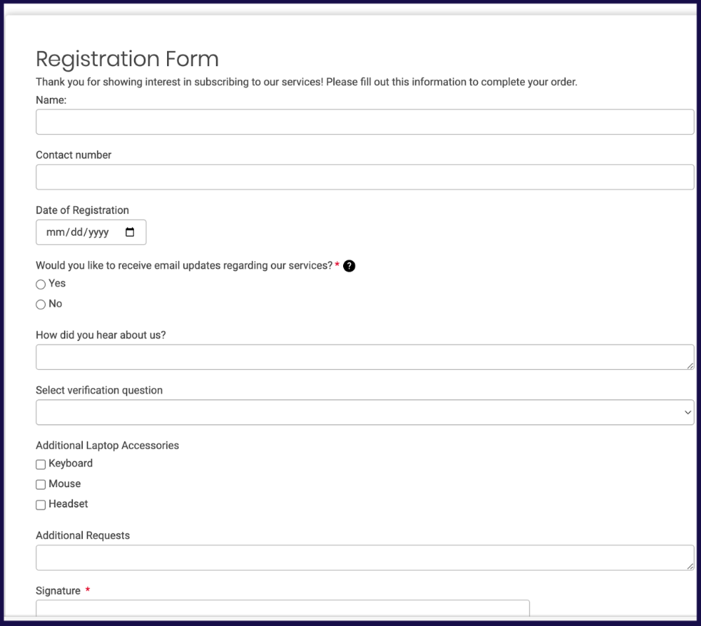
Form Sample
Here is an example of a form that uses all the above field elements:
Viewing Responses
Once a form is created and shared, you can check the response of your form.
To view all responses of the form:
Navigate to your created Form click on the three dots next to the corresponding item. Click on View Responses.
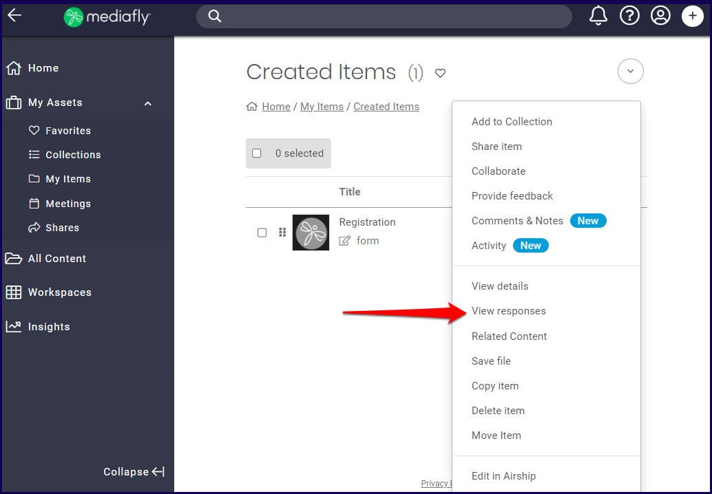
2. The page redirects to the Responses tab of the View Details page. All recorded responses are saved in this page. Content managers may download the CSV file of the page.
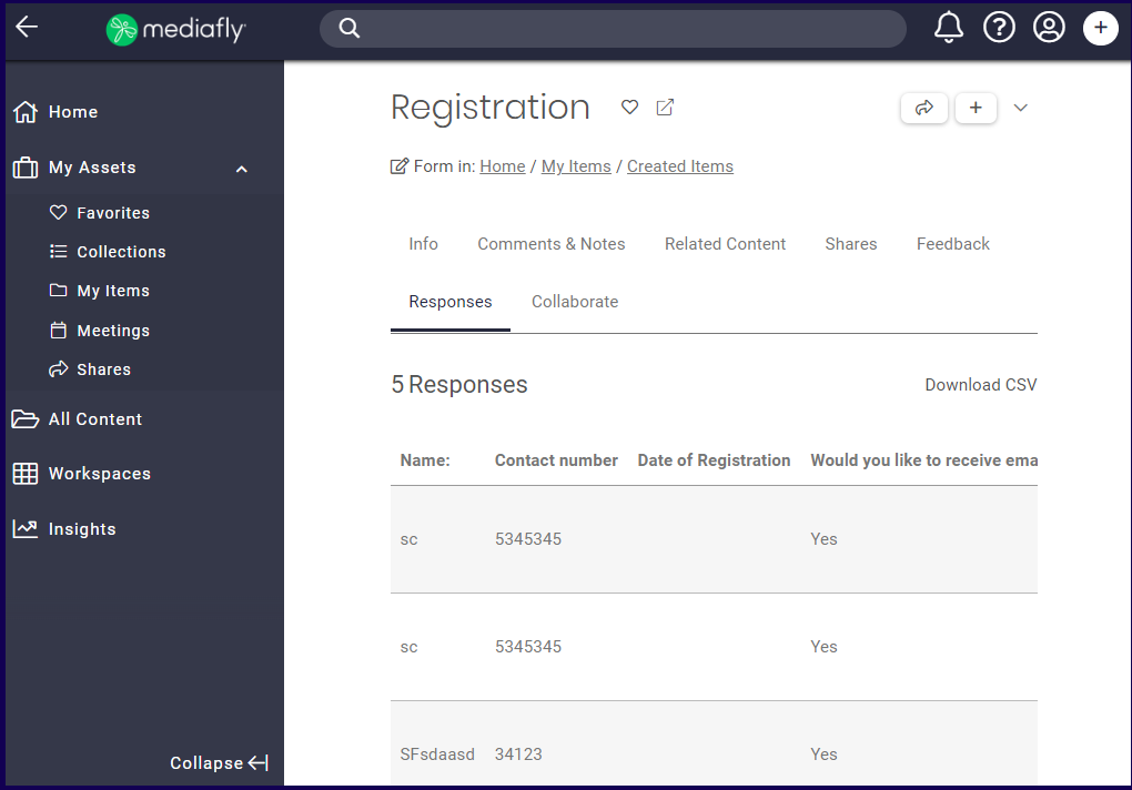
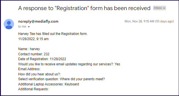
If an email address is defined the Form Responses section of the Form, the defined email receives a notification detailing the answers once an end-user has successfully submitted one form.
Posting Form Responses to Salesforce
Mediafly Forms support the ability to post form responses to Salesforce, into a custom object.
- The Engagement environment needs to be connected to Salesforce. Please follow the Configuration Guide for Salesforce to create a Connected App, and work with your Mediafly team member to connect it to your Salesforce instance.
-
Create a custom object. Name it whatever you like.
For example:Note: When you save it, ensure that the object is “Deployed”.
-
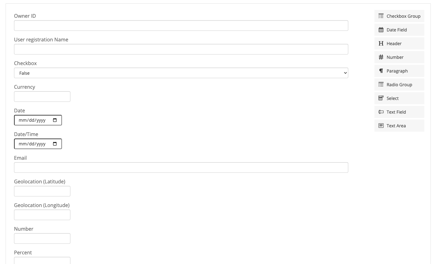
In the custom object, create relevant fields.
The following are supported types of fields:- Currency
- Date
- Date/Time
- Geolocation
- Number
- Phone
- Picklist
- Text
- Text Area (Long)
- Text Area (Rich)
-
URL
The following field types are not supported:
- Text (Encrypted)
- Time
- In Engagement, Create a new Form.
- Under Form Responses, check “Salesforce.com”, then pick the object from the dropdown for the custom object you created above. If you see no custom objects, please revisit the first step to ensure your Engagement environment is connected to your Salesforce org with a user that has sufficient permissions.
- After you choose the object, the fields will automatically populate with all fields in the custom object. You can remove them from your form and edit them as you wish.
- If you had validations on your fields in Salesforce, you will have to recreate those validations to match the form in Mediafly. Otherwise, users will get confusing errors when attempting to submit the form with values that don’t validate.
- Name and Save the form, and test it out. If you encounter errors, please reach out to your Mediafly team member for assistance.
Replies have been locked on this page!