
Overview
Building pages and configuring your logic is all done through the Design Studio, or Template Editor. This is accessed by selecting or creating a new analysis and going to the Editor option in the Menu.
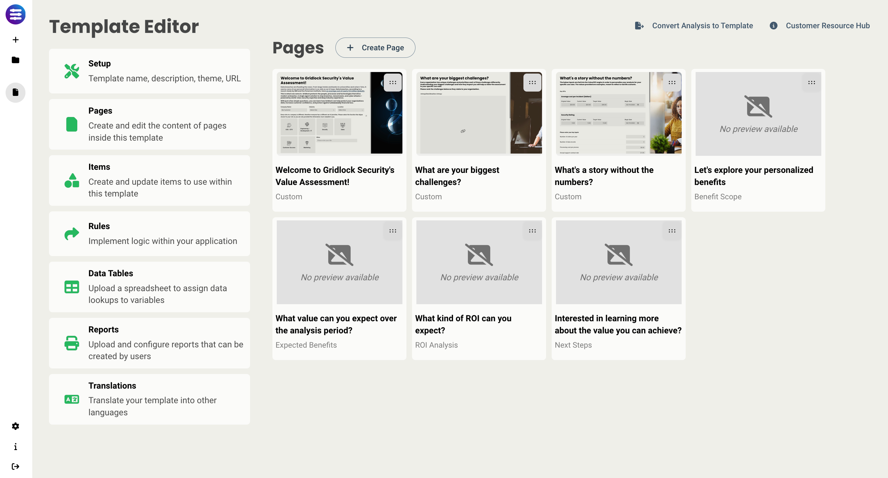
From the Editor main screen, you will see the following options:
Setup - configure the options for that analysis/template including analysis period, time to deploy, and benefit realization. More information can be found here.
Pages - let's you view (and update if you're authorized) all current pages, and for each page add a name, description, mnemonic, and validation requirements. An explanation of mnemonics can be found here, and information on validation can be found here.
Items - this is where you access the item library, where you can create and configure all inputs that can be added to pages.
Rules - lets you build all the logic behind the scenes to create interactive experiences. Information on rules can be found here.
Data Tables - lets you add spreadsheets that can populate fields with data. More on Data Tables can be found here.
Reports - lets you manage all your reports applied to the Template. Information about reports can be found here.
Translations - lets you manage the languages available for this Template. Information about translations can be found here.
Creating Pages
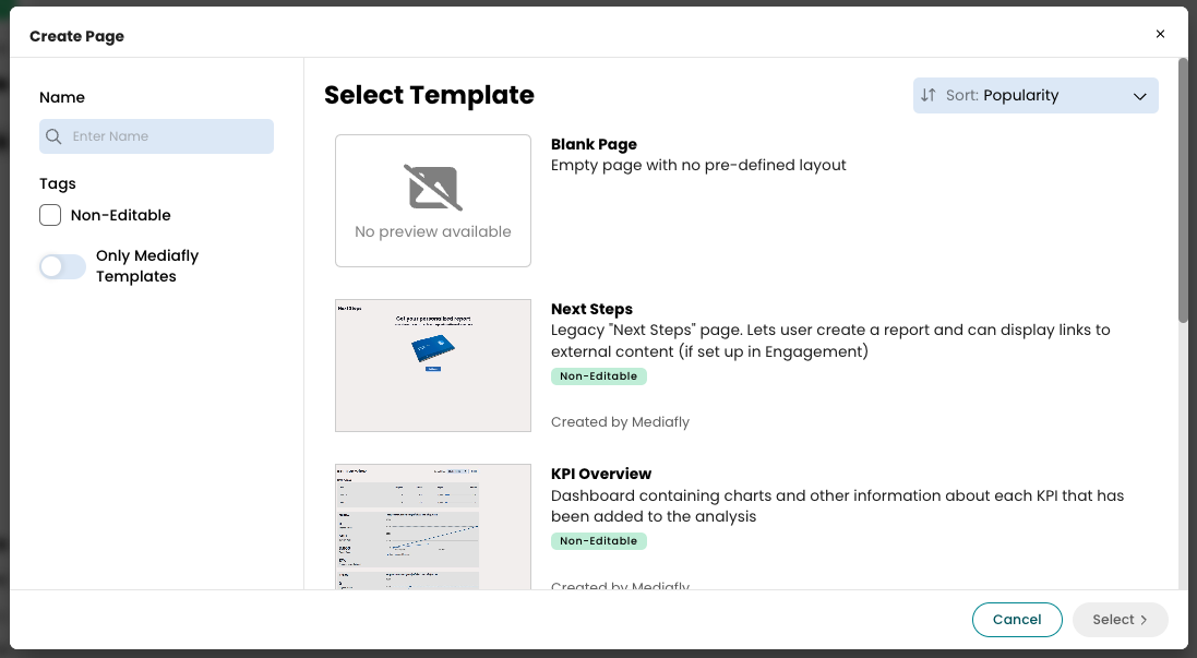
When creating a page, you will have the option to select:
- Blank Page - a blank slate that has no elements added. This is where we recommend you start if you have a design in mind already, or want to create something from scratch.
-
Any one of the following pre-built pages (note - pre-built pages cannot be customized. Only the title and description can be changed.):
- Benefit Scope - dive into each Benefit to view the details of each and get a breakdown of value. Also provides a chart with the value distributed over all Benefits included. Additionally, you can sort your benefits by either Default (order in which they were added), Value (by value each benefit provides, from highest to lowest), and Name (alphabetically).
- Expected Benefits - includes a yearly breakdown of each benefits expected value, broken out by value category. Each category can be drilled into, and you are given a chart that shows realized benefits by year.
- KPI Overview - displays all KPIs that have been created, as well as a chart for each that shows the progress to date.
- ROI Analysis - incorporates your added investments into the analysis and gives you your ROI, Payback Period, NPV Savings, and IRR (if applicable)
- Next Steps - shows all related content that has been added to your tool, as well as a modal to generate a report that can be sent to the customer/prospect.
- Custom Page Templates - the populated library will also include page templates that have been created by your org that you've been authorized to use.
Pro tip: Before creating a page, define the elements you want to include and their placement. This will help determine the number of sections, their positioning, and their sizing to optimize your layout.
Editing a Page
Once you create a page, you have several new capabilities on the screen.
All your items are now on the left-hand side. These include:
- Layouts - layouts allows you to select existing section templates to be added to your page, which allows authors to create sections that will be used across multiple pages and analyses and prevent the need to recreate the same section multiples time.
-
Structural elements - provide structure to the page that allow you to embed items into sections and tables.
- Section
- Table
- Item Table
- Static elements - can be placed anywhere on a page that a user cannot directly interact with
- Interactive - elements that consist of adjustable inputs that can be tied directly to logic. Out of this list, all but the Button can be accessed via the Items Library.
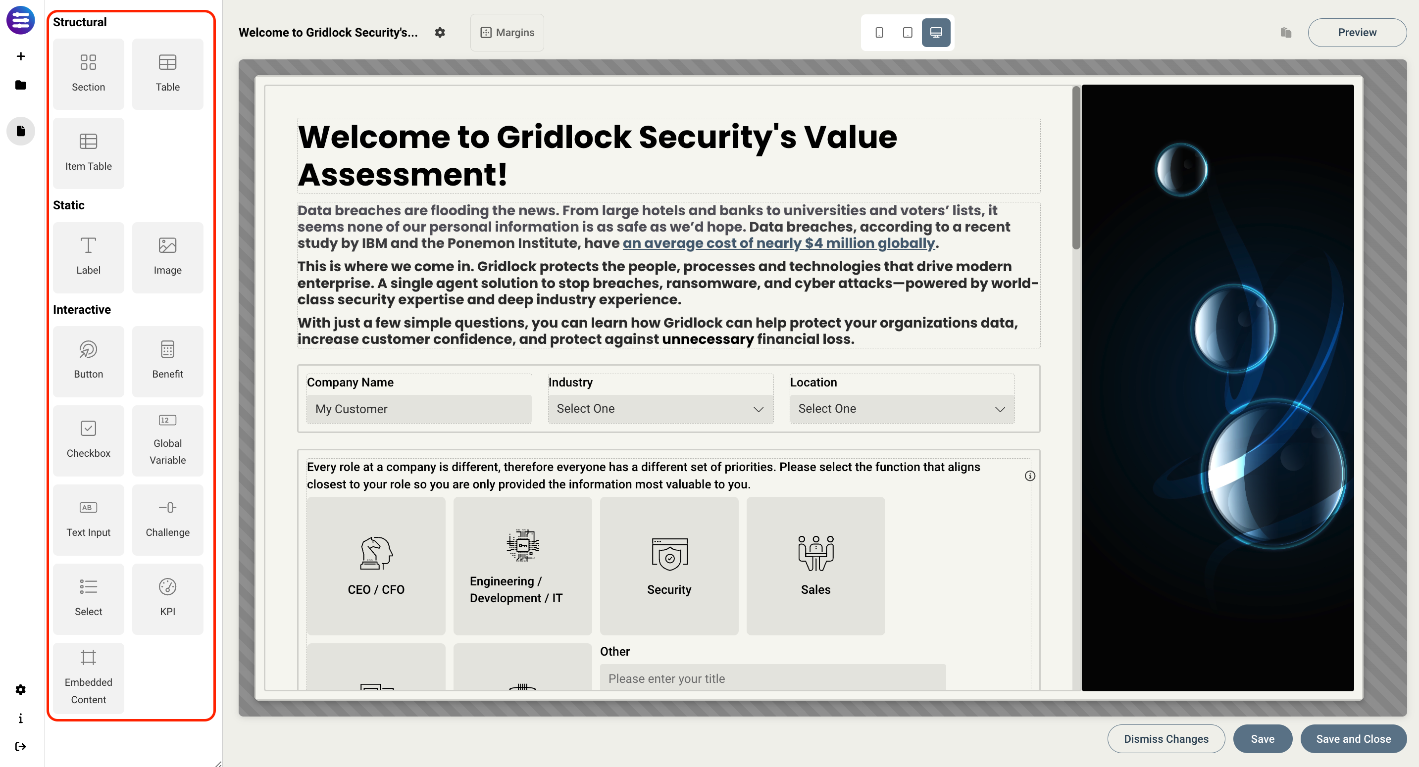
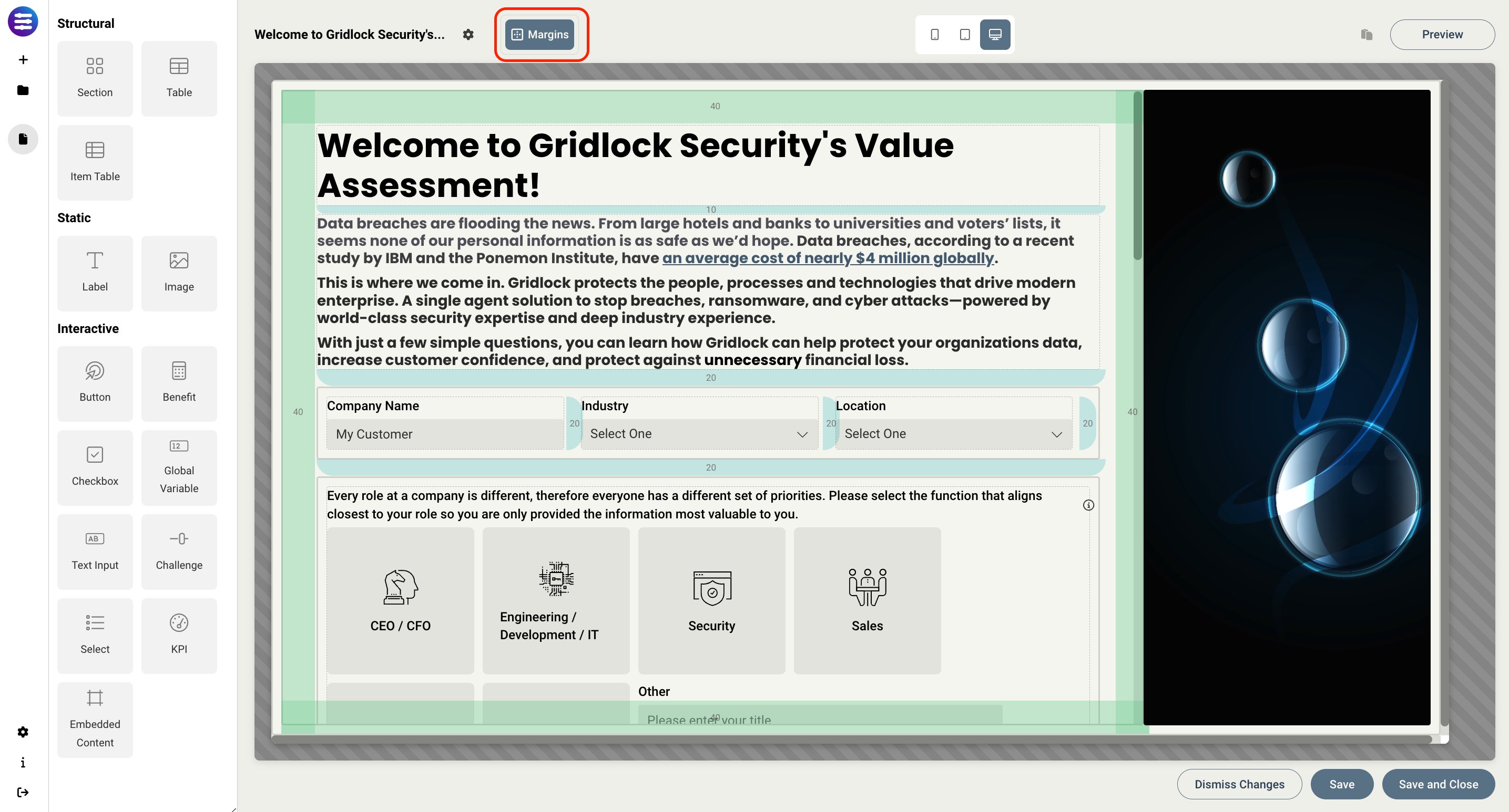
On the top toolbar, you have options to:
- Turn visibility on for all the margins and padding on the page, and indicate the px size of each.
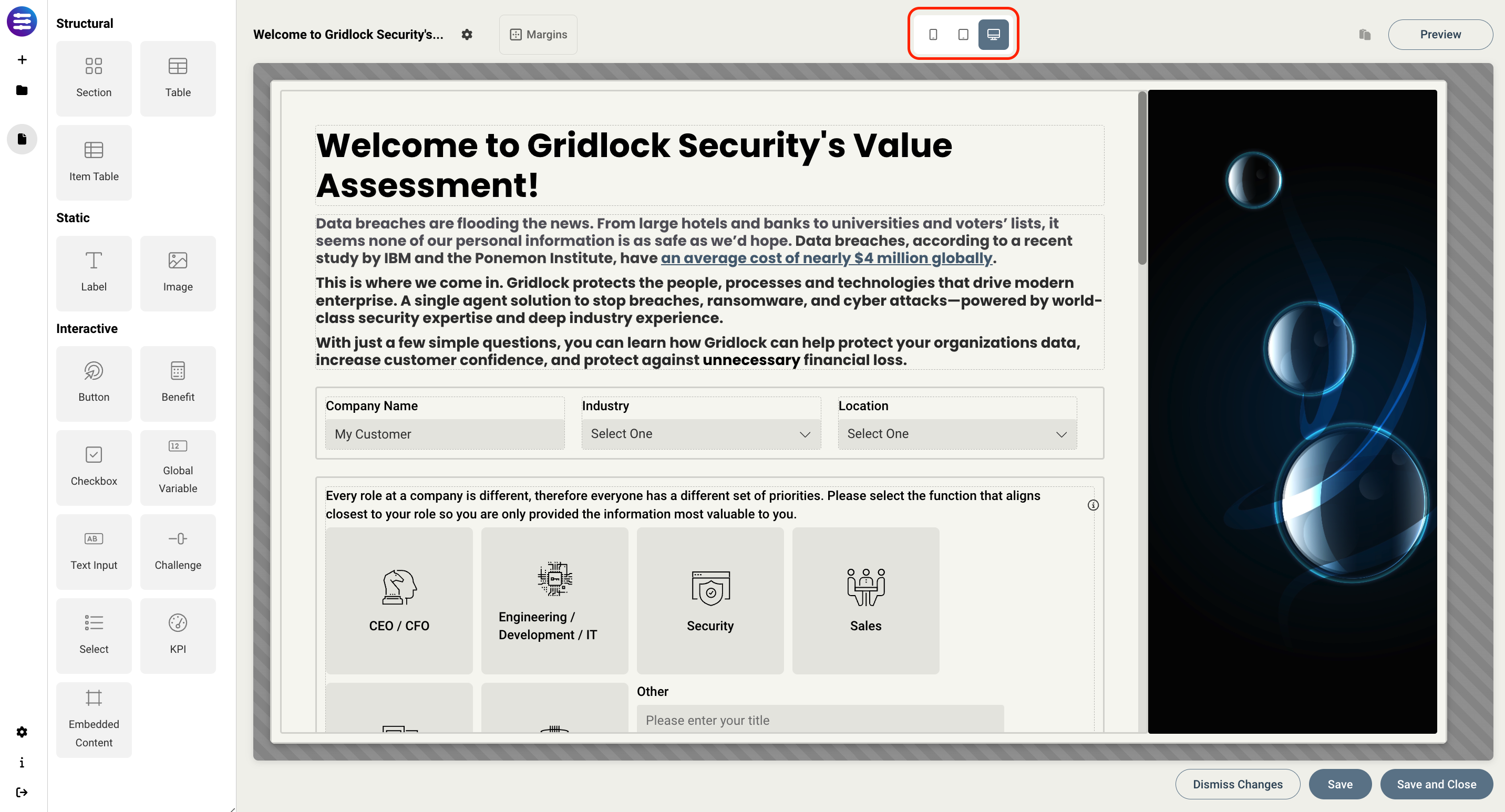
- Switch between what the page will look like on each type of device in order to optimize for each scenario - mobile, tablet, or desktop.
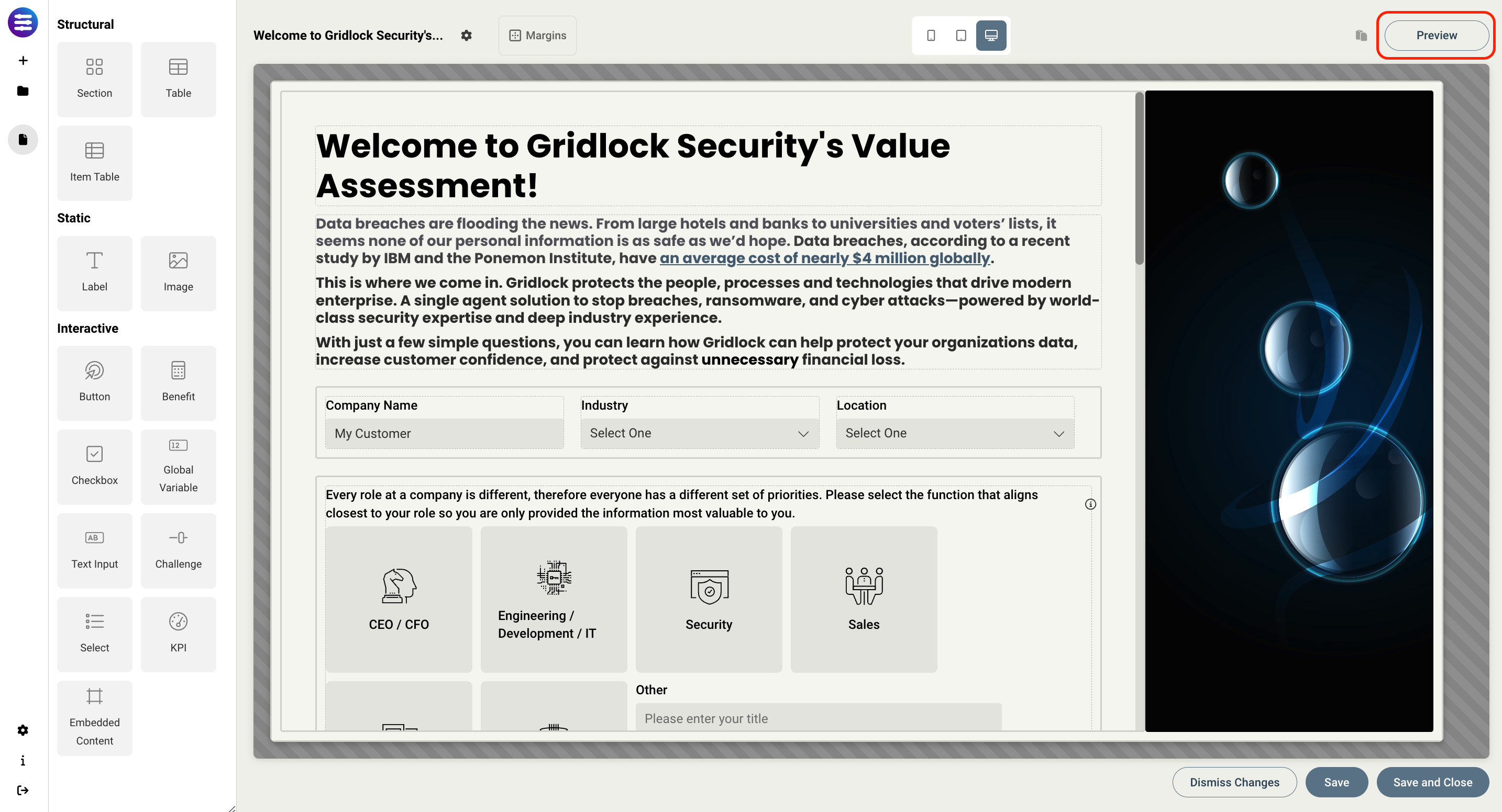
- Preview what the page will look like to an end user.
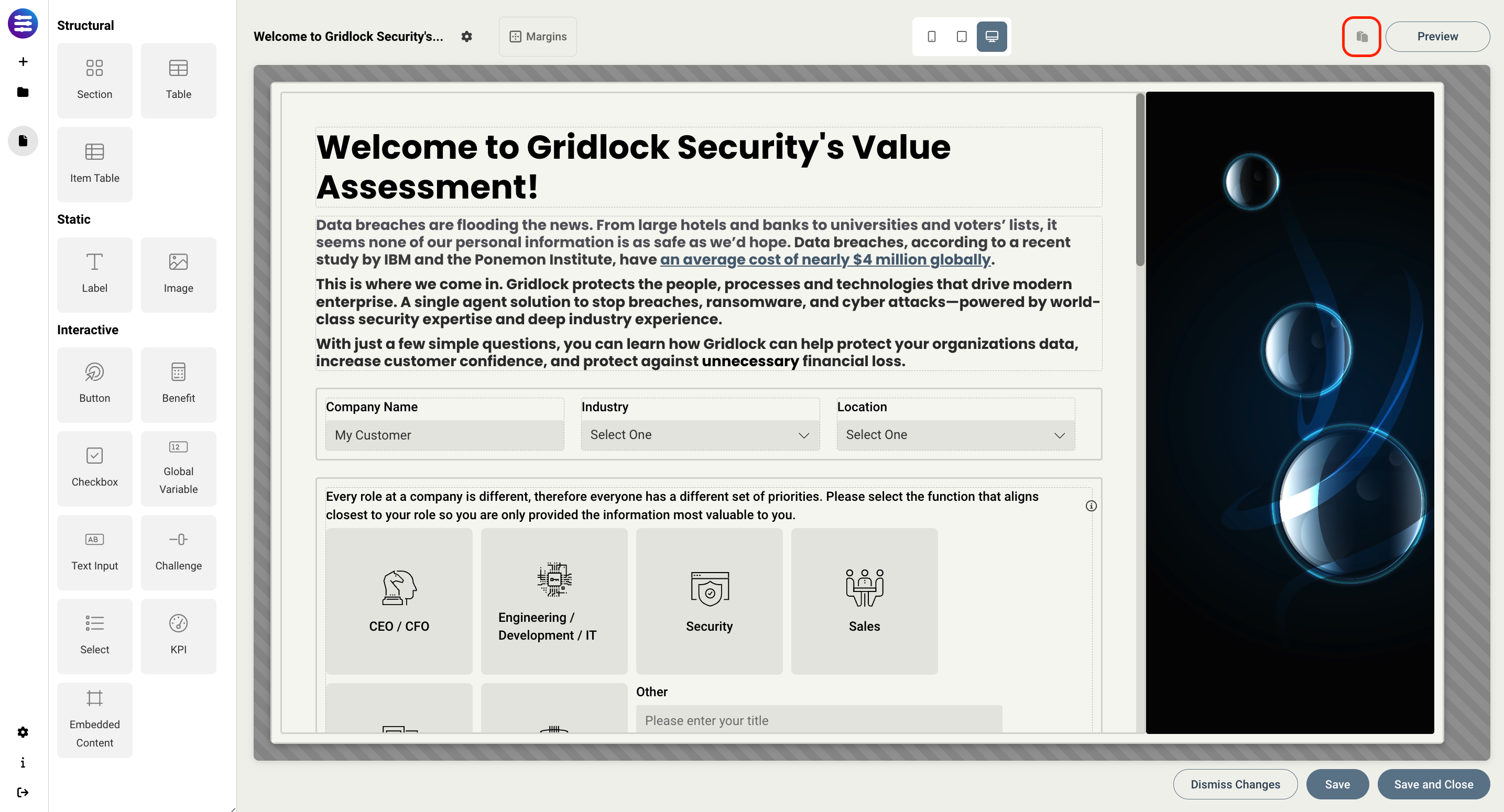
- Copy/paste whatever element is selected.
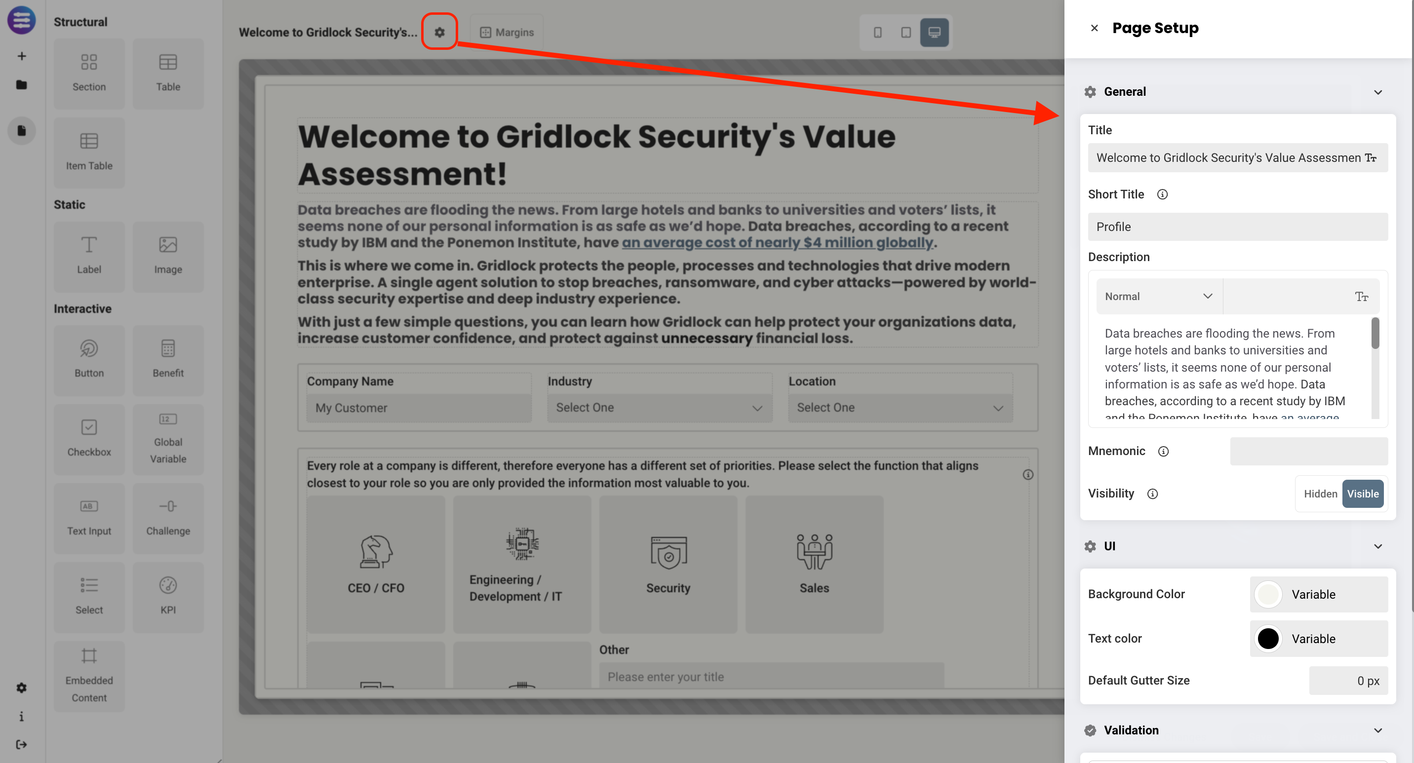
- Configure page settings, including
- Title and short title - this allows you to change the name of a page. Short title is what shows up in the Tabs at the top, title is what shows up on the page
- Description
- Mnemonic - read more about how mnemonics work in the Output Report Authoring Basics article
- Visibility - whether or not the page is hidden or visible by default. Rules can be used to change a pages visibility.
- Page color theme - read more about themes in the Managing your domain as an administrator article under the Template Themes section.
- Validation requirements
Sections
Sections have been improved to provide a baseline for all page layouts. Instead of just being a place to add items to a page, they can now be used to add structure to a page, giving you a framework to arrange all your elements easily and programmatically. You will have the option to select from custom section templates created by your organization that you've been given access to use, which enables sections to serve as reusable components across different analyses and pages, eliminating the need to recreate the same section multiple times.
Within the page editor, drag the Section icon to the desired position on a page add a new section. To use an existing section template, click Layouts to select and add an existing section template to your page.
Pro tip: Before creating a page, we recommend that you define what elements you want on the page, and where they will be located, this will determine how many sections exist on the page, where they should be placed, and how they should be sized to optimize your layout.
Here's an example:
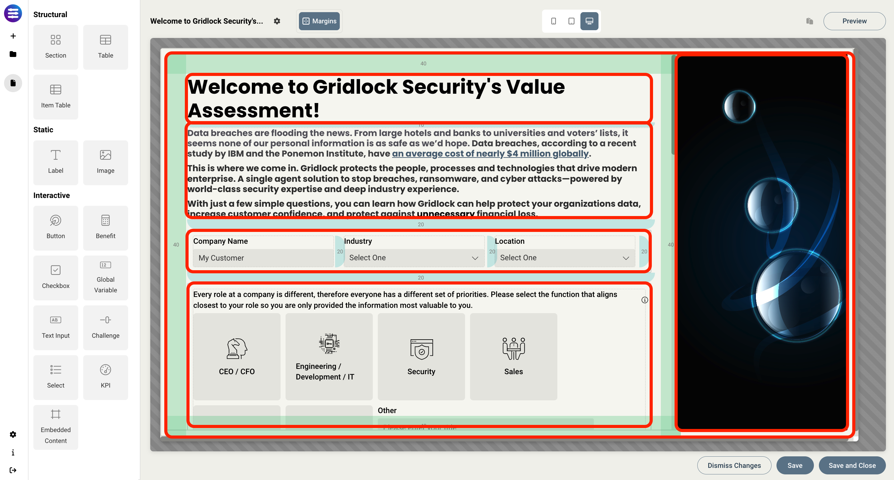
As you can see, a section was first placed in the background and expanded to meet the size of the page. This acts as the container that will hold all other sections. Then, we add additional sections for each group of elements, allowing you to easily organize the content on the page in an intuitive way. It also allows you to then copy an entire section and re-use it somewhere else without having to individually recreate each element on it's own.
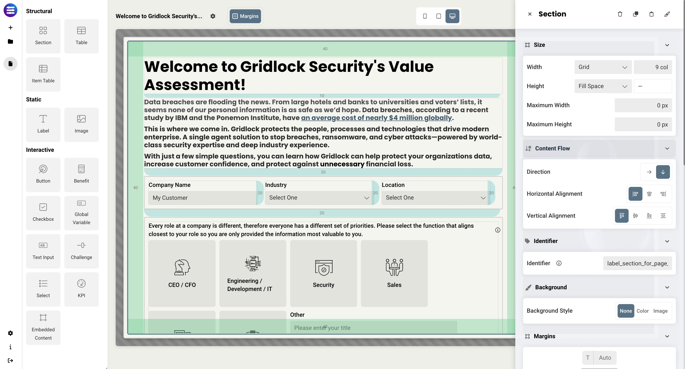
Sections (as well as all static and interactive elements) can be added to pages by dragging and dropping them onto the page. Each section has it's own set of design properties that can be customized. These include:
-
Size
- Grid - sets the size of the section based on the number of columns you want it to span across the page. A standard page is made up of 12 columns. So for example, two equal sections placed on a page would each span 6 columns.
- Fixed - allows you to set the exact size of the section using pixels or a percentage
- Fit content - makes it so the section expands to fit the content that it contains
- Fill space/available - expands the section to the size of the page, which will expand as you expand the window
-
Content flow
- Direction - determines how the content flows in that particular section. Horizontal will place elements side by side, and vertical will stack elements on top of each other.
- Horizontal alignment - this sets the content to flow from the left, flow from the right, or align to center. This works similar to how text in word can be structured.
- Vertical alignment - similar to horizontal alignment, this controls how the content will be arranged inside of a section
- Identifier - this gives the section a name that can be referenced in rules, e.g., hide/showing a section on a page
- Text color - this allows you to set a default color that get's applied to all text within that section, including Labels and Items.
- Background style - lets you set the background of the section to be transparent, a specific color or gradient, or an image. Any colors from your theme can be utilized here.
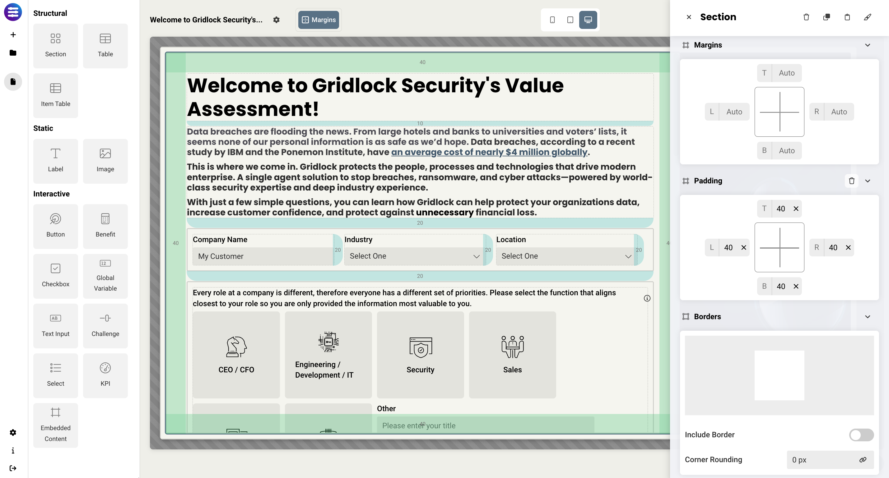
- Margins/Padding - allows you to space elements out on a page by adjusting the px size of margins and padding. Margins define the bounds outside of an element (pushes content away from it), and padding defines the bounds inside the element block but outside of the actual content (squishes content).
- Borders - allows you to add a border and define the weight of the border for any section. You may also link the border to a theme and add corner rounding if necessary.
- Drop shadow - allows you to add a drop shadow to a section to give a 3D shadow effect. You have the ability to adjust horizontal offset (px), vertical offset (px), blur amount (px), and the color.
- Visibility - allows you to define what devices each section will be visible on. For example, you may want to hide certain large sections on a mobile device because they take up too much space, or are not as relevant.
Troubleshooting tips
- If child sections are not spaced correctly on the page, make sure that the parent section is set to either Fit Content or Fill Available. This will expand the parent section to fit the content within it, or allow the child sections to expand to fit the size of the parent.
Replies have been locked on this page!