
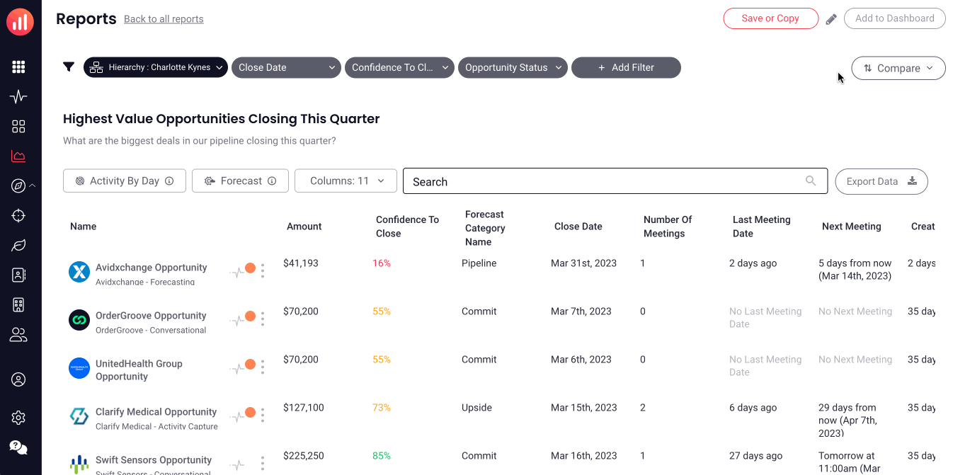
Grid Trends are an easy to understand visual that gives you immediate insight into how your current data is comparing to past data.
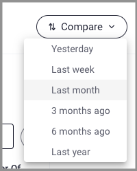
Add visual trends (up/down arrows) to your reports in just two clicks, allowing you to quickly compare current content to content in the past (e.g. Yesterday, Last Week, 6 Months Ago). When "compare" is enabled, the report grid will display trends in the cells of any content that have history tracking enabled and data changes for the selected period. These changes will be displayed by a green, upward arrow, red downward arrow to indicate the trend direction or a black up/down (or left/right in the case of dates) arrow to indicate a change occurred. Hovering over the arrow will display trend details.
By default, grid trends are available on all non-historical reports/cards. If you'd like to use grid trends for historical reports/cards, please reach out to your CSM.
Jump to:
Enabling Grid Trends
If you can see the Compare button, then there is history tracking content available on the report or card.
- Click on Compare
-
Select the desired time frame to configure how to compare the current content to content in the past (Yesterday, Last Week, Last Month, etc.) The report will now display trends with green/up arrows, red/down arrows or black up/down arrows to indicate changes in a cell. The compare button will now indicate the selected time frame, which can be changed at any point.
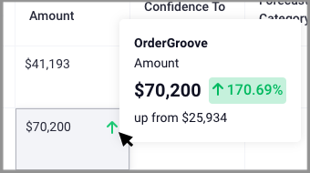
- Hover over any cell that has an arrow in it indicating a trend, and get a popup with more details of the change.
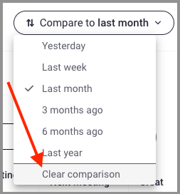
- To clear the Compare setting, select "Don't show comparison" from the Compare dropdown, the report will return to the state that does not include trends.
- To Save or Not to Save:
- Admin can save a comparison setting to a report, so that the next time the report is viewed it automatically shows the selected comparison.
- Anyone with Dashboard Edit access can save a comparison setting to a card (by saving the dashboard), so that the next time the card is inspected it automatically shows the selected comparison.
- If you do not want to save and have the trends appear when you return to the report/card, simply navigate to another page.
Understanding Grid Trends
Number Values (eg. Amount)
 |
The current value is more than the value at the beginning of the compare range, or there was no value at the beginning of the compare range but there is now |
 |
The current value is less than the value at the beginning of the compare range |
Date Values (eg. Close Date)
| Date was pushed out | |
|
Date was pulled in |
String Fields (eg. Stage Name)
 |
The current value is different than the last value, or the content had no value at the beginning of the compare range but does now |
Replies have been locked on this page!