
Creating Workspaces are the first things that you would be doing to create customized pages and content. Mediafly Engagement allows you to create powerful workspaces with interactive content and allow you to create customized customer experience. You can create workspaces from scratch, from existing templates, or duplicate existing workspace.
Workspaces have a lot of moving parts, to make navigating this article easier, we've provided a menu below so you can jump directly to your specific need(s). Each section will give you the option to return to this menu so you can find guidance exactly where you need it.
Menu
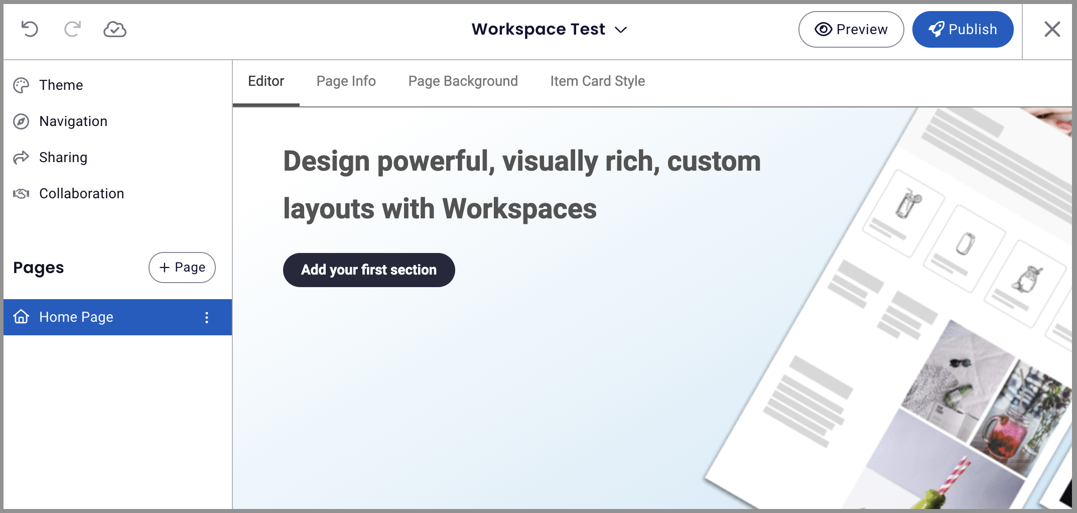
Creating a Workspace
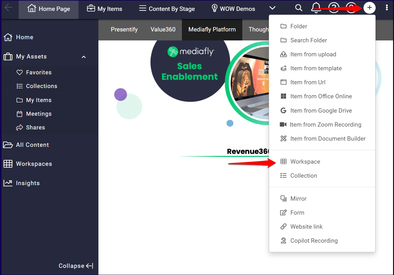
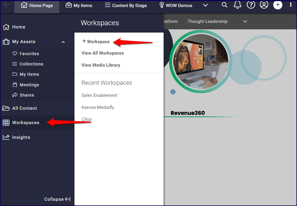
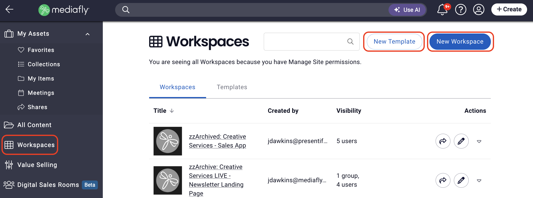
- Once you're logged in to the Mediafly environment, there are three ways you create a workspace:
a. Click on the '+' button > select Workspace
b. Click Workspace on the sidebar then click + Workspace OR
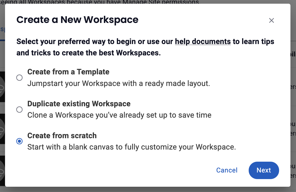
c. Click on View All Workspaces > New Workspace - Next you'll choose to Create from a Template, Duplicate existing Workspace or Create from scratch, then click Next.
Jump to:
Create from a template: Jumpstart your Workspace with a ready made layout.
-
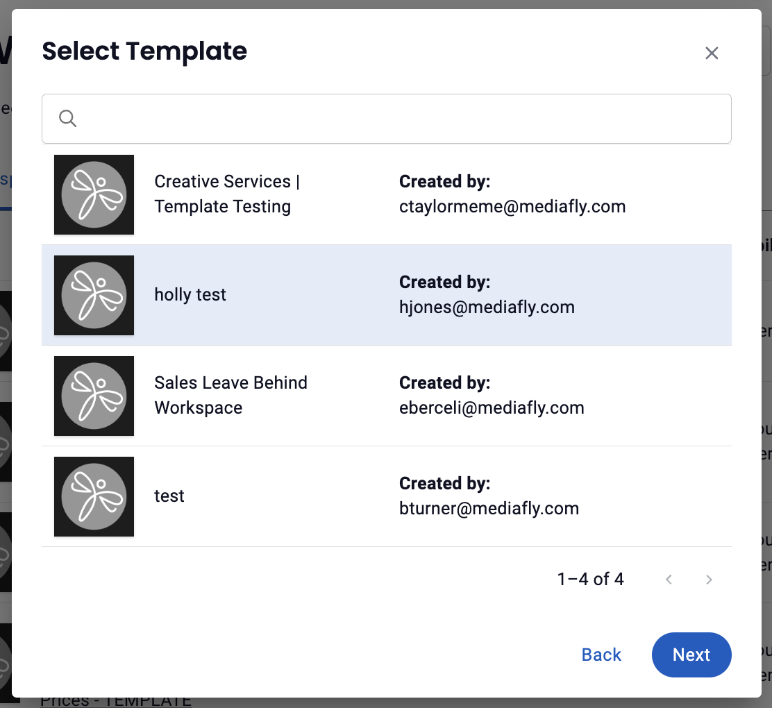
Select Template from the library of existing workspace templates to determine which workspace template you want to work from, then click Next
-
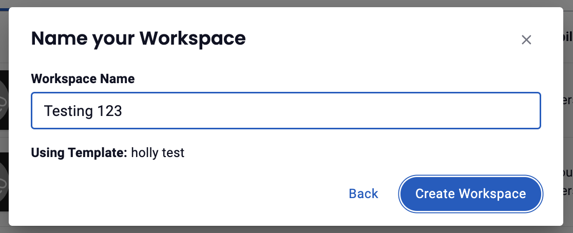
Name your Workspace, then click Create Workspace (Note: you'll see the name of the template you're working from listed here as well)
- Use the Workspace Editor to create a new workspace based on the selected template.
Duplicate existing workspace: Clone a workspace you've already set up to save time.
-
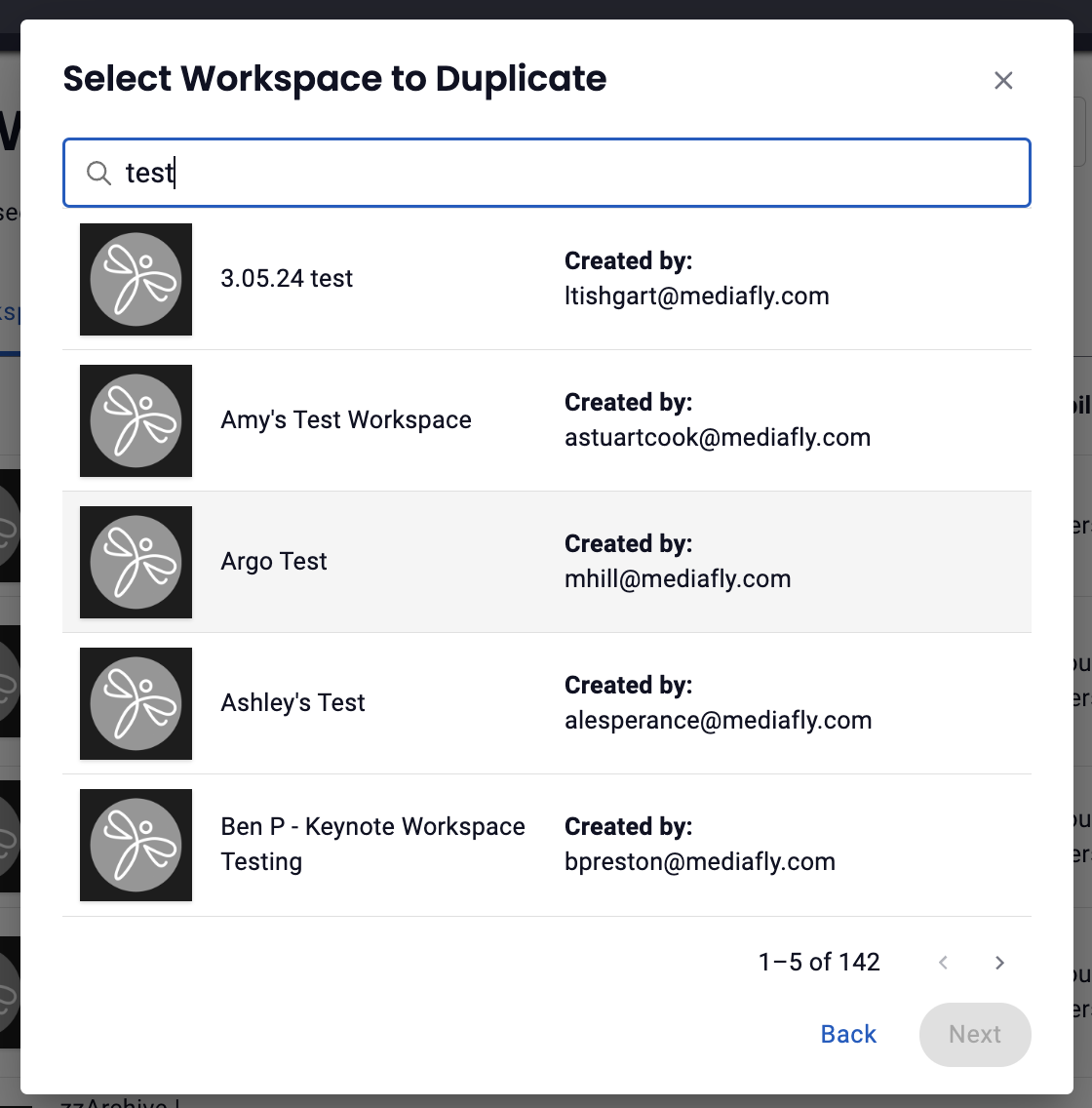
Select Workspace to Duplicate from the library of existing workspaces to determine which workspace you want to work from, then click Next
-
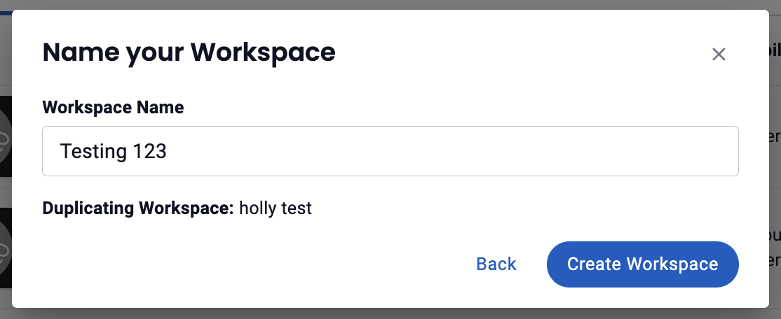
Name your workspace, then click Create Workspace (Note: you'll see the name of the workspace you've duplicated listed here as well)
- Use the Workspace Editor to create a new workspace based on the selected template.
Create from scratch: Start with a blank canvas to fully customize your workspace.
Use the workspace editor to design and layout your workspace.
Using the Workspace Editor
Workspace Toolbar
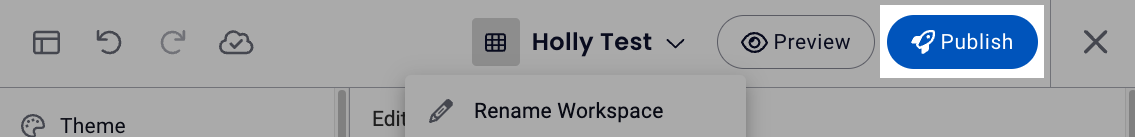
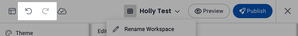
The workspace toolbar, which shows changes have been saved and includes the options to hide/show editor panel, undo, redo, show saved changes, rename, preview and publish a workspace is located at the top of the workspace editor screen.
Hide / Show Editor Panel
Click the Hide / Show Panel icon to control when the editor panel is visible, giving you more screen space to work with, ensuring a more accurate design experience.
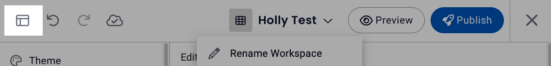
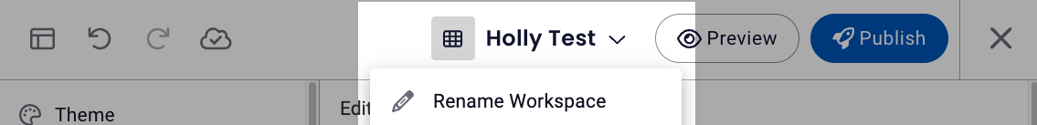
Renaming a Workspace
Renaming a workspace is now accomplished by clicking on the dropdown arrow by the title and selecting Rename.
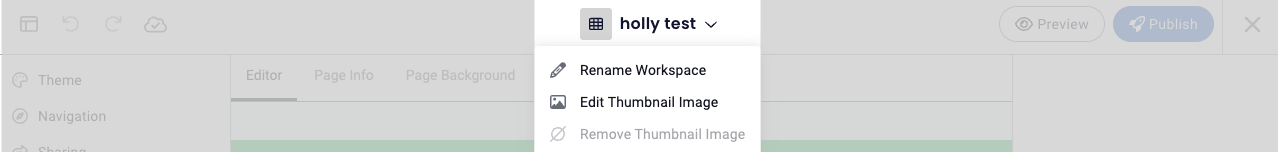
Workspace Thumbnail
You can add, edit or remove the workspace thumbnail. This will change the image icon for the workspace when you see it in folder menus.
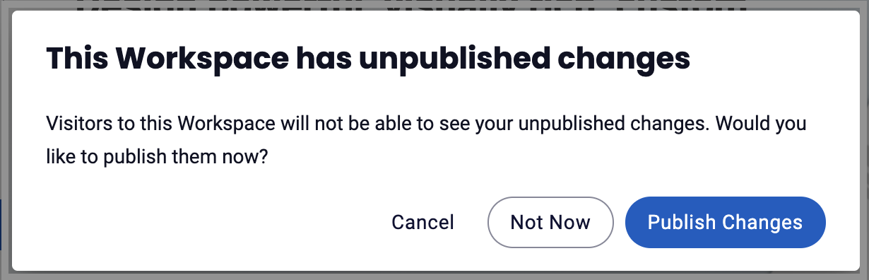
Publishing Changes
You can select Publish Changes to publish the workspace with changes or select Not Now to save the changes in a working draft until you're ready to publish.
Undo/Redo
The Undo/Redo option is a New functionality that allows you to undo/redo actions within an independent page. The Undo/Redo buttons:
- Only maintains the stack of changes within that current session
- Stacks are independent per page
- Only tracks changes to the pages and their content. It does not work for theme changes or page deletes, and our page delete UI makes it very clear so you don’t accidentally lose a page.
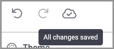
All Changes Saved
- The workspace editor will save changes as you go, you'll see this happening in the Workspace Toolbar:
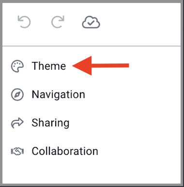
Theme
The Theme page provides four columns that are used to to create and update the page.
Theme Editor
A theme editor panel will appear on the right of the workspace, offering theme edits and a live preview that lets you instantly see how your theme changes will appear, so you can make confident decisions with every tweak.
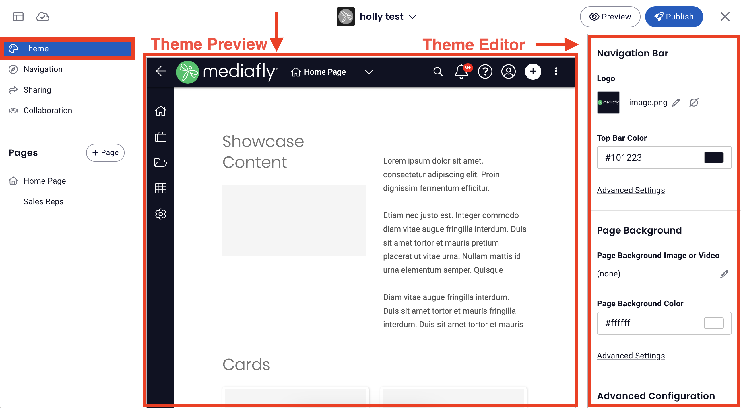
Navigation Bar
- Logo: upload/update logo
- Pro tip: When viewing a workspace, clicking on the logo will return viewer to the workspace's home page.
- Top Bar Color: update/select top bar color
- Advanced Settings
- Top Bar Color +Icon & Text Color: update/select top bar color + icon & text color
- Side Bar Color +Icon & Text Color: update/select side bar color, icon & text color
Page Background
- Page Background Image or Video: update/select background image or video
- Page Background Color: update/select background color
- Advanced Settings
- Text Color: update/select page background text color
Advanced Configuration
Card Styles
Default Theme Card Styles
Your admin has set up a default theme for a consistent, fast, and easy experience. Please contact your admin if you need to change it.
Custom Card Styles
- Thumbnail Shape
- Frame Corner Style
- Frame Color
- Drop Shadow
- Thumbnail Padding
- Title Style
- Title Length
- Title Text Color
- Hide Folder Counts
Folder Themes
This section is used to specify the themes of each folder in the workspace environment. This allows you to customize the look and feel of each folder according to it's content. Folder themes provide additional styling options on folders you visit inside a Workspace.
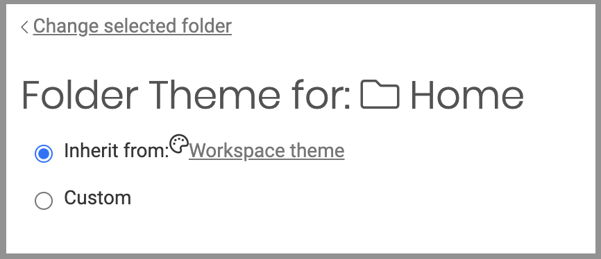
Inheriting Folder Themes
Every folder in the environment can have inherit a folder theme, or have it's custom theme.
The Home folder, being the folder at the top of the hierarchy, can inherit the workspace theme that is set in the Theme tabs of the Workspace section. The succeeding folders after the Home folder, and the subfolders of these folders, can either inherit the theme directly from it's parent folder, inherit the theme directly from the workspace theme, or have a custom folder theme of it's own.
In this example, the folder inherits the theme set on the Home folder. Since the Home folder inherited it from the Workspace theme, the child folder can also inherit the Workspace theme.
In this example, the My Items folder has it's own custom theme. Once defined, you can apply this theme to all child folders by marking the Apply this theme to all child folders check box.
If the Apply this theme to all child folders check box is unmarked, all child folders can inherit the theme from the workspace theme instead of the parent folder.
Customizing a Folder Theme
Folder Header
- Header Background Image: Use this to set the background image of the header by selecting or upload an item from the media library or in the folder content of your environment.
- Header Background Color: Set the header background color by enter the desired hex code or clicking the color block and selecting a color.
- Advanced Settings: Customize header background width & position and folder title color & alignment.
Folder Page Page
- Page Background Image: Use this to set the background image of the page by selecting or uploading an item from the media library or in the folder content of your environment.
- Page Background Color: Set the page background color by enter the desired hex code or clicking the color block and selecting a color.
- Page Icon & Text Color: Select dark or light for the page icon and text
- Advanced Settings: Customize background alignment
Side Content
This tab allows you to set whether or not side contents will be displayed. You can set the folder to display new items or most popular items on the side.
Child Folders
Enable "apply to all child folders" to apply this theme to all child folders within the selected folder to which the theme has been customized.
Navigation
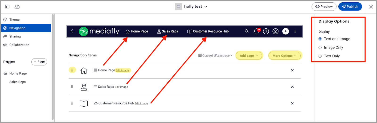
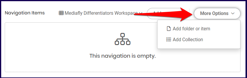
Workspace Navigation allows you to set clickable links that allows your users to move around the workspace site easily, from here you can:
- add pages or select More Options to add folders, items or collections to the workspace navigation
- adjust the order of navigation items
- edit image or icon for navigation items
- select display options to show text and image, text only, or image only for navigation items
Sharing
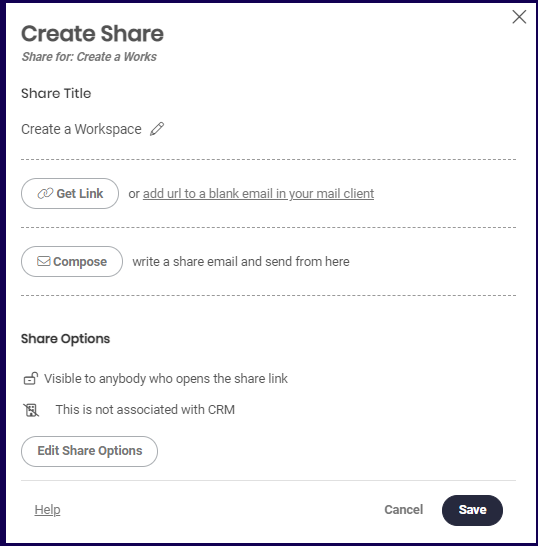
The Shared Links page allows you to create a share link of your workspace.
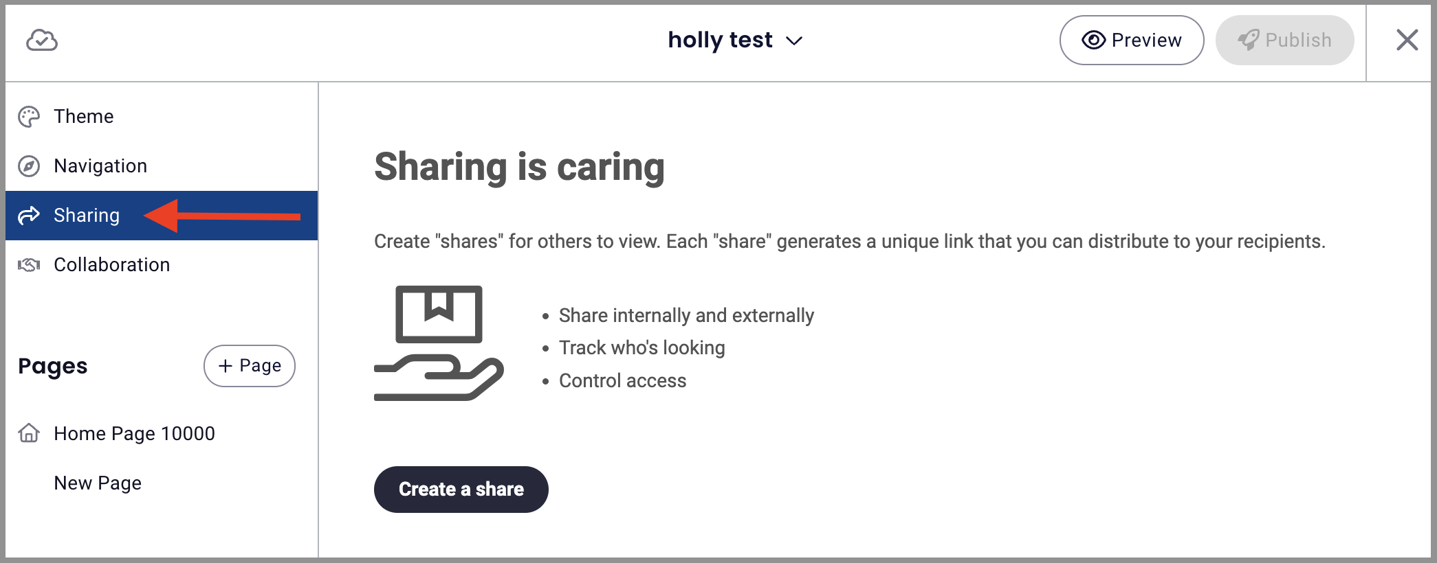
Click the Create a share button to create a new share. To learn more about how to create shares and the advantages of sharing, read Sharing content and track engagement with Mediafly.
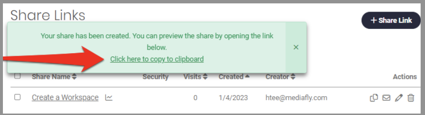
Once a share is created, you can preview the share by clicking on the link displayed on the floating window of the Share Links page.
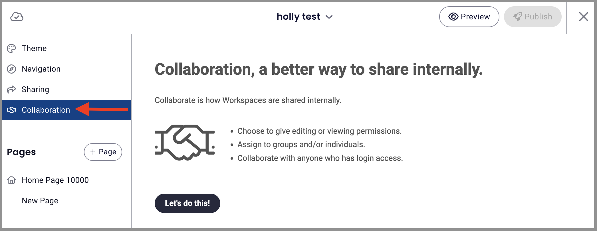
Collaboration
This page allows you to assign collaborators to the workspace. Read the Collaboration document to learn more of how to create a collaboration in workspaces.
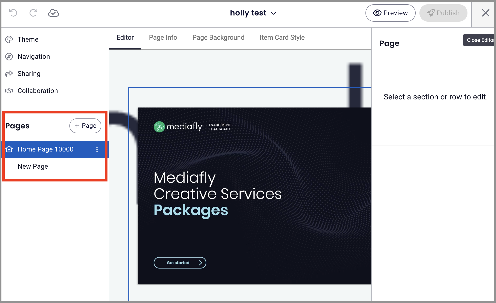
Pages
This section is used to create the different pages of the workspace. Workspaces can have multiple pages that will contain different items, files, folders, and documents. A page could also contain information about specific details that will organize the content of the workspace making it easier for users to navigate in the workspace and view content they are looking for rather than scrolling down a single large page.
A default page, the Home Page, is automatically created in your workspace. This serves as the first page and cannot be deleted even if a new page is created.
Creating a new Page
To create a new page, select the + Page button.
Creating a new page redirects you to the page type selection page. You can select between two types of pages.
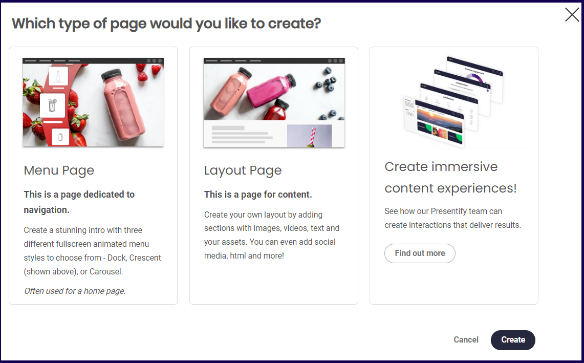
The Menu Page is a navigation page that allows you create an attractive, animated menu. While the layout page allows you to layout your own page and put in a diverse set of content. The last option is a link to Presentify which offers ways to create great interactions to your page.
Select between Menu and Layout page and click on the Create button.
Note: Clicking on the Create button without selecting a page type will redirect you to the page editor of a Layout page.
Page Actions
When accessing the Page section, a new button is provided at the bottom. Depending on type of page you created, the actions that you can perform varies.
Page Actions Menu
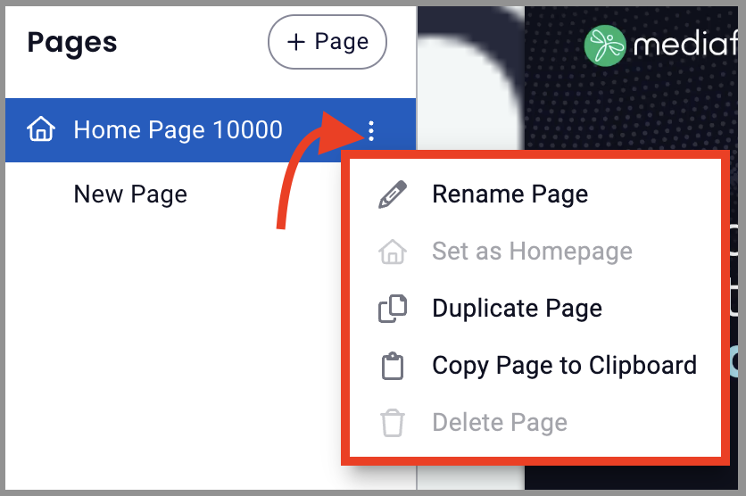
- Rename Page: Click to rename page within workspace
- Set as Homepage: Set a certain page as the homepage of the workspace
- Duplicate Page: Duplicate page to create a similar page where you can make changes rather than starting a new page from scratch
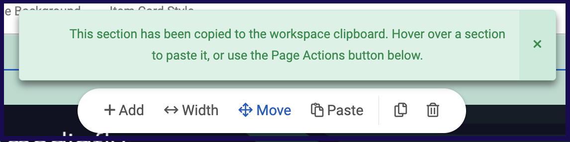
- Copy Page to Clipboard: This page action allows you to copy the page and paste in in any workspace, other than the current one. Selecting this action displays the following message on the page.
- Delete Page:This action deletes the page that you are currently accessing. This option is disabled if the page being accessed is the Home Page. Once selected, the Delete Page window is displayed. Click on the Delete button to confirm.
Within the page editor, you can also:
Add Section: Click + to add a section to the page, this action is only available in layout page types. It is is used to add a section in the page.
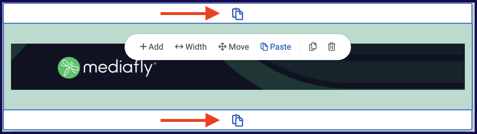
Paste Section: Paste a copied section, this action is only available in layout page types. Once a section is copied, this section becomes enabled and clicking this will paste the section below the current section that you are working on. If a page has been copied to clipboard, a Paste button appears next to the + Page button on the side menu of any workspace.
⚠ WARNING: If a page is deleted, it can no longer be retrieved in the workspace. ⚠
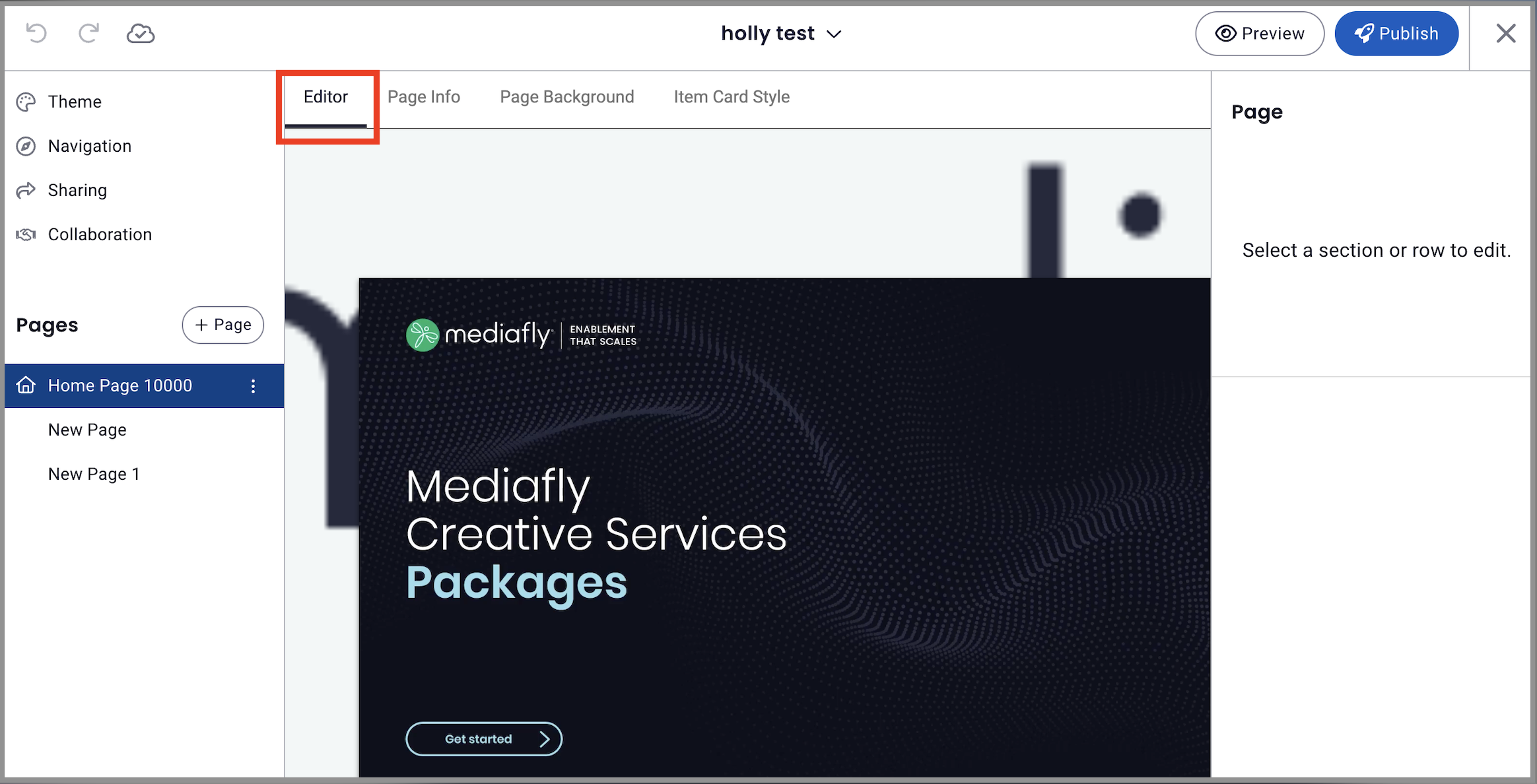
Customizing your Page
After you have created your page, you will be directed to the page editor. Four tabs are provided to assist you in creating a page.
Jump to:
- Editor Tab
- Menu Items Tab
- Page Info Tab
- Page Info (Menu Items) Tab
- Page Background Tab
- Item Card Style Tab
Editor Tab
The Editor tab is the tab where you can add sections and layout the actual content of the page. See the Adding Sections in a Page discussion to understand how to add sections on the page.
Menu Items Tab
If the created page is a Menu type, the Editor Tab is replaced with the Menu Items tab. In this page, you can add navigation items to create an interactive menu.
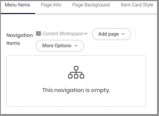
The menu items provides a navigation section that allows you to add several clickable links to the page. Users can add links to items, collections and from pages from within the workspace or pages in other existing workspaces.
Adding Pages in the Navigation Items
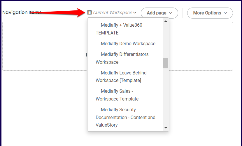
To add a Page, do the following:
1. Select which workspace the page to be added is from.
Note: Selecting Current Workspace will bring up all existing pages within the active workspace you are working on.
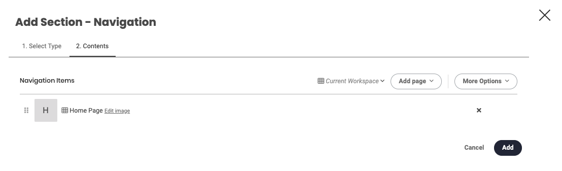
2. Once a Workspace has been selected, click on the Add Page dropdown and select which page to add to the navigation items.
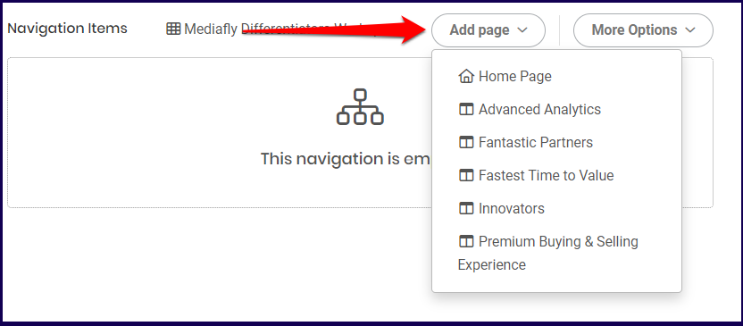
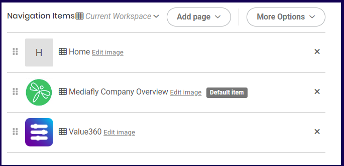
3. The selected item is displayed on the list.
The default display image of the added page will be the first letter of the page. Click on the Edit Image button to set the image of the navigation item.
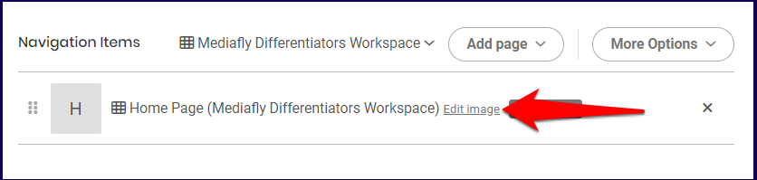
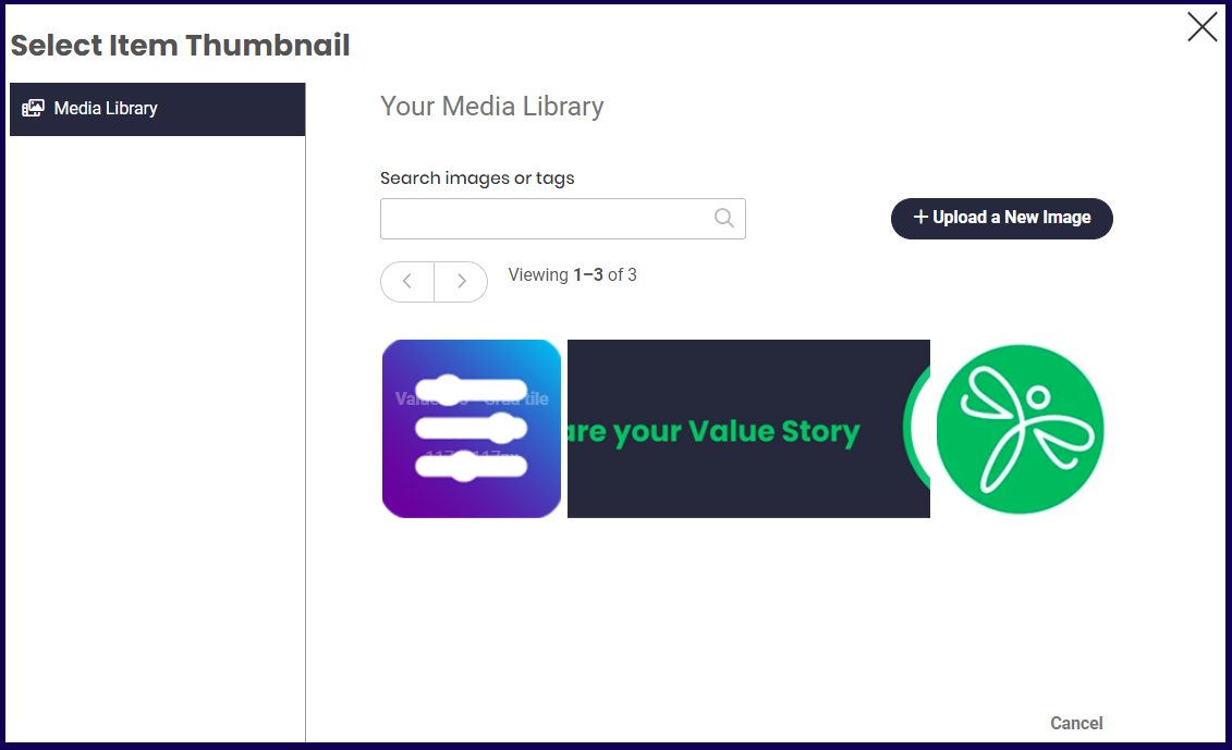
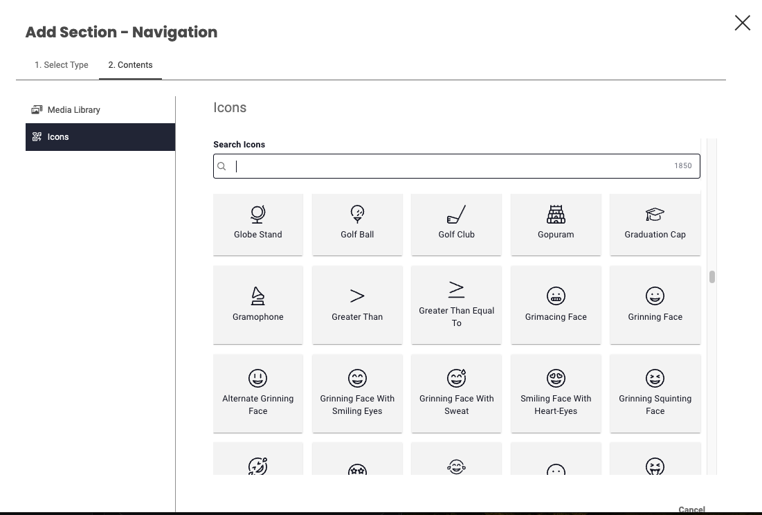
4. The Edit image button allows you to select from images uploaded into the Media Library, or select from a list of icons.
Adding Folders, Items, or Collections in the Navigation Item
To add an item or collection, click on the More Options button and select what you want to upload.
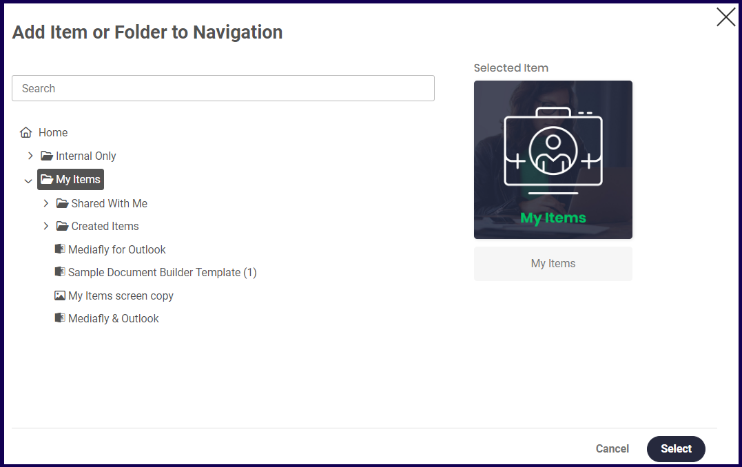
If the Add Folder or Item option is selected, browse through the list of items or the folder to add in the environment. Select the folder or item and click on the select button. Click on the Add button or set the display properties in the Display properties tab.
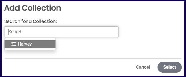
If the Add Collection is selected, a search field is displayed. Clicking the search field allows you to select from all Collections that you have permissions to access. Click on the Add button or set the display properties in the Display properties tab.
Setting the Default Item
The default item in the Navigation Items of a Menu page is the item that is shown first among the navigation items placed inside. When adding up to two navigation items, the most recent one added becomes the default item. When three or more items are added, the item at the very center of the arrangement becomes the default item. You may click and drag the list to rearrange them as you see fit.
In this example, the second item is the default as it is in the middle of the list.
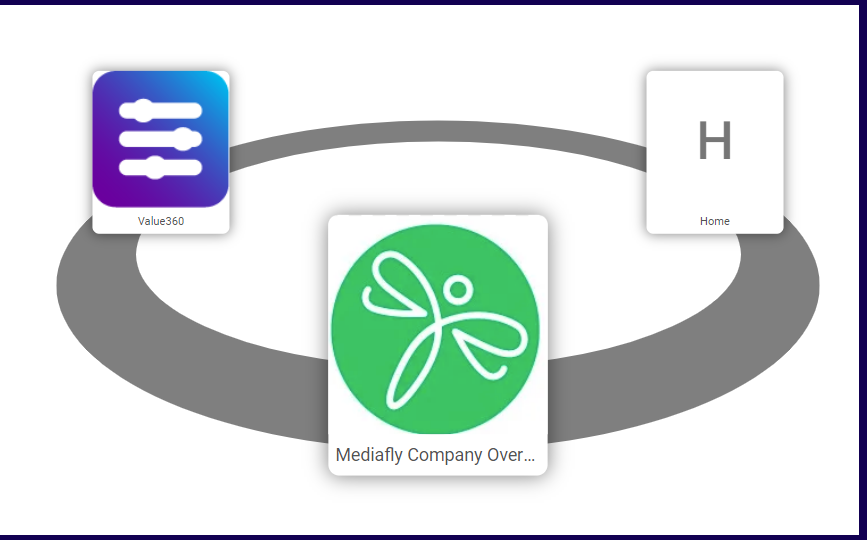
Using the above settings, a published Menu page will look like this:
Page Info Tab
The Page Info tab functions similarly to the Info tab in the Workspace section. See Info discussion to learn more about this tab.
Page Info (Menu Items) Tab
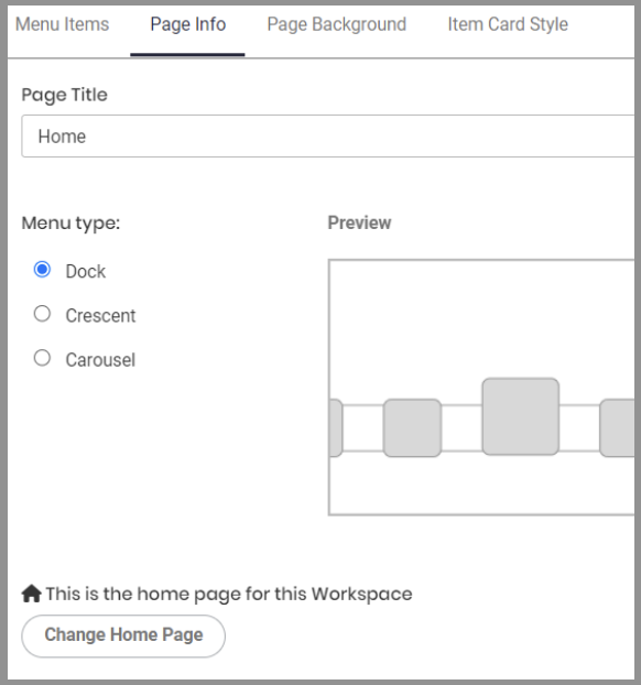
For Menu type pages, the Page Info allows users to select the menu type. There are three Menu types to select. A preview id displayed of each menu types. Mark the menu type you want to apply.
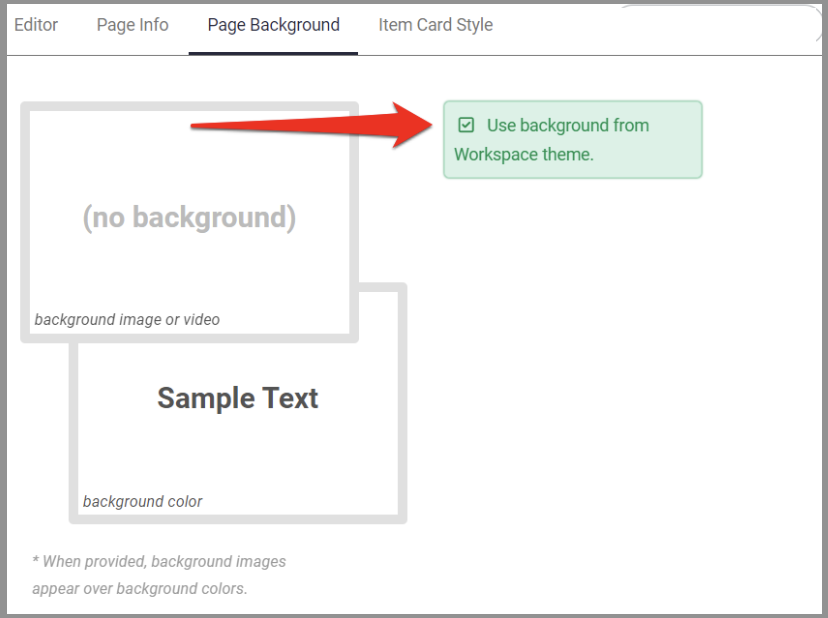
Page Background Tab
The Page Background tab functions similarly to the Page Backgrounds tab under Navigation and Theme of the Workspace section. See the Page Backgrounds discussion to learn more about this tab.
By default, the Use background from Workspace theme option is marked. Uncheck this field to modify the backgrounds of the page.
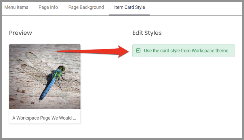
Item Card Style Tab
The Item Card Style tab functions similarly to the Item Card Style tab under Navigation and Theme of the Workspace section. See the Item Card Style discussion to learn more about this tab.
By default, the Use the card style from Workspace theme option is marked. Uncheck this field to modify the card style of the page.
Adding Sections in a Page
-
Add a Section
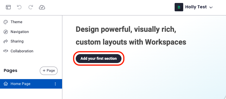
▪ If you're creating a workspace from scratch, you'll first be brought to a screen that asks you to Add your first section, simply click this button to begin.
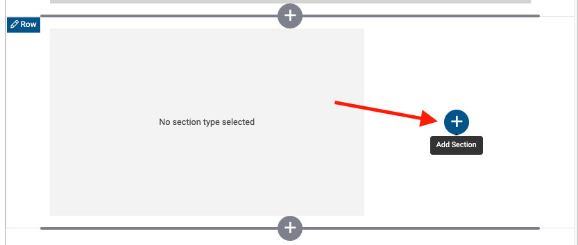
▪ If you're adding additional sections, click on the + button where you'd like to add another section. -
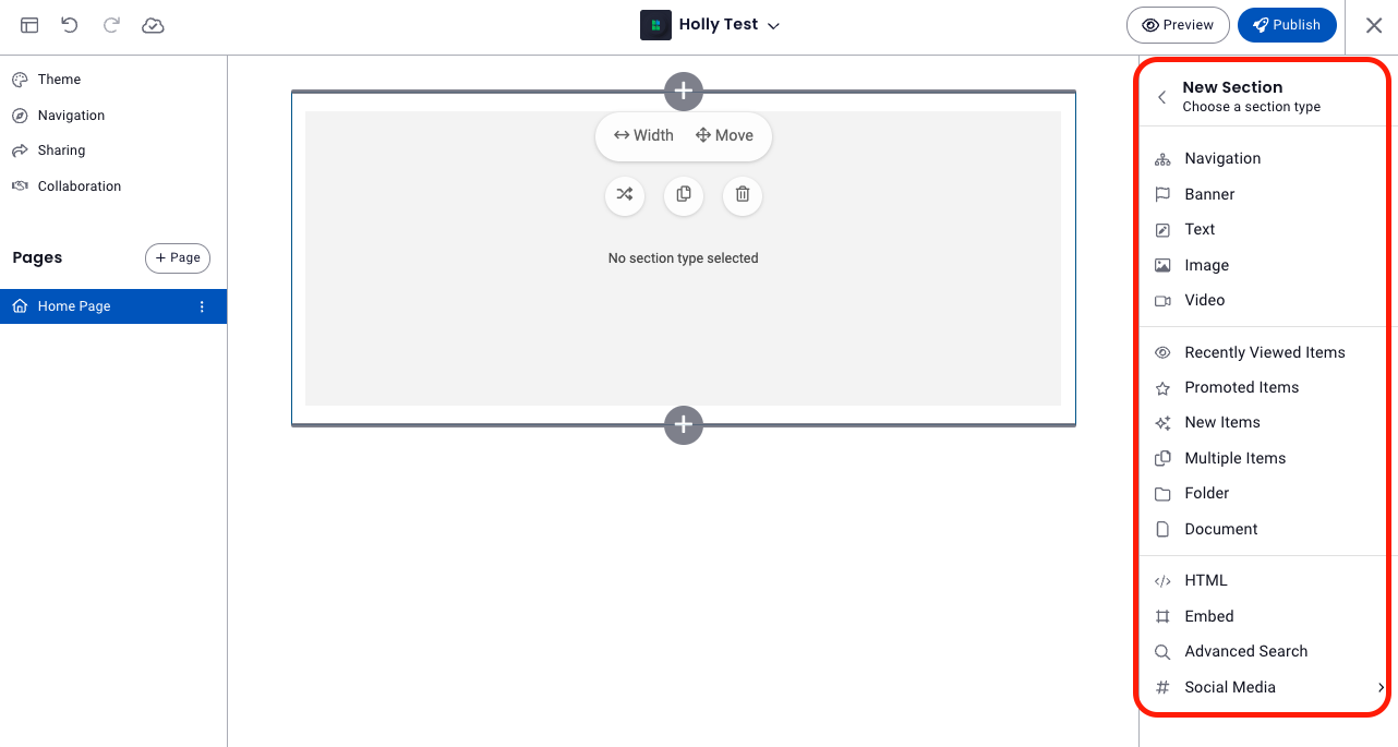
Choose a section type. A panel on the right will display possible section types which are listed below. Click on a section type in the table to learn more about it.
Navigation Banner Text Image Video Recently Viewed Items Promoted Items New Items Multiple Items Folder Document HTML Embed Advanced Search Social Media - Once you've clicked on a section type, a placeholder for that section type will appear and the panel on the right will display the option specific to that type. For example, if you selected image, this panel will allow you to select an image, then manage the title, background color, alignment, etc. Each section type will have its own options which are described in detail in the Section Types segment of this article.
Note: A workspace cannot be published with a placeholder unless you are admin creating a template. - Continue add sections by clicking on the + button where you'd like to add another section and repeating the process above.
Note: If you want to change the section type, simply delete the existing section by clicking on the trash can icon and selecting a new section type.
Section Layouts
Adding sections in the page can be arranged to a customized layout.
Clicking on a section will produce an edit window on the right and a pop set of options listed below.
Add
Clicking the Add button allows you to add sections on the corresponding direction that you select. Click on the '+' button in the direction or location where you want the new section to be added. Depending on the width and position of the section, you may not be able to add a section beside the section. Only sections with shorter widths allow you to add a section right next to it. In this example, the section has enough space to add another section to the right.
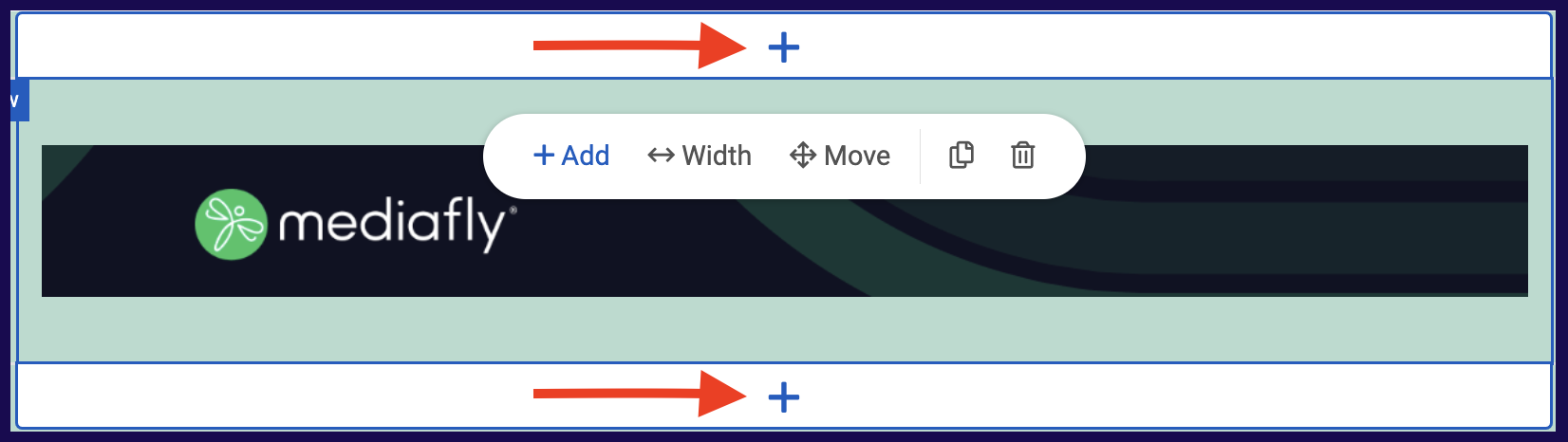
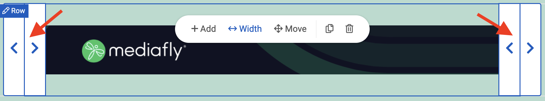
Width
Clicking the Width button displays several arrows which, when clicked, will increase or decrease the width of the entire section.
Note: The width buttons is only displayed if the section is still able to expand or shrink to that corresponding directions. If the item is unable to expand or shrink to a certain direction, the arrow disappears.
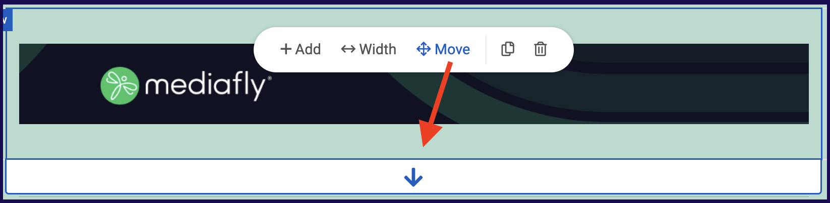
Move
Clicking the Move button displays the directions where the selected section can move to. For example, f you can only move the section down, only the down arrow option will appear.
Copy
The Copy button allows you to copy the entire section. Once a section is copied, the following message is displayed to confirm that the section is copied on the clipboard.
Paste
The Paste button only appears if there is a section copied in the workspace clipboard. Once the paste button is clicked, click the paste icon where you want the section pasted.
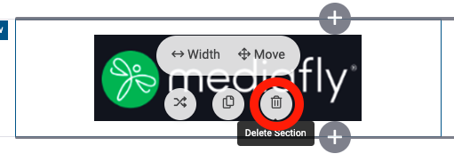
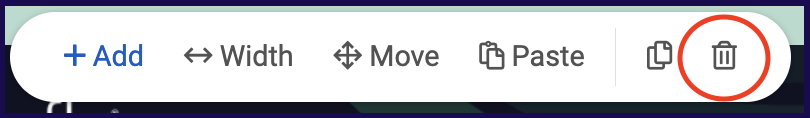
Delete
The delete button deletes the entire section. Clicking on this button will remove the entire section.
⚠ WARNING ⚠
If a section is deleted, it can no longer be retrieved in the page.
Section Customization
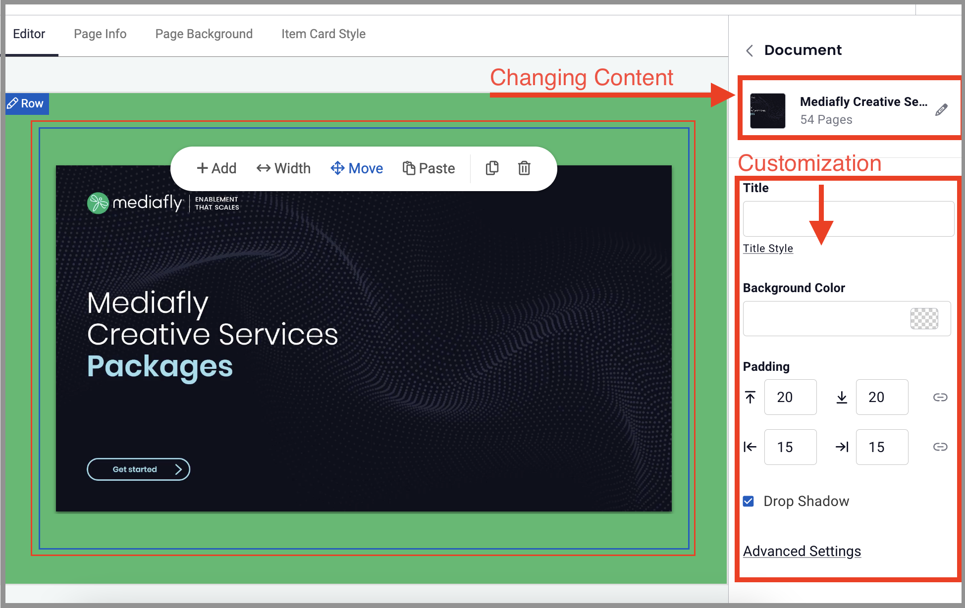
Click on the desired section to produce the section appropriate customization panel (based on Section Type's display options) on the right. Note that the top section is where you can click the edit icon to take you the dialogue to change the content, and the customization options are all available just beneath the content section. As you customize the section, you'll see the changes happening in real time.
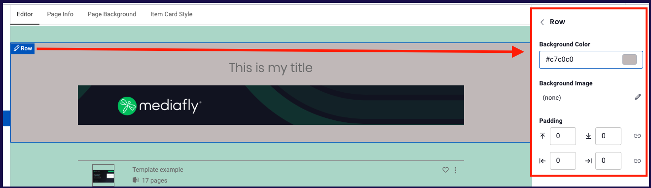
Row Customization
Click on the Edit Row icon to produce the row customization panel on the right. Here you can customize the background color, background image and padding of the row, this customizes only this row, not the page itself. Here you can see that the page has a green background and this single row's background is gray.
Section Types
Navigation
Allows you to add several clickable links to the page. Users can add links to items, collections and from pages from within the workspace or any other existing workspaces.
Adding Pages in the Navigation Section
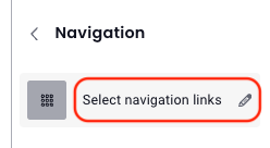
- Once you've selected the Navigation section type, click Select navigation links
-
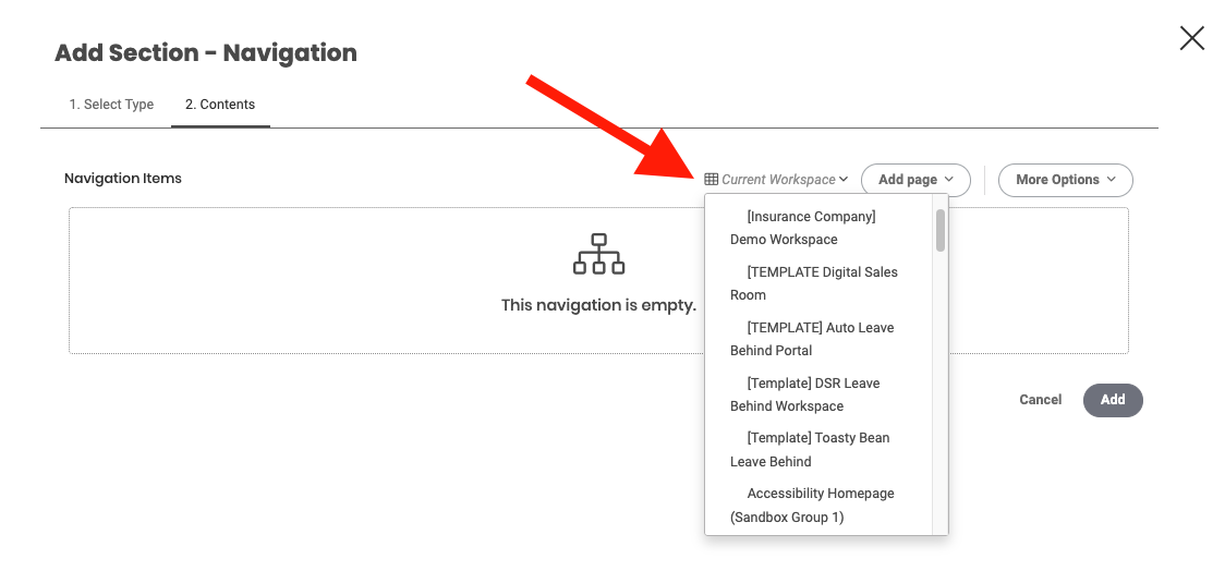
Select which workspace the page to be added is from.
Note: Selecting Current Workspace will bring up all existing pages within the active workspace you are working on. -
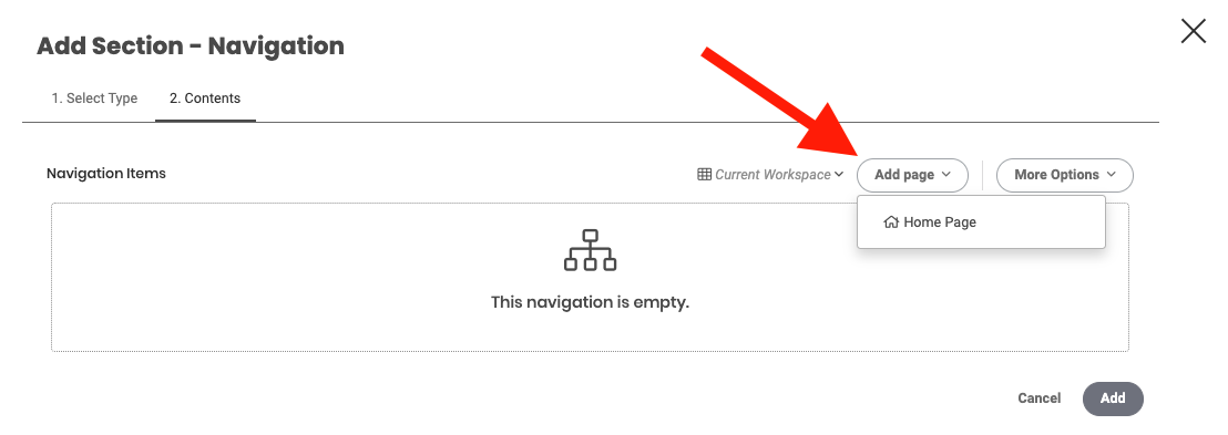
Once a Workspace has been selected, click on the Add Page dropdown and select which page to add to the navigation items.
- The selected item is displayed on the list. The default display image of the added page will be the first letter of the page. Click on the Edit Image button to set the image of the navigation item.
- The Edit image button allows you to select from images uploaded into the Media Library, or select from a list of icons.
Adding Folders, Items, or Collections
To add an item or collection using the Add section - Navigation, click on the More Options button and select what you want to upload.
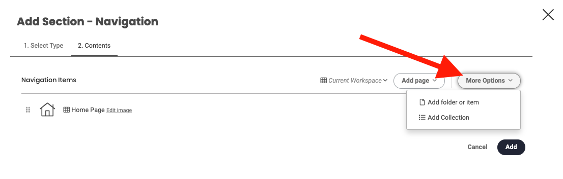
If the Add Folder or Item option is selected, browse through the list of items or the folder to add in the environment. Select the folder or item and click on the select button, then click Select.
If the Add Collection is selected, a search field is displayed. Clicking the search field allows you to select from all Collections that you have permissions to access. Click Select.
Navigation Display Options
Clicking on a section in the workspace will populate a customization panel on the right that will display the the options specific the section type.
- Title
- Style: This allows users to select the style of all navigation items to either Grid format, or Menu.
- Background color: This allows users to change the background color of the navigation style.
- Display: This allows users to set if the navigation item will display text and image, Text only, or image only.
- Padding: Allows users to set the padding area, which is the space between the navigation item's image and the borders.
- Replace Section: will empty the section type selection, but leave the section
- Delete: will delete section
Banner
This allows you to create a customized banner or use an existing banner for your page.
See Banner Builder for a detailed step-by-step procedure to add a banner.
Banner Display Properties
Clicking on a section in the workspace will populate a customization panel on the right that will display the the options specific the section type.
- Background: color or image
- Background Color
- Banner Height
- Banner Content: text or logo
- Text
- Text Color
- Text Size
- Font
- Font Weight
- Alignment
- Replace Section: will empty the section type selection, but leave the section
- Delete: will delete section
See Creating customized graphics for Workspaces for details of graphic recommendations and sizes of uploaded images.
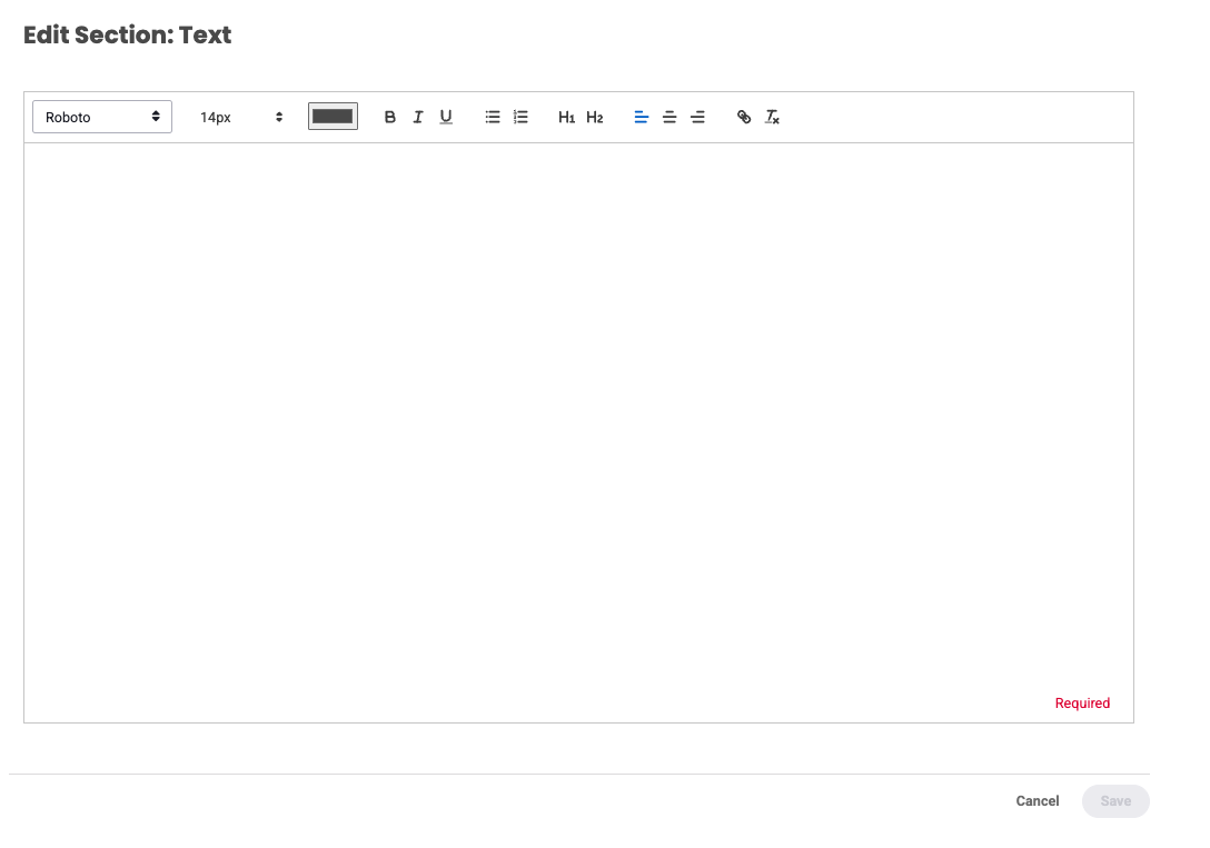
Text
This is used to add a text section into the workspace page.
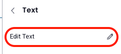
- Click Edit Text to add text content.
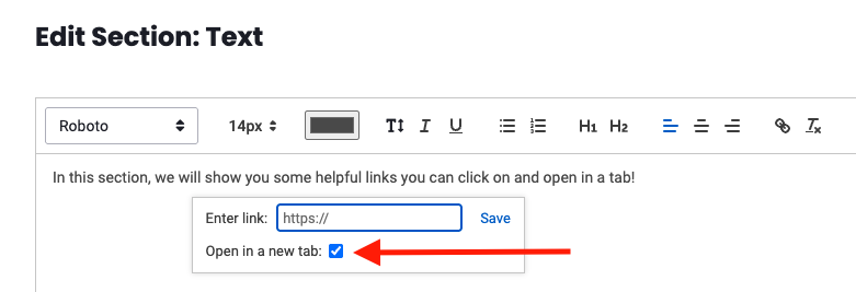
- The Edit Section: Text window will open, allowing you to create and alter the style, size, font color, paragraph alignment, or add links to the text. Remember to click Save!
Pro tip:When adding hyperlinks in a text section, select “Open in a new tab” to have the link open in a new tab.
Text Display Properties
Clicking on a section in the workspace will populate a customization panel on the right that will display the the options specific the section type.
- Title
- Background color: This allows users to change the background color of the text section.
- Padding: Allows users to set the padding area, which is the space between the text contents and the borders of the section.
- Replace Section: will empty the section type selection, but leave the section
- Delete: will delete section
Image
This is used to add an image into the page.
- Click Select an Image
- Click Change image, you will be given the option to select images either from the Media Library, or you may browse images in the folder contents of the environment. Select your image and click Save.
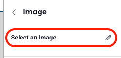
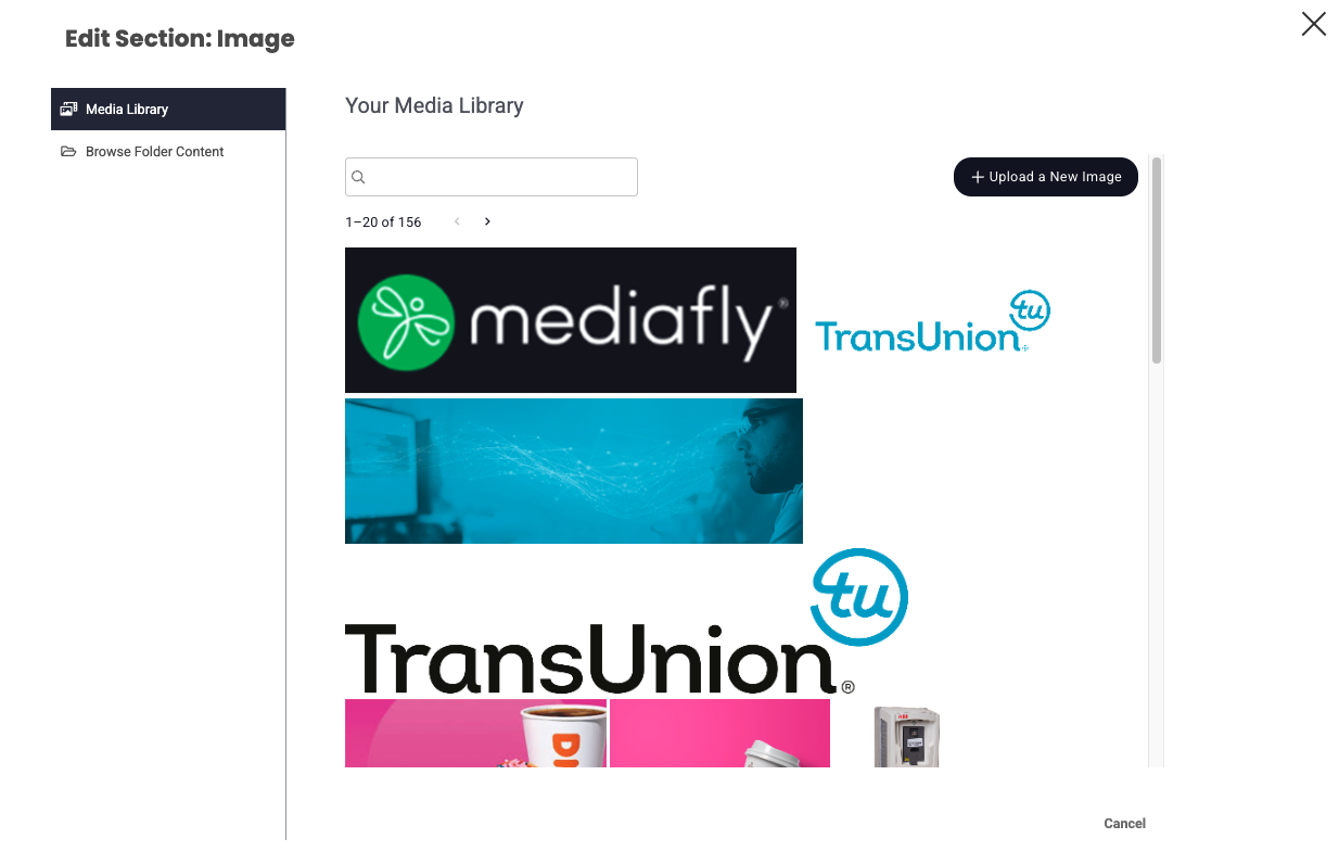
Image Display Properties
Clicking on a section in the workspace will populate a customization panel on the right that will display the the options specific the section type.
- Title: This allows users to set the title of the image.
- Background color: This allows users to change the background color of the image section.
- Alignment: This allows users to set the alignment of the image. Select between left, center, or right alignment.
- Padding: Allows users to set the padding area, which is the space between the image and the borders of the section.
- Replace Section: will empty the section type selection, but leave the section
- Delete: will delete section
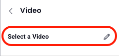
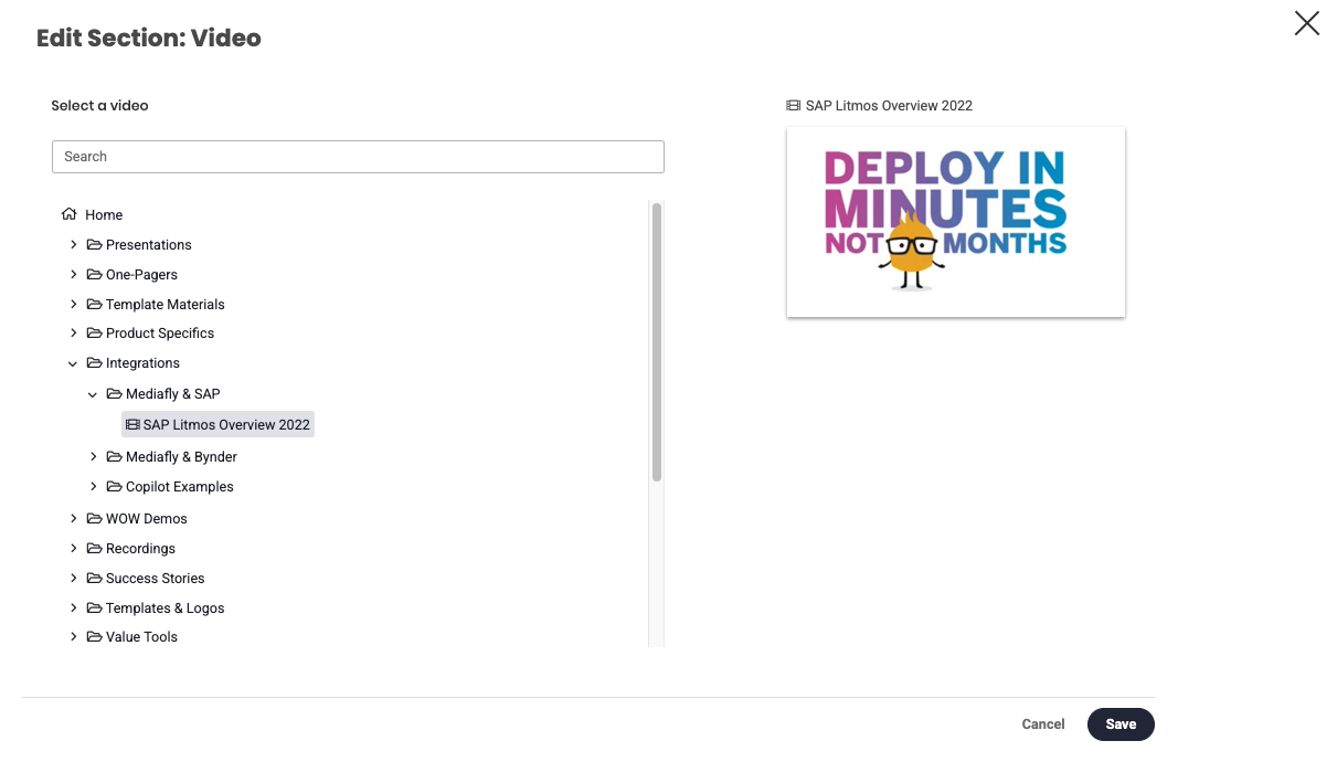
Video
This is used to add videos to the page.
- Click Select a Video
- Browse through the folders to select the video you want to be placed in the page. Once a video has been selected, a preview of the video is displayed. Click Save .
Video Display Properties
Clicking on a section in the workspace will populate a customization panel on the right that will display the the options specific the section type.
- Title: This allows users to set the title of the video.
- Background color: This allows users to change the background color of the image section.
-
Auto Start (audio will be muted): This allows users to set that the video will automatically start upon loading the page.
Note: As indicated, the audio will be muted when this is enabled. - Padding: Allows users to set the padding area, which is the space between the video and the borders of the section.
- Replace Section: will empty the section type selection, but leave the section
- Delete: will delete section
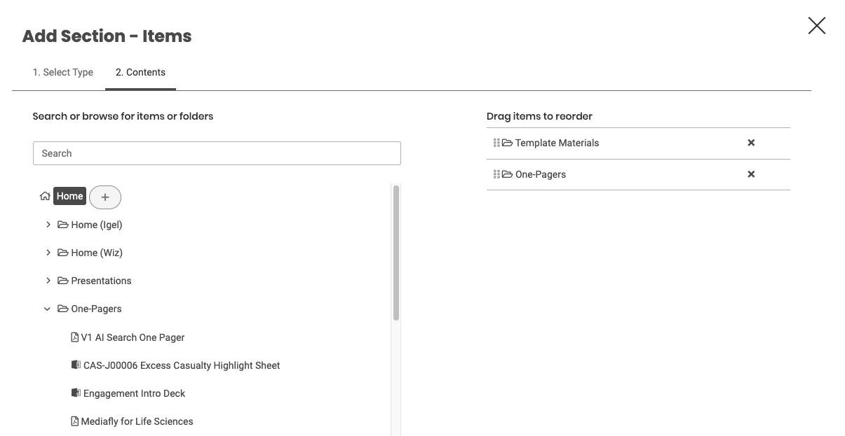
Items
This is used to add an item within the environment into the created page.
1. Browse through the files and select the item you want to add. Once selected, a +button is displayed next to the item. Click on the plus item.
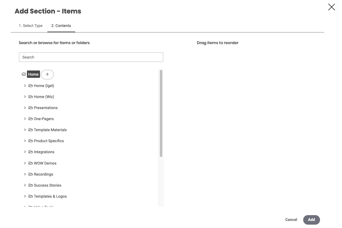
2. The items added is displayed on the right. Drag the files to rearrange the items. Click Add.
Item Display Properties
Clicking on a section in the workspace will populate a customization panel on the right that will display the the options specific the section type.
- Item Display Type: This allows users to select the style the folder is created. Users can set the display to Table and Grid.
- Title: This allows users to set the title of the items inside the section.
- Section background color: This allows users to change the background color of the folder style.
- Padding: Allows users to set the padding area, which is the space between the items and the borders of the section.
Folder
This is used to share the folder location into the created page.
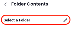
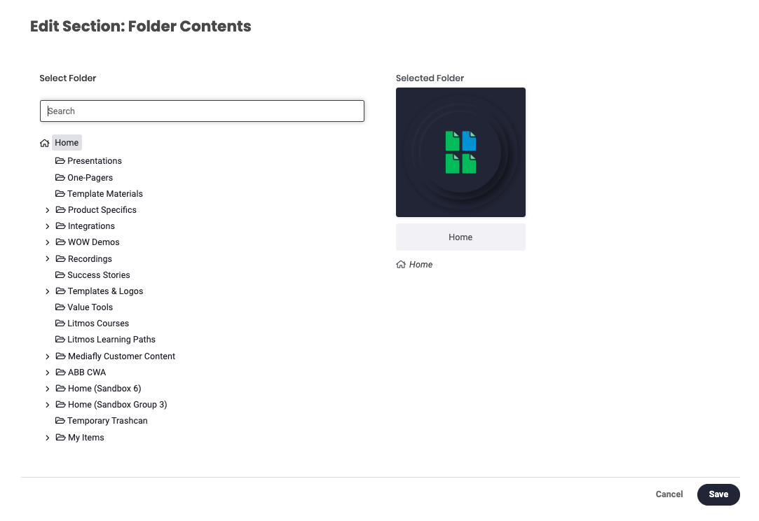
- Click Select a Folder
- Select desired folder and click Save.
Folder Display Properties
Clicking on a section in the workspace will populate a customization panel on the right that will display the the options specific the section type.
- Background color: This allows users to change the background color of the folder style.
-
Display Mode: This allows users to select the style the folder is created. Users can set the Folder display to Table, Grid, and, Folder Thumbnail.
Note: Table and Grid style shows the items inside the folder, while Folder Thumbnail only shows the folder itself. - Max number of items: This field is used to specify the number of items displayed for Table and Grid display type.
-
Title
Note: This field is hidden if Folder Thumbnail is selected. - Show Item Count: enable to show # of items in folders
- Padding: Allows users to set the padding area, which is the space between the folder's contents or thumbnail and the borders of the section.
- Replace Section: will empty the section type selection, but leave the section
- Delete: will delete section
Document
This is used to upload a document into the page.
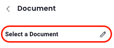
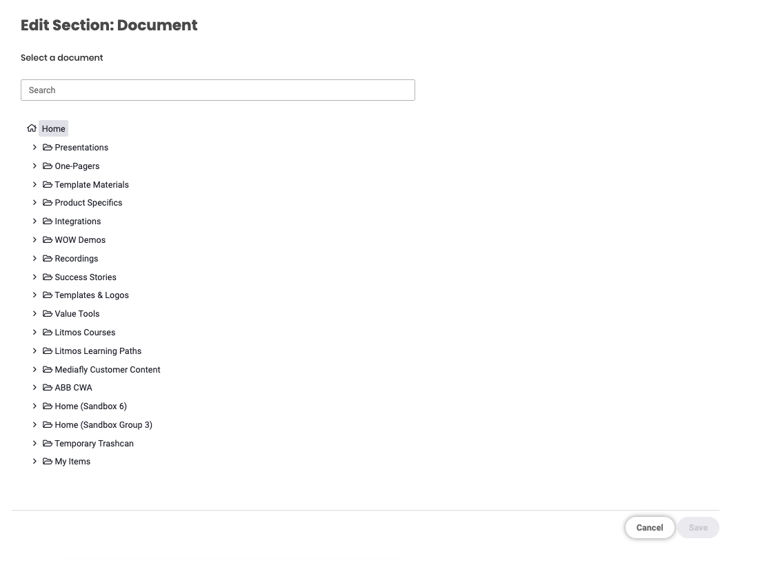
- Click Select a Document
- Browse through the folders to select the document you want to be placed in the page then click Save.
Document Display Properties
Clicking on a section in the workspace will populate a customization panel on the right that will display the the options specific the section type.
- Title: This allows users to set the title of the video.
- Background color: This allows users to change the background color of the document section.
- Padding: Allows users to set the padding area, which is the space between the video and the borders of the section.
-
Advanced Settings
- Paging Controls: This sets the paging controls end user will have access to when viewing the document. The paging controls can be set to None, Previous/ next page buttons only, and All paging controls.
- Start Page: Use this to set the page where the document begins if it is accessed or viewed.
- Show link to document view: Mark this to show a link to open the item in viewer mode.
- Replace Section: will empty the section type selection, but leave the section
- Delete: will delete section
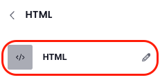
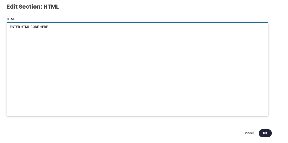
HTML
Use this section to create a custom HTML section to be displayed on the workspace page.
- Click HTML
- Click Edit HTML then specify the HTML code on the space provided and click OK.
HTML Display Properties
Clicking on a section in the workspace will populate a customization panel on the right that will display the the options specific the section type.
- Background color: This allows users to change the background color of the HTML section.
-
Max Height: This allows users to set the height of the embedded objects. See Creating customized graphics for Workspaces for details of graphic recommendations and sizes of uploaded images.
- No maximum: Leave blank for no max height
- Title
- Padding: Allows users to set the padding area, which is the space between the video and the borders of the section.
- Replace Section: will empty the section type selection, but leave the section
- Delete: will delete section
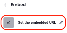
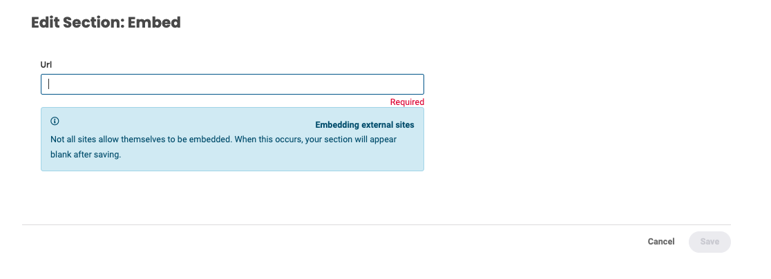
Embed
Allows users to embed an item from an external site into the section. Depending on the permissions of the site, an item may or may not be embedded and the section will appear blank after saving the item.
- Click Set the embedded URL
- Enter the URL and click Save.
Embed Display Properties
Clicking on a section in the workspace will populate a customization panel on the right that will display the the options specific the section type.
- Title
- Background color: This allows users to change the background color of the embedded section.
- Height: This allows users to set the height of the embedded objects. See Creating customized graphics for Workspaces for details of graphic recommendations and sizes of uploaded images.
- Padding: Allows users to set the padding area, which is the space between the video and the borders of the section.
- Replace Section: will empty the section type selection, but leave the section
- Delete: will delete section
Advanced Search
This is used to add the list of a search results in Mediafly into the created page and allows any viewers who have access to the workspace see the items in the search result regardless of their logged credentials. For more information about Search results, read the Creating Viewable Search Result Sections in Workspaces article.
For more reading on Advanced Search, try: Creating dynamic sets of content with Advanced Search Results.
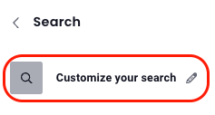
- Click Customize your search
-
Enter the keyword of the search result you want to add into the page. In this example I searched for the keyword, 'outlook'. The search results is immediately displayed.
- Refine the search as necessary to show the specific search result you want the end user to see. Once the search has been refined, and the items that you want to be shown is selected, click Save.
Note: The items inside the search result section can be viewed by guest users.
Search Display Properties
Clicking on a section in the workspace will populate a customization panel on the right that will display the the options specific the section type.
- Title
- Background color: This allows users to change the background color of the search result section.
- Display Mode: This allows users to select the style; Table or Grid.
- Maximum Number of Items: enter the maximum number of items displayed
- Padding: Allows users to set the padding area, which is the space between the search results contents and the borders of the section.
- Replace Section: will empty the section type selection, but leave the section
- Delete: will delete section
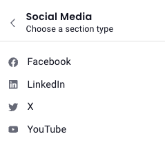
Social Media
Use this to embed a section from the offered Social Media options.
- Once you've selected Social Media as the section type, choose Facebook, LinkedIn, X or YouTube.
- You will then proceed as you would with any HTML section.
LINE
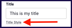
Title Style
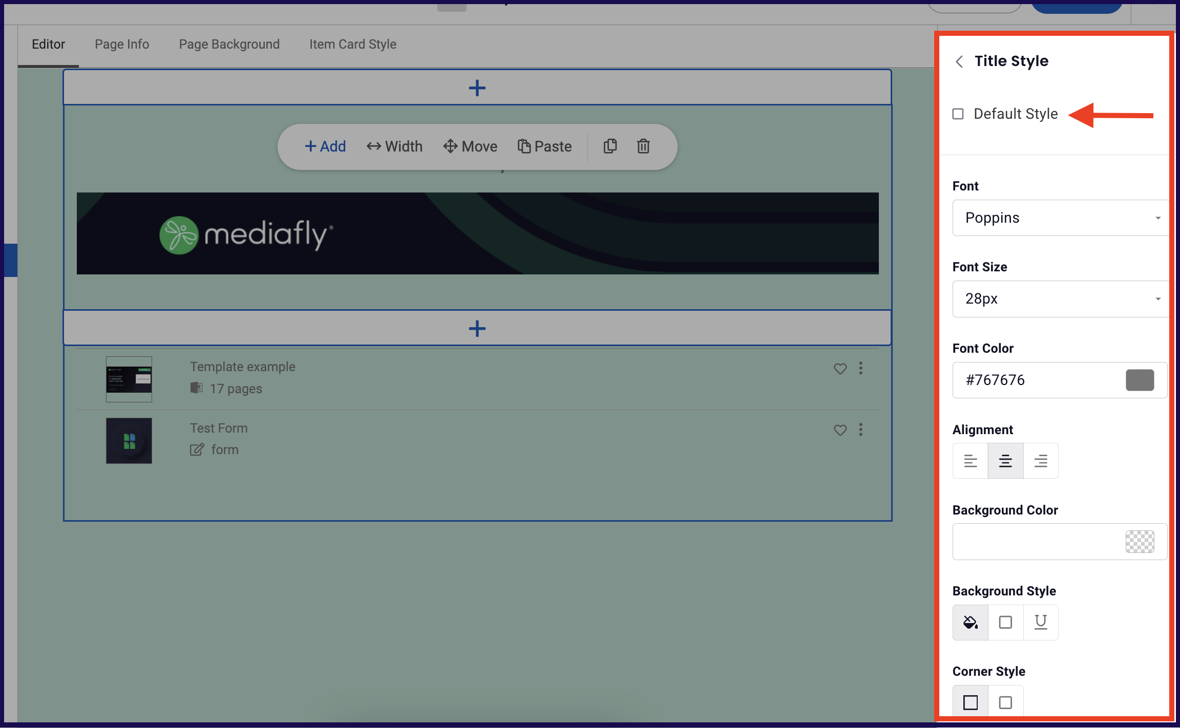
Some section types allow you to add a title. Adding a title to a section is optional, and once you do, its style is initially set to the default. To customize the title style click on Title Style and uncheck "Default Style" to expand the title style customization options listed below.
- Font: Click on the drop down arrow and select the font you want for the title.
- Font Size: Use this to change the font size.
- Text Color: Change the text color by inputting the corresponding hex number on the field, or clicking the color button to view and select colors from the color palette.
- Align: Use this to set the alignment of the title. You can align the title to be at the left, centered, or aligned right.
- Background Color: Change the background color surrounding the title by inputting the corresponding hex number on the field, or clicking the color button to view and select colors from the color palette.
-
Background Style: Use this to set how the background color is applied on the text.
- Solid: Covers the background of the text with the selected background color.
- Bordered: Creates a border around the title area with the selected color. Selecting this background style displays three option for the thickness of the border. You can set the border style to be thin, medium, or thick.
- Underlined: Creates an underline that covers the entire title area. Selecting this background style displays three option for the thickness of the underline. You can set the border style to be thin, medium, or thick.
- Corner Style: This allows you to set the corner style of the text.
Replies have been locked on this page!