
TL;DR: Interactive Cards are adjustable versions of base reports that live exclusively on a dashboard and allow you to make real-time changes without modifying the base report. You get flexible data faster and keep a more manageable report library.
Interactive cards are configurable versions of existing reports you can add to a dashboard. These cards will use the base report's data while allowing dynamic changes to the card as it lives on a dashboard, giving you flexible insight and complete control over what you're looking at.
Instead of creating and configuring new reports for slight alterations, interactive cards provide a 10 second edit experience and make it super easy for non-admins to manipulate data without opening the definition editor. Cards also make it easy for business users to create new cards, without requiring the ability to create a new report (only admin can create new base reports).
In addition to simplifying access to flexible data, interactive cards help reduce the number of unique reports that are created in the system and reduce the number of OOTB reports, making base reports easier to find and your library easier to navigate.
Jump to:
- What You Need to Know
- Dynamic Time Frame
- Dynamic Hierarchy
- Filters
- Change View Type
- Rename Card
- Benchmark Lines
- Color Set
- Sort By
- Use Case by Role
What you need to know
- Click the card context icon on a card to access the dynamic options

- Who can adjust data?
- Users without edit permissions on a dashboard can dynamically adjust and view data
- Users with edit permissions on a dashboard can accomplish the above and save those changes to the dashboard
- Admin can accomplish the above and create/edit base reports
- These permissions give users the chance to adjust data and inspect it from different perspectives while protecting the dashboard as it was built by the editor.
- Cards are dynamically editable versions of base reports that live on the dashboard...and only on that dashboard. You can find a list of the base reports on the All Reports Page.
- Report Summary: Hover over the filter funnel icon to the left of a card title for a report summary that shows you what dashboard, base report and card filters are being applied, as well as any hierarchy, attainment filter, etc. so you know exactly what information you're seeing.
- Unsaved changes will not be included in an emailed report, even if the changes are currently visible on the card.
Dynamic Time Frame
The interactive time frame lets you dynamically change the time frame of data being shown on a card while maintaining the data of the base report. Not only does this give you quick access to different time frames, but you can reduce the number of cards on a dashboard by changing the time frame for different views rather than creating a report for each time frame.
For example, you may currently have a dashboard with Closed Won this Week, Closed Won this Month, Closed Won this Quarter and Closed Won this year reports (four reports with all the same data for different time periods) and can replace it with ONE Closed Won report where you can quickly view those different periods dynamically on one card, or create multiple cards with the same base report but different time frames.
Check out this Interactive Time Frame Video for an in depth video on how it works.
Compare to Previous Period
While you're in the Dynamic Time Frame, some cards will offer the option to Compare to a previous timeframe. When available, this option will allow you to compare the selected card's data to the same data from a previous period. This option is only available when the report has:
- a date rage on the X-axis
- has NO Split by or Overlay line
- is NOT a historical report
- can only compare previous Quarters or Years and split by more than a week (month, quarter, etc.)
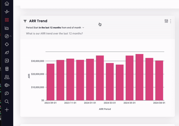
Below you can see an ARR Trend card that shows the last 12 months of data, then we choose to compare by Quarter and see a side by side comparison of each month of the current & previous quarter.
Dynamic Hierarchy
Interactive Card Hierarchy lets you keep the base report data, but shift the data to illustrate the report data for a specific level of the hierarchy.
Card Filters
To further customize an interactive card, you can add, update, and remove card level filters. Filters that are already included in the base report will not be available in the card filter menu. Once a card filter is added, the card data will adjust accordingly.
If you have edit access to a dashboard, you can save filter changes to that card, on that dashboard. If you do not, you can still adjust card filters for inspection purposes, but you will not be able to save those changes. Changes to a card do not affect the base report.
To view existing filters, click the filter funnel icon positioned to the left of the card title to present a summary that displays any dashboard, report, or card level filters that are already being applied to the card.
To add a card filter:
- Click on the sliding scale icon in the top right corner of the card
- Click +filter
- Select the filter & adjust it fit your needs
- Click Apply
To adjust an existing card filter:
- Click on the sliding scale icon in the top right corner of the card
- Click on the desired filter
- Adjust the filter to fit your needs
- Click Apply
To remove a card filter:
- Click on the sliding scale icon in the top right corner of the card
- Click on the desired filter
- Click Remove Filter
- Click Apply
Change View Type
You can change the view type of a card if you want to see the data using a different visualization than the base report.
- Click on the sliding scale icon in the top right corner of the card
- Click Change View Type
- Select from the populated visualization options
We can see the card below changing from a bar chart to a table; the same data is included, only the visualization of that data has changed.
Rename Card
Being able to rename a card on the dashboard is part of what makes interactive cards so amazing! The base report gives you a starting point, being able to adjust that data by time frame, hierarchy, etc. lets you quickly tweak and edit that report, then rename and keep the tweaked card card on a dashboard for future use. Gone are the days of creating new reports for each perspective!
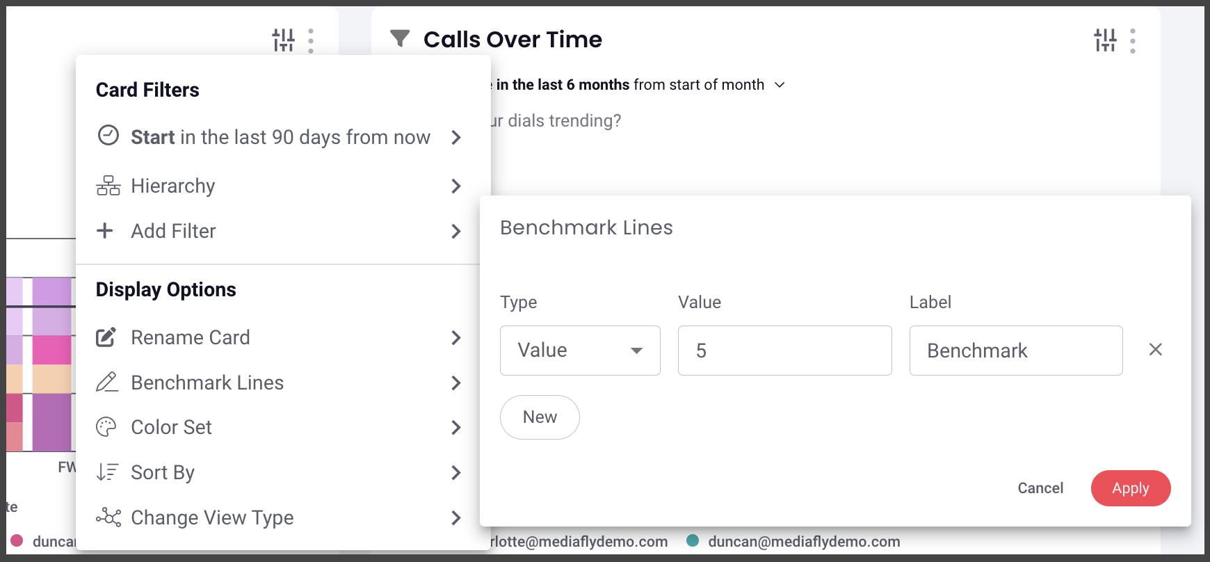
Benchmark
You can adjust the type, value & labels of existing benchmark lines & add new ones directly from the interactive card.
You can benchmark performance against a metric or a target when it doesn't make sense to use goals or the reference is a moving target, eg. a team average. Reference lines give analytics more context, and can help identify "good" and "bad" results by comparison.
Note: The benchmark option will only be visible when benchmarks are enabled on the base report.
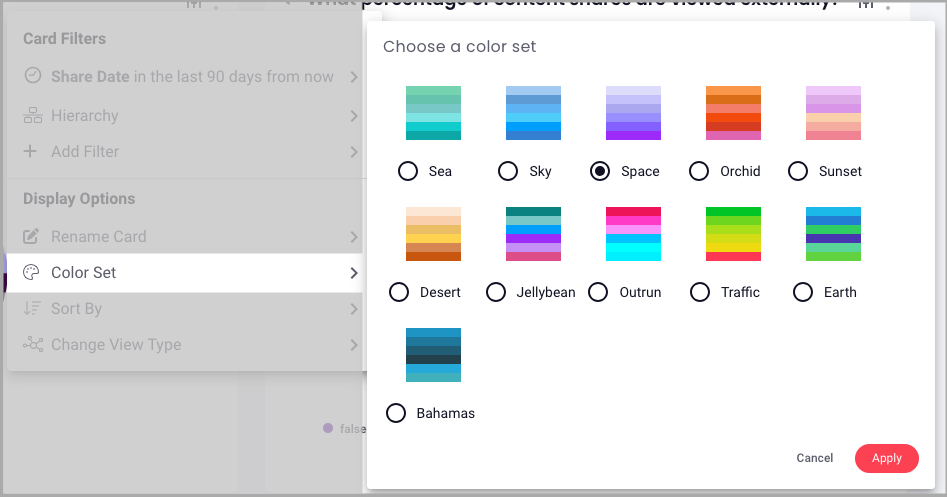
Color Set
You can make adjustments to the color set of a card right from the dashboard. Simply click the filter icon > color set > make your selection & save.
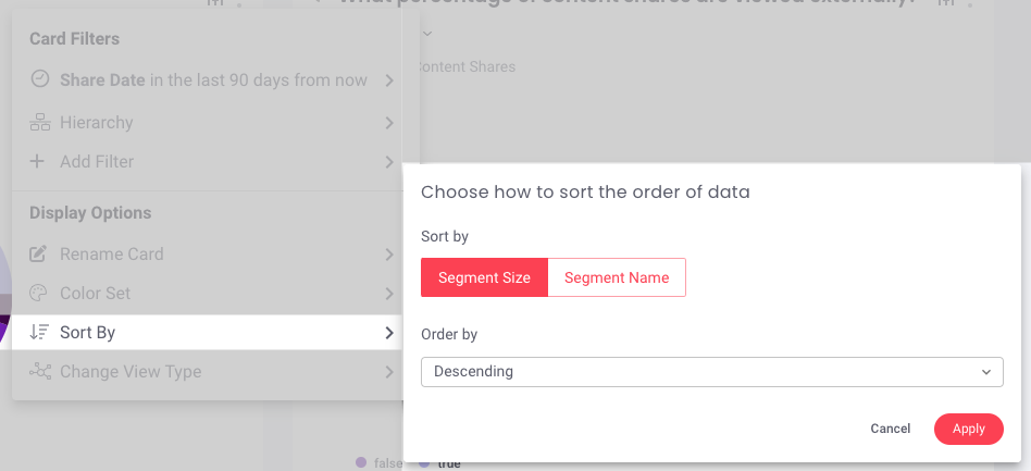
Sort By
You can sort data based on the sort and data type of a report. If applicable, there will be a sort by option in the filter menu. From there, you can select how to sort & order data.
Use Case by Role
Admin
Admin need to have control over what their team is seeing, yet the freedom to let the team make the adjustments they need to inspect data and more informed decisions to WIN.
Admins are the only users who can create, edit, or copy reports. Reports should be created with the highest level of filtering (like Region, Product, Type, etc.) so that the most vital information is available and your team can make adjustments to cards to fit their more specific needs.
Admin also have the same abilities to dynamically adjust cards to inspect a base report at a more specific level. If you have viewer permissions on a dashboard, you can adjust data, if you have editor permissions, you can save the card changes to the dashboard.
Sales Leader / Manager
Managers need to be able to see their team’s data as quickly and efficiently as possible and have the ability to be agile and update reports without having to call on admin. Imagine how quickly a manager can accomplish 1:1 meetings with each team member if they can keep the same dashboard open and quickly adjust each card to fit each team member; no need for multiple dashboards, no need for endless (almost identical) reports.
If you have viewer permissions on a dashboard, you can adjust data, if you have editor permissions, you can save the card changes to the dashboard.
Rep
Reps want to know their book of business and be prepared to talk to their manager about their pipeline and forecast. Since reps need to spend most of their time selling, interactive cards allow them to adjust data for inspection that fits their needs without spending time creating more cards or reports. This 10 second edit experience is massively beneficial to reps who want to quickly inspect their data so they can start their day equipped with only what they need and spend that extra time closing more deals!
If you have viewer permissions on a dashboard, you can adjust data, if you have editor permissions, you can save the card changes to the dashboard.
Replies have been locked on this page!