
Common Use Cases - BLANK Generic Report Template
The BLANK Generic Report Template represents a great starting point that will include the information from the tool in a detailed and organized manner. This template also doesn't require any modification when adding in your information.
Let's go through some examples of common tags and scenarios you might encounter.
Slide 1 - General Information
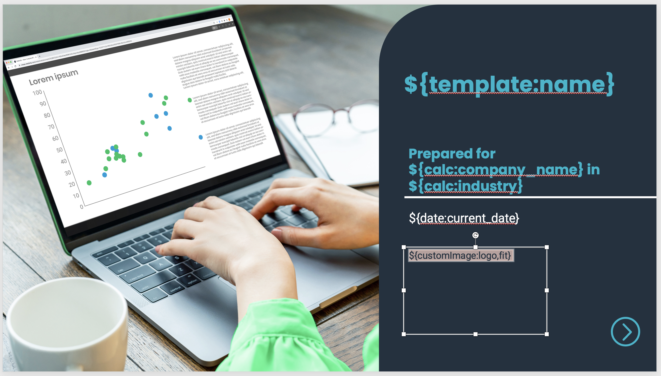
The report tags on the first page, such as ${template:name} and ${date:current_date}, are standard definition tags. These are used to pull in general plain text fields from the tool.
The 'customimage' tag highlighted in the text box is used to pull in client images on the get report page. This tag is by default hidden so it doesn't show up if a picture is not added. This is done making the text transparent via left-click > Text Options > Text Fill > Transparency to 100%.
Slide 2 & 3 - Navigation & Animation

The second and third page are dedicated to navigation and animation throughout the deck. The second page is hidden by default so you can navigate from any page back to the home page in case you are interested in exploring another topic.
Slide 4 & 5 - Executive Summary Text

The next two pages provide the Executive Summary general information. The second option has slightly different wording and is shown instead only when the post-sales mode is chosen in the tool.
Slide 6 & 7 - Executive Summary Key Metrics
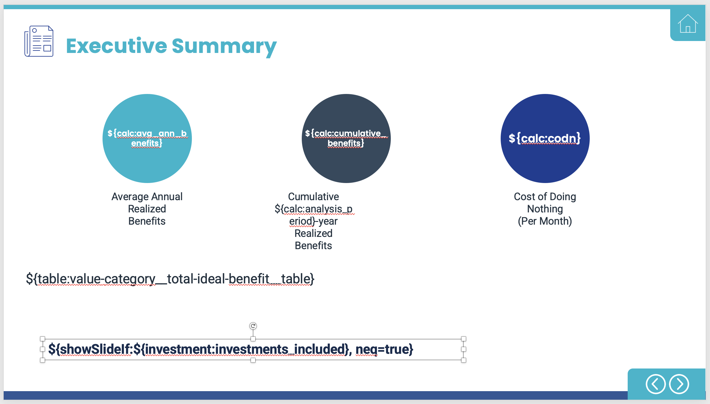
The next two slides act in the same way. Slide 6 is shown if investments have not been added to the Analysis, and Slide 7 is shown if they have.
At the bottom in above example of slide 6, you will see a report tag that makes the slide visible if investments are excluded. This is because 'neq=true' is added at the end, meaning the statement is 'not equal to true.'
You will also see the Value Map Category tag, which pulls in a table showing the Total Ideal Benefit for each category. The 'total-ideal-benefit' portion can also be replaced with 'total-realized-benefit,' giving you a table with the Total Realized Benefit for each category.
Slide 8 & 9 - Benefits by Year
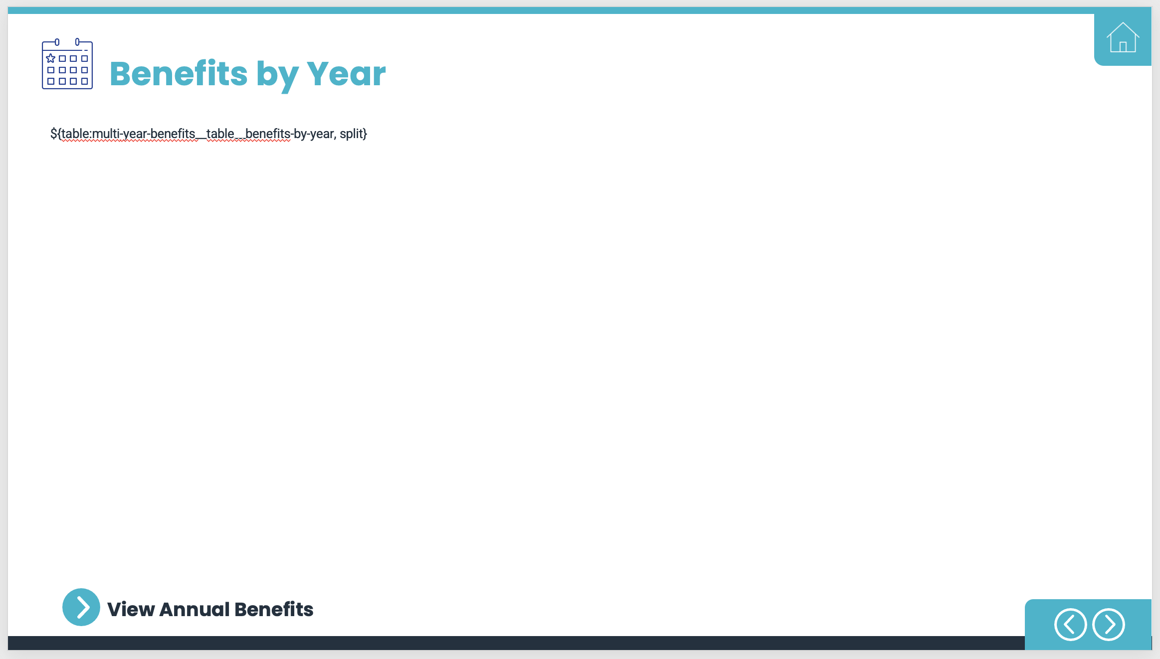
Slide 8 displays the Benefits by Year data. It is a multi-year table that includes all the benefits by year per the Analysis period. At the end of the tag, you will notice a component called 'split.' This can be useful if a table is too long. If you end up with a table that runs off the bottom of the slide, you can add this component into the report tag to split the table once it reaches the bottom and continue it on the next slide.
Note - the second slide will not have a header
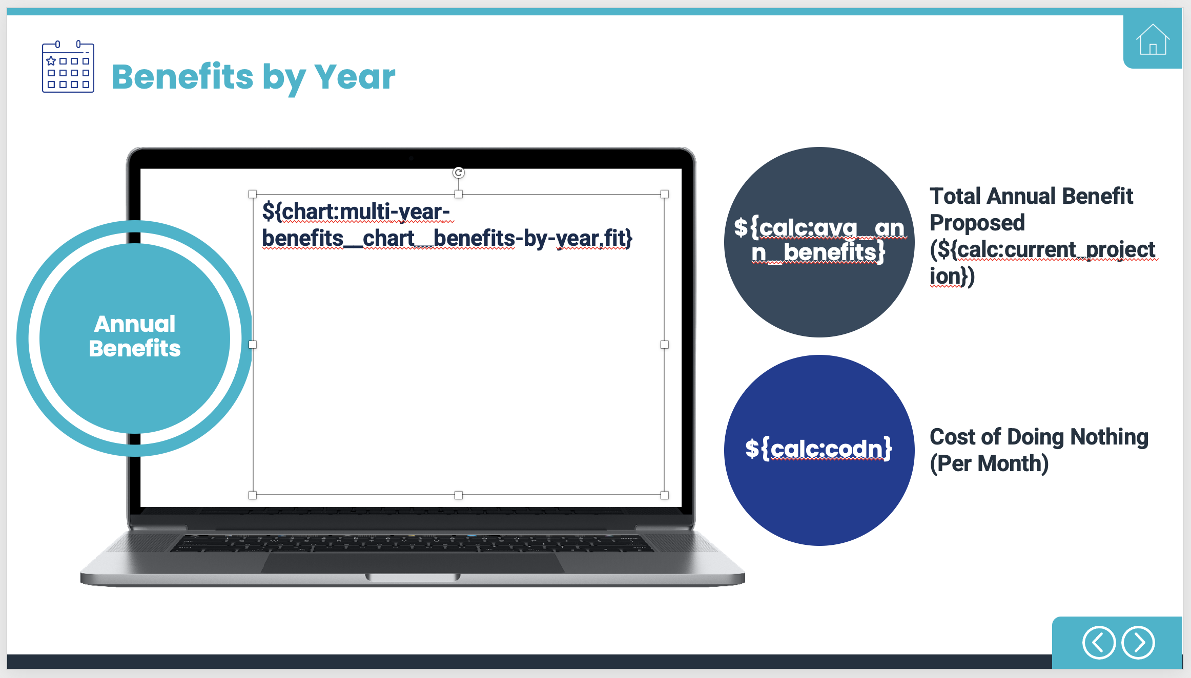
As you may have guessed, the tag at the top of the laptop screen pulls in and displays the multi-year, benefits by year chart. You will also see 'fit' located at the end. This resizes the chart to fit within the bounds of the text box.
The tags at the right pertain to the 'Total Annual Benefit Potential' and the 'Cost of Doing Nothing.' The former pulls the selected projection type, so if they have selected conservative, it will show the conservative projection.
Slide 10 & 11 - Investments
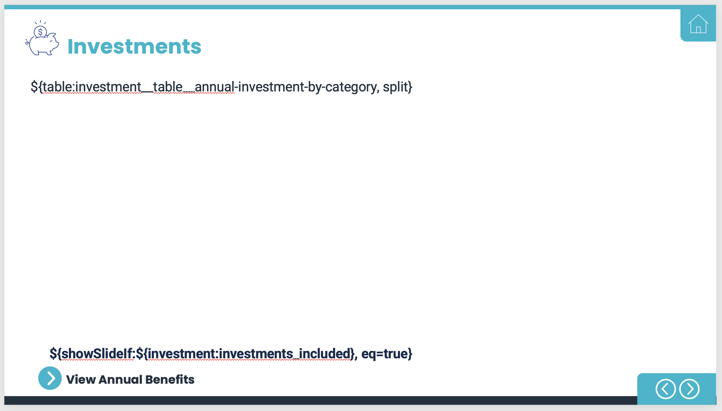
Slide 10 is the investments slide, shown year over year. It can sometimes be helpful to add the 'split' component if the table ends up running over the page.
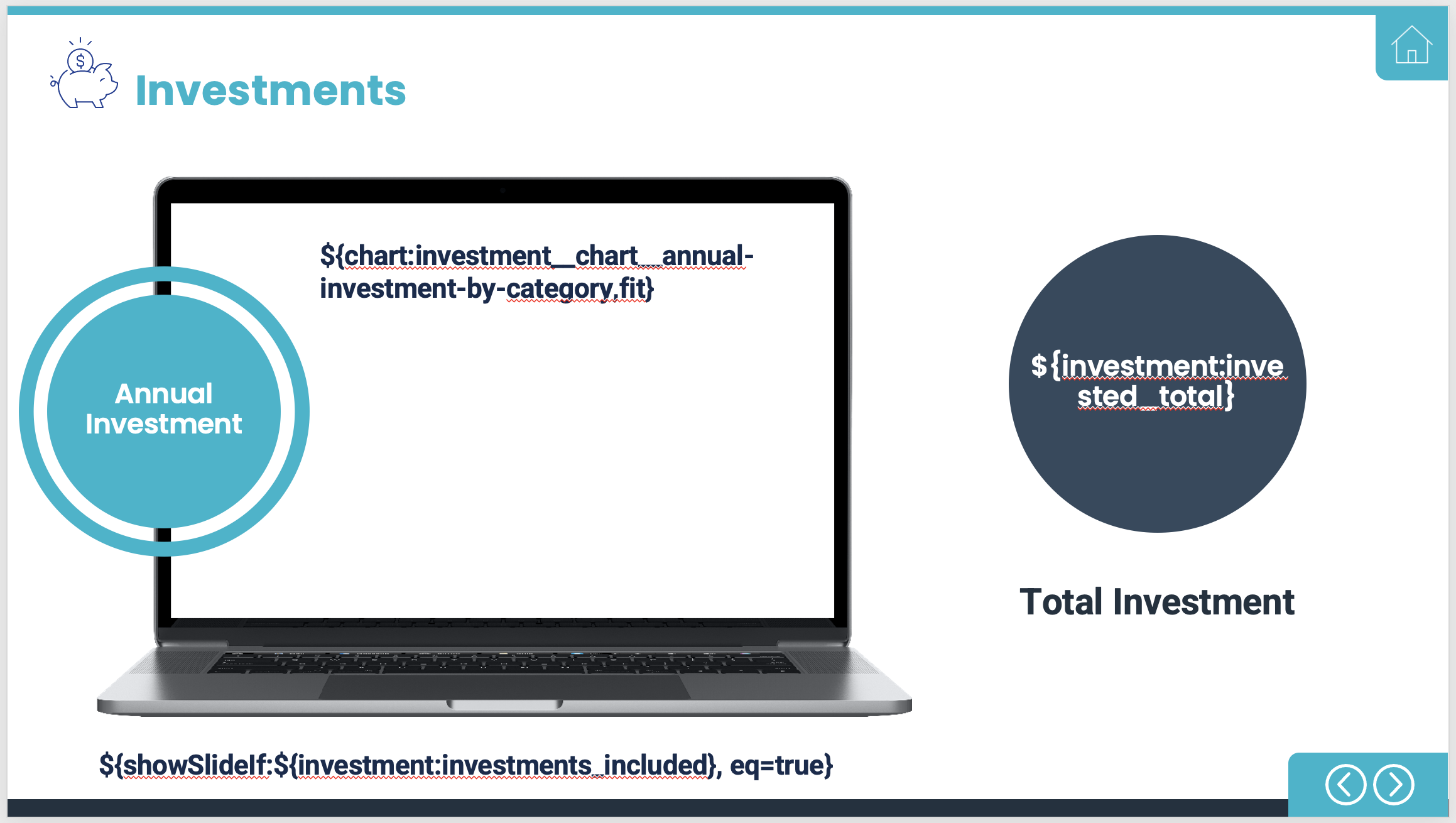
Slide 11 shows the chart associated with the total investment per value map category.
Slide 12 & 13 - Cash Flow
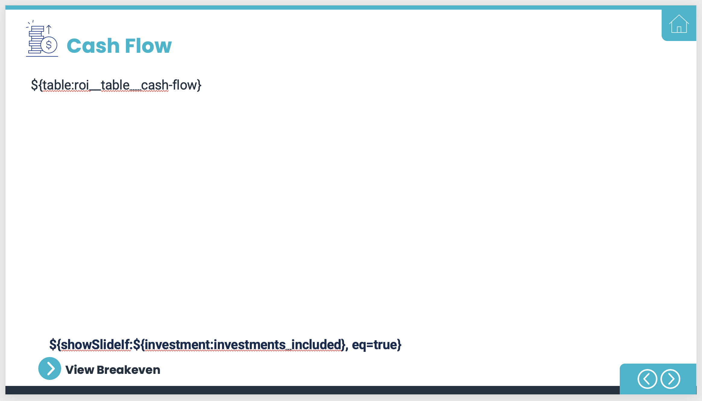
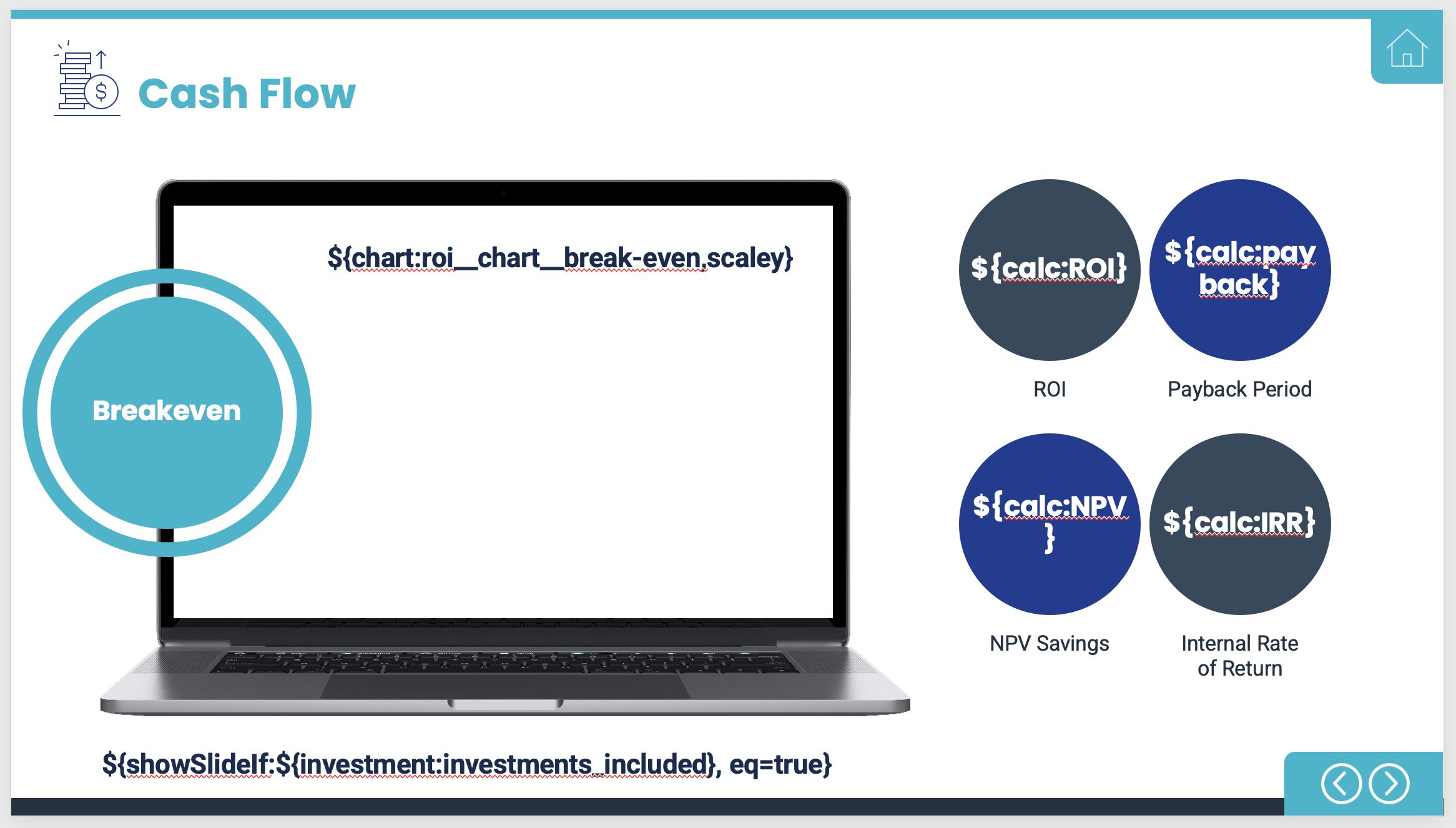
Slide 12 and 13 present the ROI and cash flow information, as well as some key metrics including IRR and NPV. It's important to note that the investment tag be present at the bottom, or else the investment information will not be displayed.
Slide 16 - Value Categories
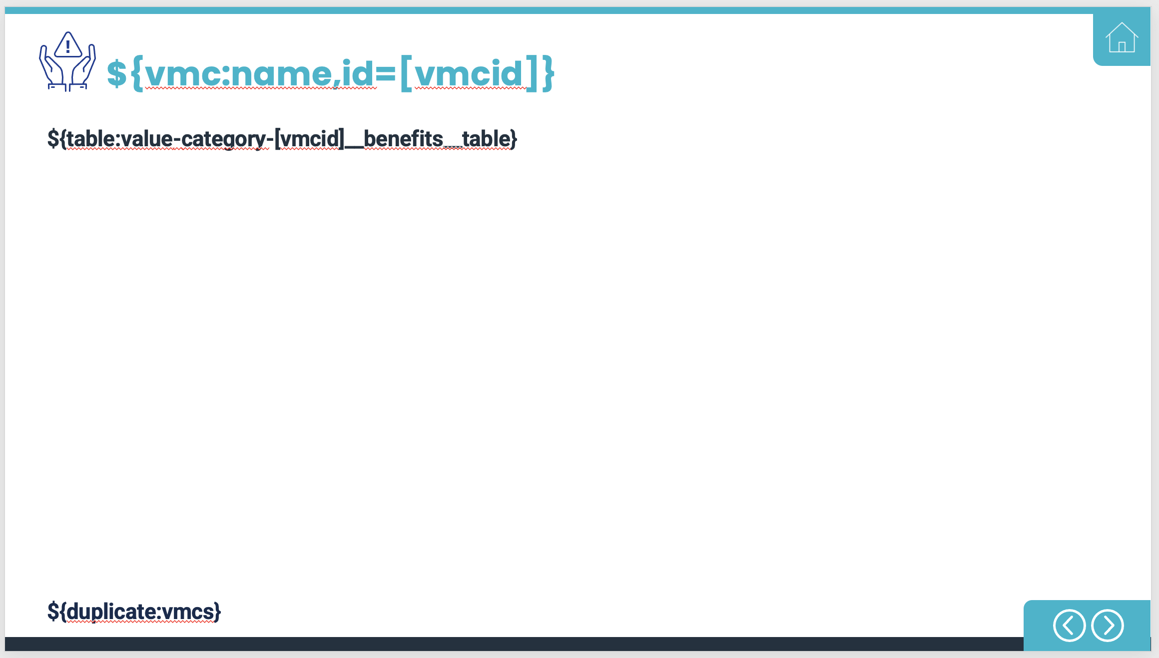
Once we get to Value Categories, there is only one slide present that includes two report tags. Any tag that includes 'id=' is an iterator tag. These tags duplicate the slide and include the appropriate benefits table based on the tag at the bottom. In this case, it will be duplicated for every Value Map Category. So if you had three categories in your tool, you would end up with three slides from this iterator.
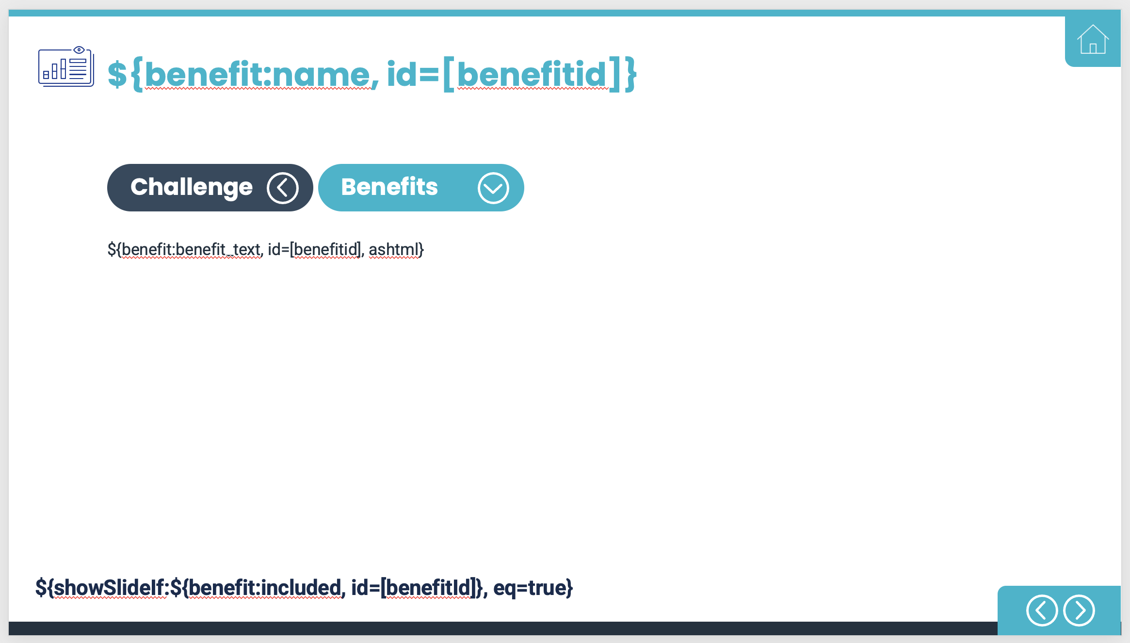
Slide 18 to 23 - Calculations
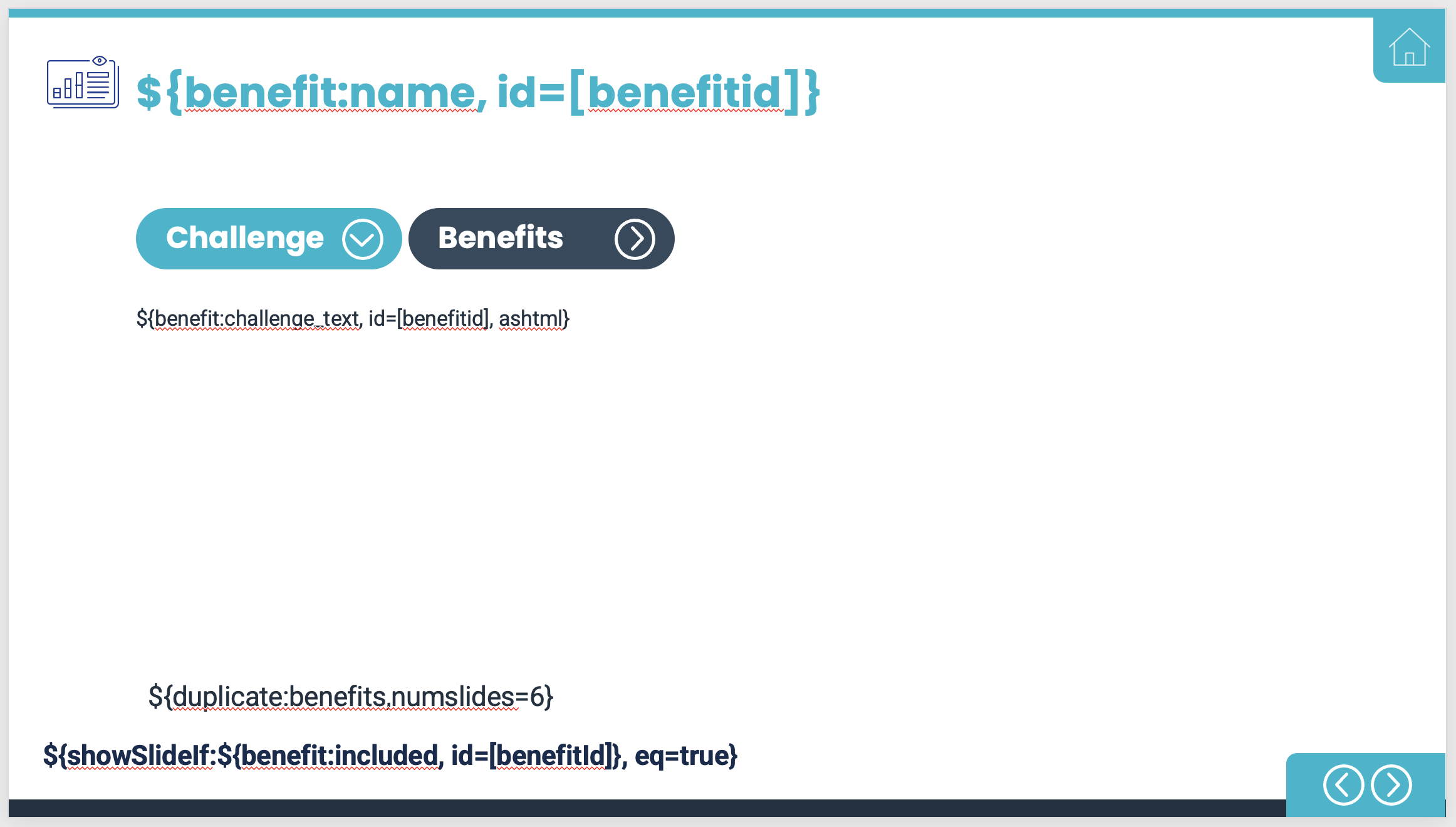
Slide 18 through 23 pull in all information present in the tool for each benefit. Because of how they are built, tags, branding, and formatting is consistent across all resulting slides.
For example, if you have one benefit that is text heavy compared to the rest , you will need to shorten the text of said benefit, or use 'split' on all benefits. This is because the iterator is applied to all benefits included, in the same order as they are in the tool. This is also helpful in that it allows you to add or delete benefits without having to modify the report.
Note - the 'numslides=6' will need to be changed to represent the number of slides per benefit you would like duplicated.
Slide 20 show the calculations themselves, including the name, description, current projection (conservative, probable, optimistic), and growth rate. Depending on the size of the calculator itself, you may end up waiting you remove the items on the top and just keep the calculator tag on the slide so it doesn't run off the page.
Note - you can't use the split component for this particular component.
All slides included above will work on any tool without having to make customizations to it. These are the ones included in the 'BLANK' version in the admin console. There are additional slides, including the Challenges and Key Inputs sections, that are included when the 'Generic' Report Template is chosen, and these have to be modified based on how your tool is set up.
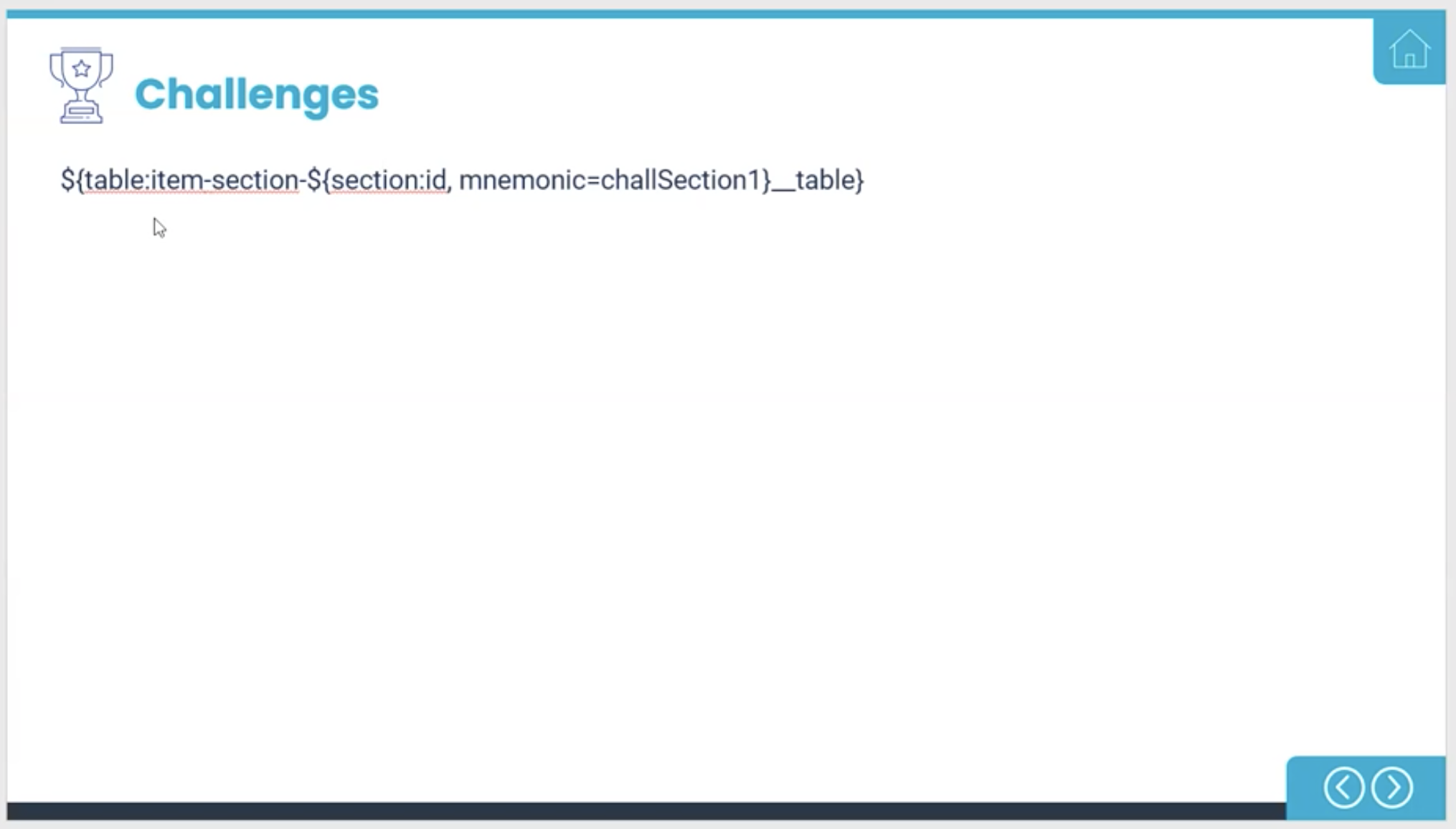
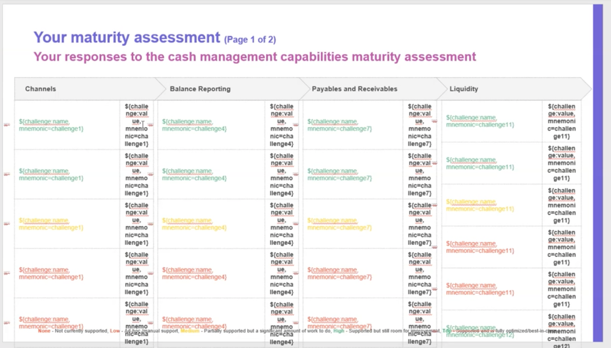
The tag above is saying that you want the item section identified by the mnemonic 'challSection1' to generate a table that shows the challenge name and how the user responded (low, med, high, etc.)
Note - be sure to make sure the mnemonic is set correctly for each piece of information you are pulling in or it will not be visible in the report.
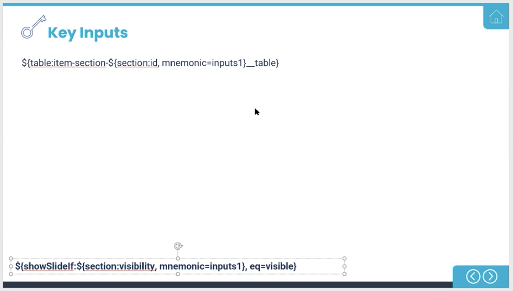
The Key Inputs pages are also placeholders and must represent the correct mnemonics in the tool. The 'showSlide' tag at the bottom must also be present in order to show/hide the correct key inputs in the report based on the variables visible/hidden in the tool.
Some Custom Examples
Once you get more comfortable with the rules and syntax, there is a lot of room for creativity when building your report templates.
Here are a few examples:
This slide has been built out for the challenges and only shows the priorities chosen, in the colors provided here.
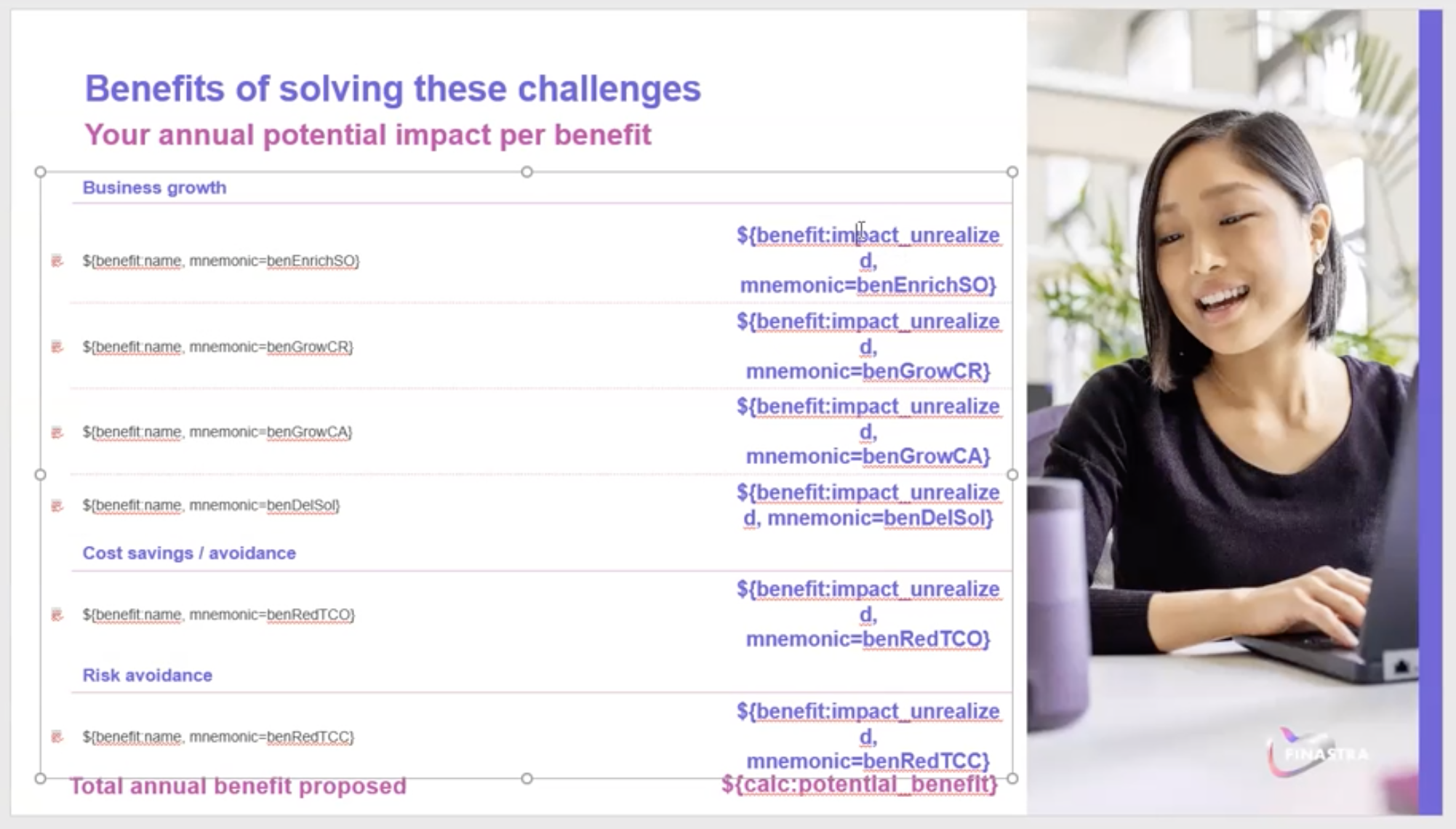
Here is a slide that allows the Author to control and color and text of each benefit individually, versus having to stick to one scheme and have it span across all the benefits included. In this example, the text on the right will show up in purple and be larger than the text on the left.
Note - fonts used in the report are the fonts used in the output reports.
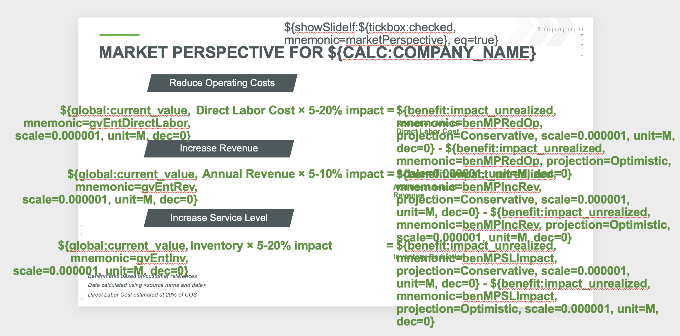
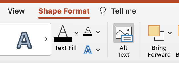
This slide uses the ALT text field to include a tag that will hide/show each of these sections if a specific benefit is included.
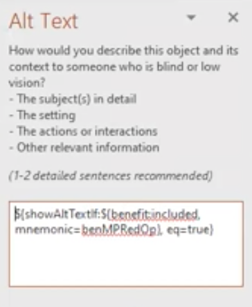
This can be found in Shape Format > Alt Text at the top tool bar, show here:
Replies have been locked on this page!